OF THE
TIMES
We'll know our disinformation program is complete when everything the American public believes is false.
All the men in the middle east are fighting with each other. It was written with charcoal, in Sanskrit, on a cave wall... fast forward, 3000...
the rapid implementation of a new vaccine technology was necessary And we end another week of World News with another comment from the Globalist...
A lot of "he said, she said" going on here.
There exists a silver lining in the story that cant be overlooked. For every vile dumped into the toilet, 5 people have avoided blood clotting...
Iran has just fired back.
To submit an article for publication, see our Submission Guidelines
Reader comments do not necessarily reflect the views of the volunteers, editors, and directors of SOTT.net or the Quantum Future Group.
Some icons on this site were created by: Afterglow, Aha-Soft, AntialiasFactory, artdesigner.lv, Artura, DailyOverview, Everaldo, GraphicsFuel, IconFactory, Iconka, IconShock, Icons-Land, i-love-icons, KDE-look.org, Klukeart, mugenb16, Map Icons Collection, PetshopBoxStudio, VisualPharm, wbeiruti, WebIconset
Powered by PikaJS 🐁 and In·Site
Original content © 2002-2024 by Sott.net/Signs of the Times. See: FAIR USE NOTICE

Reader Comments
RC
Flashback Best of the Web: Insider Trading on 9/11: Profiting From Anticipated Attack And Tragedy Using "Put Options," And The Massive Cover-up That Followed
Comment: While the Gamestop story and its implications have caught the attention of the world in the last several days, there is a far larger story which suggests how Wall Street, the banking...All the best, LG.
Will it help? Will it fuck. This train has left the station and whether we like it or not, we are along for the ride.
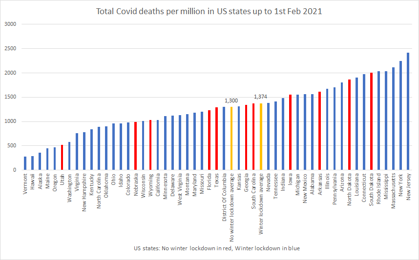
You can have a 1001 peer reviewed studies all finding lockdowns are more harmful than good, but you will only hear the single Gates funded study finding otherwise.
Its now become a case of being prepared for when we disembark. Trying to stop it has failed.
Miserably.
It's like the new report [Link] out from some NYU researchers that say social media does not censor conservatives while being funded by a Big tech billionaire Craig Newmar.
Billionaire's wield a lot of power and manipulate policy lately more so than in the past.
Its like the fox guarding the henhouse. That'll work wonders 🤦♂️
The best one is the petrol station, you get your fuel, maskless, touching the fuel pumps with your filthy diseased hands, like all the other scum, then you stroll over to the shop, put a mask on, with your filthy diseased hands, walk in about four steps, pay for your fuel, with cash from your filthy dieseaed hands, or pawing at the buttons on the card reader like a dirty animal, walk out, take your mask off...
Andrews told govt he wanted to extend ‘the state of emergency’ for a further 9 months. The liberal opposition said no but I suspect he has the numbers.
I was the only person in the shopping centre without a mask and the only person who was uncomfortable was my brother.
Noone in the chicken shop was wearing a mask this evening. People outside the city are getting over it I think, I only see people with masks on outdoors on the weekends now, city mob out for their sunday drive...
I think it's weird when you see a couple, one masked up and one not... What would the point be, and are they having bitter fights about it at home...