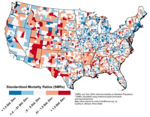
Susan Cutter and Kevin Borden from the University of South Carolina said their map presents a county-level representation of the likelihood of dying as the result of natural events such as floods, earthquakes or extreme weather.
Comment: Or, perhaps cometary impact?
"This work will enable research and emergency management practitioners to examine hazard deaths through a geographic lens," the researchers said. "Using this as a tool to identify areas with higher than average hazard deaths can justify allocation of resources to these areas with the goal of reducing loss of life."
Cutter and Borden found hazard mortality most prominent in the southern part of the nation, where most people were killed by various severe weather hazards and tornadoes. Other areas of elevated risk are the northern Great Plains where heat and drought were the biggest killers, and in the western mountains with winter weather and flooding deaths.
Heat and drought ranked highest among the hazard categories, causing 19.6 percent of total deaths, closely followed by severe summer weather 18.8 percent, and winter weather 18.1 percent.
The map is featured in the International Journal of Health Geographics.


Reader Comments
to our Newsletter