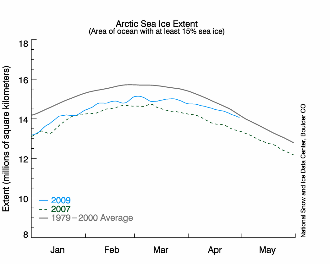
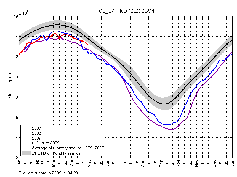
May 1st is May Day . "Mayday" is a universally understood distress call signifying that an aircraft or other vessel is headed on a collision trajectory. 2009 Arctic ice extent is on a collision trajectory with normal, which could be disastrous for AGW alarmists. "May Day" is an international holiday celebrated on May 1. In the Soviet Union it celebrated the worker's "liberation" from capitalism, though they hadn't yet thought up "cap and trade" at that time.
I have more news to report about the ongoing mystery of why NSIDC shows Arctic ice extent much closer to the 1979-2000 average than NANSEN is to the 1979-2007 average. It should be the other way around.
Dr. Walt Meier at NSIDC has again graciously responded to further questions:
Dr. Meier:To which I responded back to Dr. Meier:
It is possible that there could be inconsistency in the Nansen data. I'm not familiar with their processing. I am confident that our dataset is consistent. However, it may simply be due to the ice conditions. Most of the time, the differences between algorithm should be an offset - though this offset can vary over the course of the year (particularly summer vs. winter). However, there can inconsistencies in this depending on the character of the ice cover.
My suspicion is that much of this is due to the Bering. The ice in the Bering is very broken up and, basically, on its last legs. It could be that our algorithm is more sensitive in picking up the ice than the Nansen algorithm. Or it could be that our algorithm is overly sensitive and is not catching open water.
Remember that the threshold for ice extent is 15%. So if you have low concentration ice, even small differences in the algorithms can result in relatively large differences in extent. If Nansen consistently shows 5% less ice that NSIDC, when there is 90% ice, that makes no difference, but where there is ~15% ice, it can make a difference. From other imagery, it looks like there is a lot of area with concentrations in the ballbpark of 15%.
Me:Any ideas from the readers?
If it were due to Bering Strait ice, I would expect to see a convergence between the two data sets as the Bering ice melts. It looks to me like they are actually diverging over the last week or two though?
UPDATE: Dr. Meier just responded, minutes after posting this article:
Dr. Meier:Addendum from Anthony:
It is the Bering Sea, not the Strait and as it begins to melt, with all the old, broken up, sparse ice, you see the divergence. As it melts out completely, I expect that we'll see things go back to being more consistent.
A question to Dr. Meier: When are we going to see a date/time stamp on the NSIDC imagery? NANSEN has one.
This NSIDC graphic above is one of the most widely displayed and quoted on the net today, yet it lacks this most basic feature found in many scientific images presented for public consumption.
I realize the curve itself is marked against the x axis, but it is not easy to determine an exact date. Science is exacting, it would seem prudent to add a date/time stamp. Otherwise, the appearance of exacting science presented to the public is one of sloppiness, IMHO.


Hello,
Our school district maintains live steerable webcams at several locations, including one directly on the Bering Strait, and looking at the Russian side.
Diomede Island - Bering Strait
[Link]
There is also one in the village of Wales, looking out into the the Strait, and one in Shishmaref, which is a bit north on the Chukchi Sea coast.
Regards,
John
[Link]