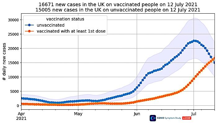
At what point will the Government accept that these vaccines have limited efficacy in preventing infection and transmission, and thus the whole rationale of being vaccinated to protect others - vaccine passports, compulsory vaccination, and so on - is suspect?
The above graph was in yesterday's report, so I downloaded today's report (you can get it by signing up to the app and reporting your symptoms) to get the new update. I was dismayed to find the graph was gone. At the bottom, a note explains:
Removed incidence graph by vaccination status from the report as there are very few unvaccinated users in the infection survey, the Confidence Intervals are very wide and the trend for unvaccinated people is no longer representative.Which I would say is very convenient, just as infections in the vaccinated became the majority. Perhaps ZOE should try to recruit some more unvaccinated people for its survey, so it can continue to report on this as well as have a control group for its vaccine data? That would seem the scientific thing to do, rather than just stop reporting it because it is suddenly "no longer representative".
It's doubly odd because Tim Spector, lead scientist on the ZOE app, made the decline among the unvaccinated a feature of his video this week. So the realisation that the trend is "no longer representative" appears to have been rather sudden, even invalidating the contents of a ZOE 'data release' two days earlier.
It seems we will never know how the story ends, which is a shame and a missed opportunity for ZOE.
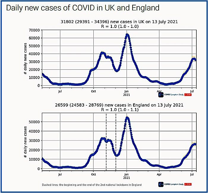
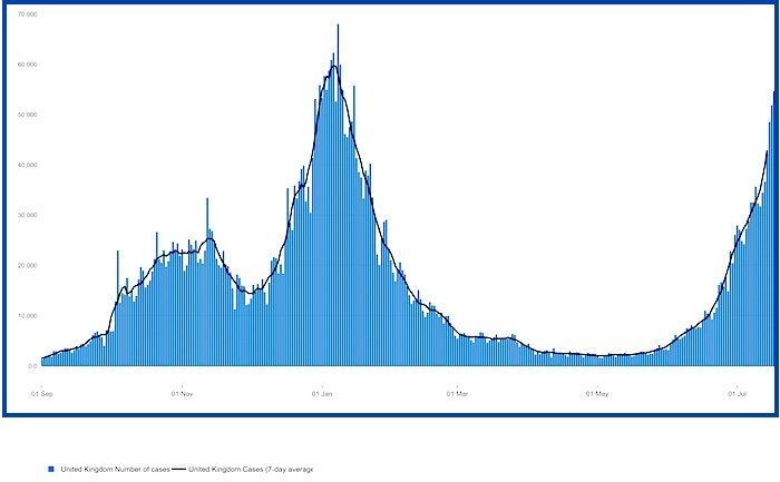
ZOE data continues to suggest the current Covid surge is peaking and possibly even beginning to decline in the U.K., at least outside England (see above). Yet this is at odds with the daily Covid reports from the Government, which show continued growth.
Why the discrepancy? Is it because the Government figures include all the lateral flow tests that schoolchildren are taking as they isolate? 839,100 children - 11.2% of the total pupil population, more than one in 10 - were absent from state schools for Covid-related reasons on July 8th. All of them will have been tested and this will be picking up asymptomatic or mild infections that would usually not be noticed. ZOE data is symptom based, with a confirmatory PCR test, so would not be affected by surges in lateral flow testing among schoolchildren picking up asymptomatic infections.
Whatever the explanation, one to watch.


The cabal is on the move. They are making moves to stop you from talking, and to make you scared. they want to turn your brain into a pretzel. They want to use the rabid vaccine jabbed jackals to push & shame you, and coerce you into seeing this thing with rose colored glasses. They'll use threatening propaganda to create hysteria again. The variants you see, the variants.
Do you know what neighborhood watch is? Well, here in the US it's organized people in neighborhoods watching out for each other. if they see or hear of anything questionable they report it to the police, and to other neighbors. This idea just might be a great way to connect on-line logicians to information. SUPPORT, SUPPORT, SUPPORT each other. I read an article that was written by a prominent Dr. the other day; (I think it was yeadon) but, I can't remember for sure. Anyway, he said something that I agree with-as sad as it might be. He said something to the likes of; you have to stop wasting your time trying to convince those who have been vaxxed, and those who can not see. He said, they are already gone. Sadly, I agree. It doesn't mean that you forget them; some of them are our family and friends. But, we must try to reinforce the strength of those who can see. They will try everything to get to people by coercion and fear. They will probably work in waves. You see they'll probably catch a number of people by scaring them with the whole, no jab, no job, no food, no gas, no this, no that. But they say, you have a choice.............................
Within a 2 day period I have been harassed, asked "what the hell is wrong with me", told that this person deliberately keeps his family members away from conspiracy nuts like me. I was told that I don't care about anyone. This was someone who claims to be my friend. (?)
I see something coming (IF) we don't STOP THIS! Yesterday at the market---more people back to wearing masks. You see, these people show us what is coming by watching their behavior. This is directly from the MSM propaganda mills sucking at their grey matter & filling their heads with goo.
IF they succeed-- well, I just don't know.
If we form some kind of 'neighborhood watch' online; then we could keep each other informed about what is happening where you live. Here in the US, if we report when those so-called, enforcers come to your door......Then people will be prepared.