If you give the patient one pill, he perks up. If you give him another pill, he calms down. That might not surprise you. What might, though, is that it still works even when the pills contain no actual medicine.
Studies show that red pills are more effective stimulants than blue pills; blue pills are more effective as sleeping tablets than orange tablets. Green, white or blue pills aren't as effective as red ones as painkillers. But these were all placebos, administered in a series of experiments in the Sixties and Seventies, looking at how our perception of colour affects our minds and bodies. There was no painkiller, there was no stimulant.
The idea that colours affect our mood - red makes us angry, or sexually receptive; blue soothes us, or saddens us; that sort of thing - seems vaguely hippyish. Alternative medicine types push "chromotherapy", treating unwellness with colour; an odd amalgam of Victorian pseudoscience and cod-eastern mysticism. But now, the body of scientific research into colour is growing. And it all points to one thing: our perception of colour really does affect our minds, and our bodies. A 2004 study found that football teams wearing red were statistically more likely to win than teams in other colours. Another, in 2008, found that male volunteers shown photos of averagely attractive women on red and white backgrounds rated the women on red as more good-looking. Meanwhile, an experiment in the Seventies found that male prison inmates became physically weaker when they were housed in pink-painted cells.
And yet, while its effects on us may be profound, colour "doesn't really exist in the world", says Beau Lotto, a neuroscientist at University College London. Blue isn't a property of denim, or skies, or oceans, but of how our eyes interpret a particular set of wavelengths of electromagnetic radiation, which we call visible light. Red isn't a property of blood or cocktail dresses but how our eyes interpret another, longer set of wavelengths.
"Human vision is trichromatic," says Prof Andrew Stockman, a UCL colleague of Dr Lotto's. "Like a colour television." We have three different colour receptors, cones, in our eyes, each designed to pick up different wavelengths of light. These are red, green and blue. Most mammals, apart from a few of our fellow apes, have two, and so do most colour-blind people, meaning they can only detect green and blue wavelengths. If we had only one receptor, we'd see the world in something like black and white.
This is the product of billions of years of evolution. Long before our ancestors had anything you'd call an eye, back when they were single-celled organisms, they had some basic light sensitivity, and would have been able - to some degree - to detect differences between long-wavelength and short-wavelength light. This would have allowed them to tell when it was daylight (blue light) and sunset (red light). Later, as lifeforms grew more complex, we developed more sophisticated techniques for more sophisticated purposes.
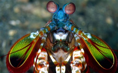
"The whole point of colour vision is not to inspire poets, but to allow contrast detection," says Russell Foster, professor of circadian neuroscience at the University of Oxford. "You've got a much better chance of detecting an object against a background if you have colour vision." Birds are the masters at this, he says - they are tetrachromatic, having four colour detectors, and would see things that we see as a single red as an infinite, glorious wash of colours. (Mantis shrimp, a kind of predatory marine crustacean, have 12 detectors, but for some reason do not seem to be better at distinguishing colours than we lowly humans.)
Unlike birds, though, mammals are descended from small, timid creatures who scurried around avoiding dinosaurs - and, crucially, were nocturnal. Our ancestors had far less use for colour detection, which is much harder at night. It was only after the death of the dinosaurs 65 million years ago that our forebears ventured out into the daylight, and it is only 30 or 40 million years or so since a mutant ape developed a third colour receptor.

But earlier, we saw that red made us perkier, and blue calmed us down. This is because, as Lotto says, context is everything; red can be friendly when it's associated with a ketchup bottle and baleful when associated with blood.
Lotto spends much of his time creating optical illusions to demonstrate how humans see and perceive colour, and the impact of context upon it. "I can take a grey patch, and cause you to see any colour in it," he says. "I can make you see blue or yellow, depending on what surrounds it. When I change your perception of it, what I'm changing is the meaning of the information, I'm not changing the physics of the information itself.
"If I make a patch appear as if it's under shadow, you'll see it as being lighter than if I make the same patch appear as if it's on a dark background. That's basically what your brain is constantly doing." The illusions are remarkable to look at: two patches of identical colour, brightness and shape will appear as utterly different colours to our eyes, because of simple tricks of perspective and shade which make one look as though it's under red light, or another under shadow. These illusions are unsettling to see, at least for me: they undermine my sense of being grounded in reality.
But we're not uniformly sensitive to these illusions; again, context matters. "How powerful people feel alters their perception of colour," says Lotto. "If I make you feel a bit more powerful, a little more in control, the strength of the illusions that I make decreases. If I put you in a state of powerlessness, the strength of illusions increases." It's because we're more sensitive to context when we feel out of control; we become less comfortable with uncertainty.
Similarly, he says, these illusions are more effective on people from eastern cultures, where social context is all-important. "The people around you are far more important in the east, whereas in the west we're far more individualistic."
It gets more complex: "context" can mean things as apparently unrelated as whether you're feeling morally compromised. A 2011 study published in the journal of the Association for Psychological Sciences found that people who had been asked to recall something unethical they'd done tended to judge the room they were in as darker than those who'd been asked to remember something ethical.
There's even some indication that the words we use to describe colour affect our ability to see it. Benjamin Whorf, a linguistic theorist, claimed that our language limits our perception: if our language lacks a word for something, we find it harder to think about that thing.
The Whorfian hypothesis has been largely discredited - after all, if we really couldn't think about things we didn't have a word for, we wouldn't need to come up with new words; English didn't have a word for "schadenfreude" until quite recently, but we understood the concept well enough. Neverthless, experiments have shown that societies such as the Tarahumara tribe in Northern Mexico, which lack different words for "blue" and "green", find it harder to find the odd one out in a group of greenish-blue squares. Meanwhile, the fact that we distinguish indigo and violet as separate colours is largely down to Newton, who named and split up the colours of the rainbow more subjectively than scientifically, leaving a large area between blue and green un-named.
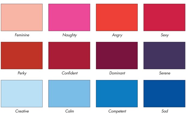
The cultural contexts and meaning of colours has been picked up, of course, by marketers, as suggested by the title of a paper in the Journal of the Academy of Marketing Science, "Exciting red and competent blue: the importance of color in marketing". White is "purity, cleanness, simplicity, hygiene, clarity and peace"; black is "sophistication, glamour, status, elegance, richness and dignity". Purple is status, pink is femininity, and, of course, blue suggests competence while red is exciting. Using these colours in your brand or logo, apparently, will subtly instil those messages in potential customers' minds.
A lot of these highly specific claims are probably hogwash, as another paper, in the journal Color Research & Application, made clear in its own title: "Colour psychology and colour therapy: Caveat emptor". The evidence-based hypotheses are often hard to tease out from the mystical or made-up nonsense, writes its author, Zena O'Connor: "The information available is often presented in an authoritative manner exhorting the reader to believe a range of claims such as red is physically stimulating and arousing and blue is calming and healing. However, evidence is rarely cited and, when it is, it's often in reference to findings that are inappropriately generalised or out-of-date." But even after the dubious claims have been weeded out, colour clearly still has a profound impact on our mental life.
An obvious question is how much of this impact is innate, and how much is culturally learnt. For instance, the study into the psychological effects of pink, mentioned above, was carried out by Alexander Schauss in the Seventies. It showed that of 153 male prisoners put in cells painted pink, 98.7 per cent were weaker after being in the pink cells for only 15 minutes - presumably because of associations with the colour pink and femininity. But pink has only been associated with girls for 70 years or so; would the same result have been found in Victorian times? Probably not. But the red light/blue light distinction that Foster refers to must be written deep in our genes.
The allure of red certainly appears to cross cultural boundaries. A 2012 study conducted in Burkina Faso, in West Africa, where red has explicitly negative associations, still revealed it to be a sexual trigger. Paintings with red in fetch far higher prices than those without, and Brett Gorvy, chairman of contemporary art at Christie's international, has described it as the "most lucrative colour". Some scientists believe that we and other primates such as chimps and gorillas developed the ability to detect the colour red because of a common characteristic: bare-skinned faces. Suddenly, we could "read" the all-important expressions of anger, dominance and sexual readiness on the faces of those around us.
Since we know that "colour" is a product of how our eyes interpret electromagnetic radiation, we know that it's not an attempt to represent the world as it really is. Natural selection doesn't care whether you have a true representation of the universe. It only cares if you can find food and attract mates and avoid predators. "Your perception of colour either helped you behave usefully towards this thing, or it didn't," Lotto says. "Either it helped you decide whether to eat something, to mate with it, or to run away from it, or it didn't. And if it didn't, you died, and you got selected out through evolution."
All our perceptions, then, are grounded in our evolutionary history, which provides us with some of our underlying assumptions, and our personal, culture-infused life history, which provides us with the rest. Colour is simply a useful way that our brains have come up with for representing the world - and what we learn from colour vision applies to the rest of the brain's interaction with the world.
"And that, to me, is why colour vision is wonderful," says Lotto. "You begin looking there, and it opens up all these other questions, and reveals what the brain is trying to do."


Reader Comments
No one can prove it either way,but this may interest you-
[Link]