GISS is the Goddard Institute for Space Studies, a part of NASA. The Director of GISS is Dr. James Hansen. Dr. Hansen is an impartial scientist who thinks people who don't believe in his apocalyptic visions of the future should be put on trial for "high crimes against humanity". GISS produces a surface temperature record called GISTEMP. Here is their record of the temperature anomaly for Dec-Jan-Feb 2010 :
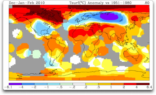
The oddity about the picture is that we are given temperature data where none exists. We have very little temperature data for the Arctic Ocean, for example. Yet the GISS map shows radical heating in the Arctic Ocean. How do they do that?
The procedure is one that is laid out in a 1987 paper by Hansen and Lebedeff In that paper, they note that annual temperature changes are well correlated over a large distance, out to 1200 kilometres (~750 miles).
("Correlation" is a mathematical measure of the similarity of two datasets. It's value ranges from zero, meaning not similar at all, to plus or minus one, indicating totally similar. A negative value means they are similar, but when one goes up the other goes down.)
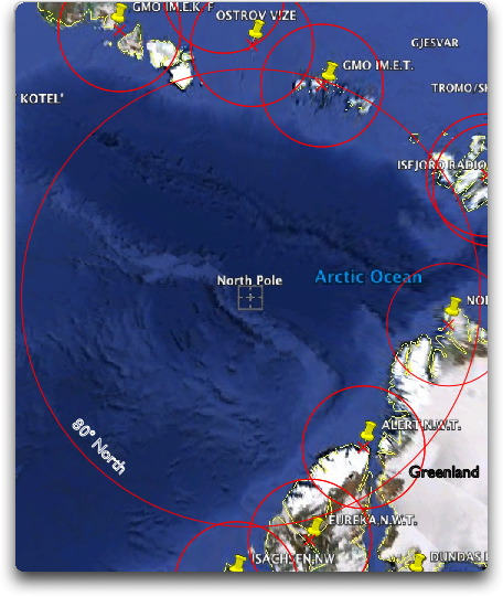
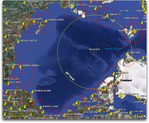
Based on Hansen and Lebedeff's finding of a good correlation (+0.5 or greater) out to 1200 km from a given temperature station, GISS show us the presumed temperature trends within 1200 km of the coastline stations and 1200 km of the island stations. Areas outside of this are shown in gray. This 1200 km. radius allows them to show the "temperature trend" of the entire Arctic Ocean, as shown in Figure 1. This gets around the problem of the very poor coverage in the Arctic Ocean. Here is a small part of the problem, the coverage of the section of the Arctic Ocean north of 80° North:
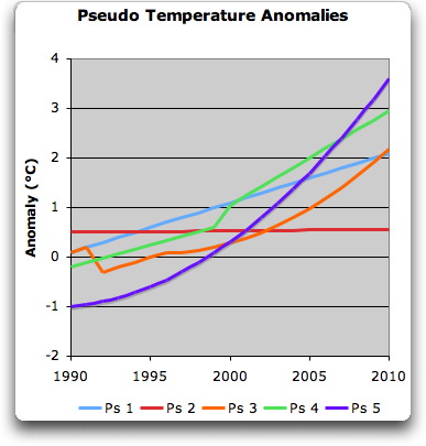
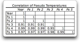
The inescapable conclusion from this is that high correlations between datasets do not mean that their trends are similar.
OK, I can hear you thinking, "Yea, right, for some imaginary short 20 year pseudo temperature datasets you can find some wild data that will have different trends. But what about real 50-year long temperature datasets like Hansen and Lebedeff used?"
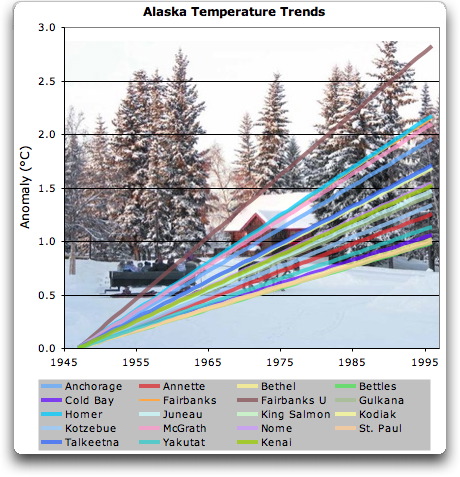
Glad you asked ... here are nineteen fifty-year long temperature datasets from Alaska. All of them have a correlation with Anchorage greater than 0.5 (max 0.94, min 0.51, avg .075). These are their trends:
As you can see, the trends range from about one degree in fifty years to nearly three degrees in fifty years. Despite this huge ~ 300% range in trends, all of them have a good correlation (greater than +0.5) with Anchorage. This clearly shows that good correlation between temperature datasets means nothing about their corresponding trends.
Finally, as far as I know, this extrapolation procedure is unique to James Hansen and GISTEMP. It is not used by the other creators of global or regional datasets, such as CRU, NCDC, or USHCN. As Kevin Trenberth stated in the CRU emails regarding the discrepancy between GISTEMP and the other datasets (emphasis mine):
My understanding is that the biggest source of this discrepancy [between global temperature datasets] is the way the Arctic is analyzed. We know that the sea ice was at record low values, 22% lower than the previous low in 2005. Some sea temperatures and air temperatures were as much as 7C above normal. But most places there is no conventional data. In NASA [GISTEMP] they extrapolate and build in the high temperatures in the Arctic. In the other records they do not. They use only the data available and the rest is missing.No data available? No problem, just build in some high temperatures ...
Conclusion?
Hansen and Lebedeff were correct that the annual temperature datasets of widely separated temperature stations tend to be well correlated. However, they were incorrect in thinking that this applies to the trends of the well correlated temperature datasets. Their trends may not be similar at all. As a result, extrapolating trends out to 1200 km from a given temperature station is an invalid procedure which does not have any mathematical foundation.


Reader Comments
to our Newsletter