Jeff Id of The Air Vent emailed me today inviting me to repost Ryan O's latest work on statistical evaluation of the Steig et al "Antarctica is warming" paper ( Nature, Jan 22, 2009) I thought long and hard about the title, especially after reviewing the previous work from Ryan O we posted on WUWT where the paper was dealt a serious blow to "robustness". After reading this latest statistical analysis, I think it is fair to conclude that the paper's premise has been falsified.
Ryan O, in his conclusion, is a bit more gracious:
I am perfectly comfortable saying that Steig's reconstruction is not a faithful representation of Antarctic temperatures over the past 50 years and that ours is closer to the mark.Not only that, Ryan O did a more complete job of the reconstruction than Steig et al did, he mentions this in comments at The Air Vent:
Steig only used 42 stations to perform his reconstruction. I used 98, since I included AWS stations.The AWS stations have their problems, such as periods of warmer temperatures due to being buried in snow, but even when using this data, Ryan O's analysis still comes out with less warming than the original Steig et al paper.
Antarctica as a whole is not warming, the Antarctic peninsula is, which is significantly removed climatically from the main continent.
It is my view that all Steig and Michael Mann have done with their application of RegEm to the station data is to smear the temperature around much like an artist would smear red and white paint on a pallete board to get a new color "pink" and then paint the entire continent with it.
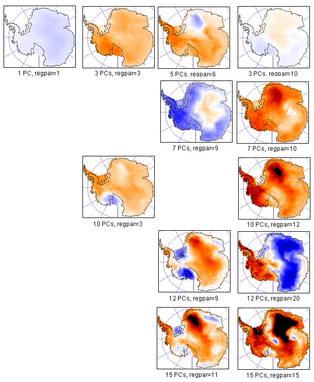
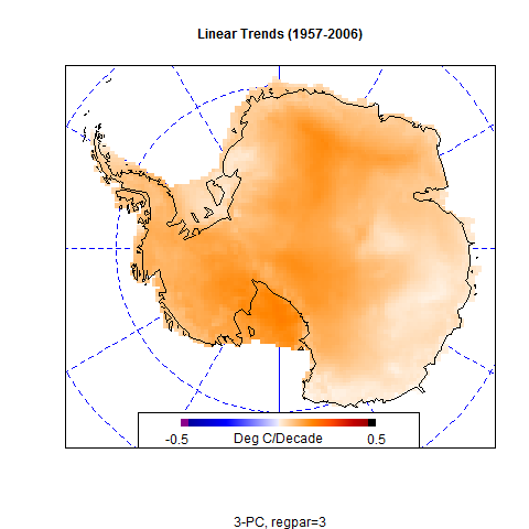
It is a lot like "spin art" you see at the county fair. For example, look (at left) at the different tiles of colored temperature results for Antarctica you can get using Steig's and Mann's methodology. The only thing that changes are the starting parameters, the data remains the same, while the RegEm program smears it around based on those starting parameters. In the Steig et al case, PC and regpar were chosen by the authors to be a value of 3. Chosing any different numbers yields an entirely different result.
So the premise of the Steig et al paper paper boils down to an arbitrary choice of values that "looked good".
I hope that Ryan O will write a rebuttal letter to Nature, and/or publish a paper. It is the only way the Team will back down on this. - Anthony
UPDATE: To further clarify, Ryan O writes in comments:
Overall, Antarctica has warmed from 1957-2006. There is no debating that point. (However, other than the Peninsula, the warming is not statistically significant. )Ryan O adds later:
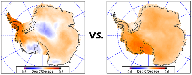
The important difference is the location of the warming and the magnitude of the warming. Steig's paper has the warming concentrated on the Ross Ice Shelf - which would lead you to entirely different conclusions than having a minimum on the ice shelf. As far as magnitude goes, the warming for the continent is half of what was reported by Steig (0.12 vs. 0.06 Deg C/Decade).
Additionally, Steig shows whole-continent warming from 1967-2006; this analysis shows that most of the continent has cooled from 1967-2006. Given that the 1940's were significantly warmer in the Antarctic than 1957 (the 1957-1960 period was unusually cold in the Antarctic), focusing on 1957 can give a somewhat slanted picture of the temperature trends in the continent.
I should have said that all reconstructions yield a positive trend, though in most cases the trend for the continent is not statistically significant.Verification of the Improved High PC Reconstruction
Posted by Jeff Id on May 28, 2009
There is always something going on around here.
Up until now all the work which has been done on the antarctic reconstruction has been done without statistical verification. We believed that they are better from correlation vs distance plots, the visual comparison to station trends and of course the better approximation of simple area weighted reconstructions using surface station data.
The authors of Steig et al. have not been queried by myself or anyone else that I'm aware of regarding the quality of the higher PC reconstructions. And the team has largely ignored what has been going on over on the Air Vent. This post however demonstrates strongly improved verification statistics which should send chills down their collective backs.
Ryan was generous in giving credit to others with his wording, he has put together this amazing piece of work himself using bits of code and knowledge gained from the numerous other posts by himself and others on the subject. He's done a top notch job again, through a Herculean effort in code and debugging.
If you didn't read Ryan's other post which led to this work the link is:
Antarctic Coup de Grace
How Do We Choose?
In order to choose which version of Antarctica is more likely to represent the real 50-year history, we need to calculate statistics with which to compare the reconstructions. For this post, we will examine r, r^2, R^2, RE, and CE for various conditions, including an analysis of the accuracy of the RegEM imputation. While Steig's paper did provide verification statistics against the satellite data, the only verification statistics that related to ground data were provided by the restricted 15-predictor reconstruction, where the withheld ground stations were the verification target. We will perform a more comprehensive analysis of performance with respect to both RegEM and the ground data. Additionally, we will compare how our reconstruction performs against Steig's reconstruction using the same methods used by Steig in his paper, along with a few more comprehensive tests.
To calculate what I would consider a healthy battery of verification statistics, we need to perform several reconstructions. The reason for this is to evaluate how well the method reproduces known data. Unless we know how well we can reproduce things we know, we cannot determine how likely the method is to estimate things we do not know. This requires that we perform a set of reconstructions by withholding certain information. The reconstructions we will perform are:
1. A 13-PC reconstruction using all manned and AWS stations, with ocean stations and Adelaide excluded. This is the main reconstruction.
2. An early calibration reconstruction using AVHRR data from 1982-1994.5. This will allow us to assess how well the method reproduces the withheld AVHRR data.
3. A late calibration reconstruction using AVHRR data from 1994.5-2006. Coupled with the early calibration, this provides comprehensive coverage of the entire satellite period.
4. A 13-PC reconstruction with the AWS stations withheld. The purpose of this reconstruction is to use the AWS stations as a verification target (i.e., see how well the reconstruction estimates the AWS data, and then compare the estimation against the real AWS data).
5. The same set of four reconstructions as above, but using 21 PCs in order to assess the stability of the reconstruction to included PCs.
6. A 3-PC reconstruction using Steig's station complement to demonstrate replication of his process.
7. A 3-PC reconstruction using the 13-PC reconstruction model frame as input to demonstrate the inability of Steig's process to properly resolve the geographical locations of the trends and trend magnitudes.
-
Using the above set of reconstructions, we will then calculate the following sets of verification statistics:
-
1. Performance vs. the AVHRR data (early and late calibration reconstructions)
2. Performance vs. the AVHRR data (full reconstruction model frame)
3. Comparison of the spliced and model reconstruction vs. the actual ground station data.
4. Comparison of the restricted (AWS data withheld) reconstruction vs. the actual AWS data.
5. Comparison of the RegEM imputation model frame for the ground stations vs. the actual ground station data.
-
The provided script performs all of the required reconstructions and makes all of the required verification calculations. I will not present them all here (because there are a lot of them). I will present the ones that I feel are the most telling and important. In fact, I have not yet plotted all the different results myself. So for those of you with R, there are plenty of things to plot.
Without further ado, let's take a look at a few of those things.
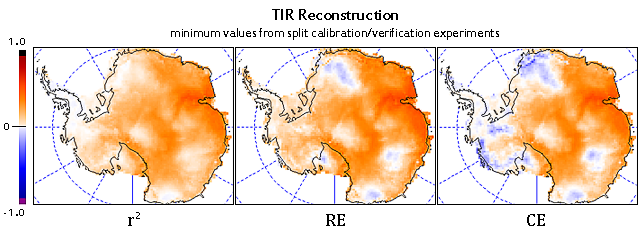
You may remember the figure above; it represents the split reconstruction verification statistics for Steig's reconstruction. Note the significant regions of negative CE values (which indicate that a simple average of observed temperatures explains more variance than the reconstruction). Of particular note, the region where Steig reports the highest trend - West Antarctica and the Ross Ice Shelf - shows the worst performance.
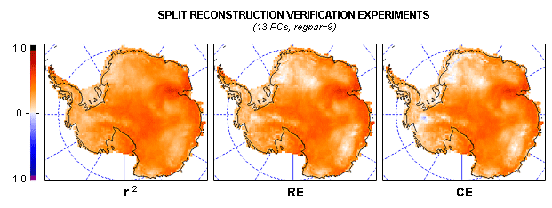
Let's compare to our reconstruction:
There still are a few areas of negative RE (too small to see in this panel) and some areas of negative CE. However, unlike the Steig reconstruction, ours performs well in most of West Antarctica, the Peninsula, and the Ross Ice Shelf. All values are significantly higher than the Steig reconstruction, and we show much smaller regions with negative values.
As an aside, the r^2 plots are not corrected by the Monte Carlo analysis yet. However, as shown in the previous post concerning Steig's verification statistics, the maximum r^2 values using AR(8) noise were only 0.019, which produces an indistinguishable change from Fig. 3.
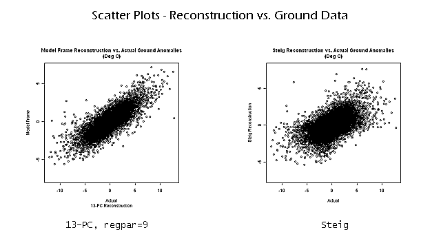
Now that we know that our method provides a more faithful reproduction of the satellite data, it is time to see how faithfully our method reproduces the ground data. A simple way to compare ours against Steig's is to look at scatterplots of reconstructed anomalies vs. ground station anomalies:
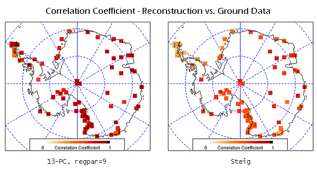
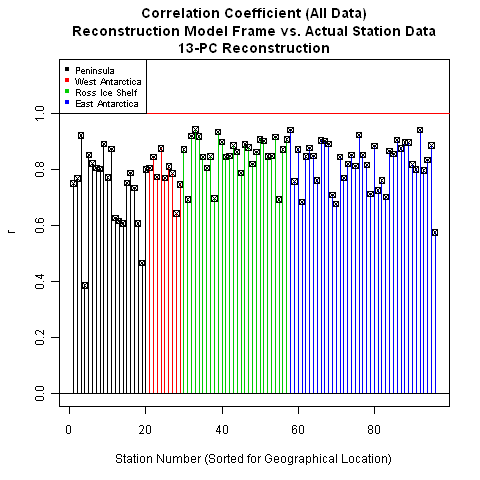
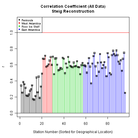
The 13-PC reconstruction shows significantly improved performance in predicting ground temperatures as compared to the Steig reconstruction. This improved performance is also reflected in plots of correlation coefficient:
As noted earlier, the performance in the Peninsula , West Antarctica, and the Ross Ice Shelf are noticeably better for our reconstruction. Examining the plots this way provides a good indication of the geographical performance of the two reconstructions. Another way to look at this - one that allows a bit more precision - is to plot the results as bar plots, sorted by location:
The difference is quite striking.
While a good performance with respect to correlation is nice, this alone does not mean we have a "good" reconstruction. One common problem is over-fitting during the calibration period (where the calibration period is defined as the periods over which actual data is present). This leads to fantastic verification statistics during calibration, but results in poor performance outside of that period.
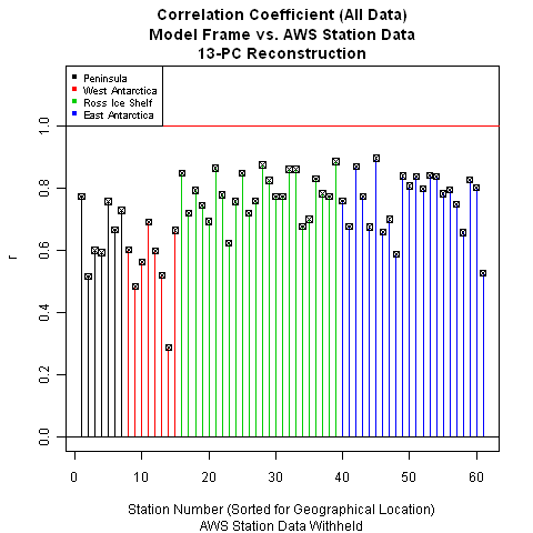
This is the purpose of the restricted reconstruction, where we withhold all AWS data. We then compare the reconstruction values against the actual AWS data. If our method resulted in overfitting (or is simply a poor method), our verification performance will be correspondingly poor.
Since Steig did not use AWS stations for performing his TIR reconstruction, this allows us to do an apples-to-apples comparison between the two methods. We can use the AWS stations as a verification target for both reconstructions. We can then compare which reconstruction results in better performance from the standpoint of being able to predict the actual AWS data. This is nice because it prevents us from later being accused of holding the reconstructions to different standards.
Note that since all of the AWS data was withheld, RE is undefined. RE uses the calibration period mean, and there is no calibration period for the AWS stations because we did the reconstruction without including any AWS data. We could run a split test like we did with the satellite data, but that would require additional calculations and is an easier test to pass regardless. Besides, the reason we have to run a split test with the satellite data is that we cannot withhold all of the satellite data and still be able to do the reconstruction. With the AWS stations, however, we are not subject to the same restriction.
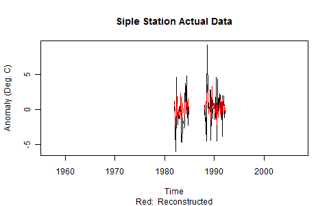
With that, I think we can safely put to bed the possibility that our calibration performance was due to overfitting. The verification performance is quite good, with the exception of one station in West Antarctica (Siple). Some of you may be curious about Siple, so I decided to plot both the original data and the reconstructed data. The problem with Siple is clearly the short record length and strange temperature swings (in excess of 10 degrees), which may indicate problems with the measurements:
While we should still be curious about Siple, we also would not be unjustified in considering it an outlier given the performance of our reconstruction at the remainder of the station locations.
Leaving Siple for the moment, let's take a look at how Steig's reconstruction performs.
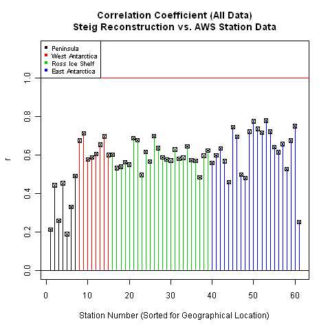
Not too bad - but not as good as ours. Curiously, Siple does not look like an outlier in Steig's reconstruction. In its place, however, seems to be the entire Peninsula. Overall, the correlation coefficients for the Steig reconstruction are poorer than ours. This allows us to conclude that our reconstruction more accurately calculated the temperature in the locations where we withheld real data.
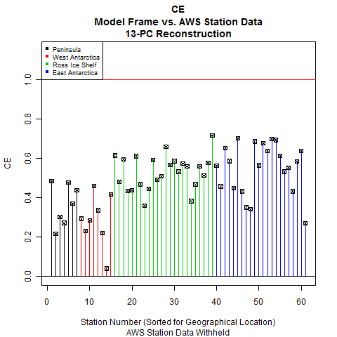
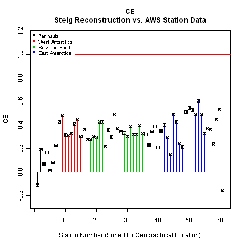
Along with correlation coefficient, the other statistic we need to look at is CE. Of the three statistics used by Steig - r, RE, and CE - CE is the most difficult statistic to pass. This is another reason why we are not concerned about lack of RE in this case: RE is an easier test to pass.
The difference in performance between the two reconstructions is more apparent in the CE statistic. Steig's reconstruction demonstrates negligible skill in the Peninsula, while our skill in the Peninsula is much higher. With the exception of Siple, our West Antarctic stations perform comparably. For the rest of the continent, our CE statistics are significantly higher than Steig's - and we have no negative CE values.
So in a test of which method best reproduces withheld ground station data, our reconstruction shows significantly more skill than Steig's.
The final set of statistics we will look at is the performance of RegEM. This is important because it will show us how faithful RegEM was to the original data. Steig did not perform any verification similar to this because PTTLS does not return the model frame. Unlike PTTLS, however, our version of RegEM (IPCA) does return the model frame. Since the model frame is accessible, it is incumbent upon us to look at it.
Note: In order to have a comparison, we will run a Steig-type reconstruction using RegEM IPCA.
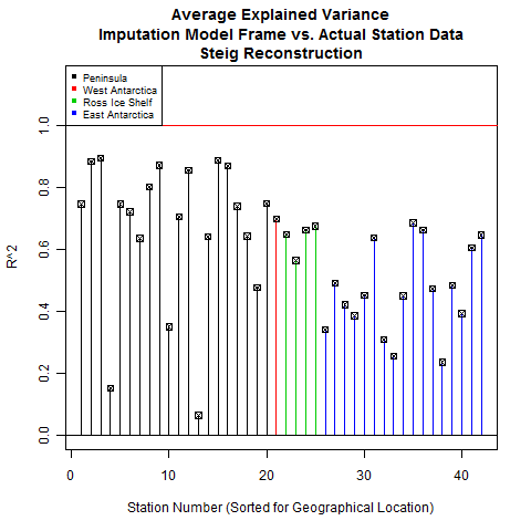
There are two key statistics for this: r and R^2. R^2 is called "average explained variance". It is a similar statistic to RE and CE with the difference being that the original data comes from the calibration period instead of the verification period. In the case of RegEM, all of the original data is technically "calibration period", which is why we do not calculate RE and CE. Those are verification period statistics.
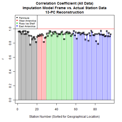
Let's look at how RegEM IPCA performed for our reconstruction vs. Steig's.
As you can see, RegEM performed quite faithfully with respect to the original data. This is a double-edged sword; if RegEM performs too faithfully, you end up with overfitting problems. However, we already checked for overfitting using our restricted reconstruction (with the AWS stations as the verification target).
While we had used regpar settings of 9 (main reconstruction) and 6 (restricted reconstruction), Steig only used a regpar setting of 3. This leads us to question whether that setting was sufficient for RegEM to be able to faithfully represent the original data. The only way to tell is to look, and the next frame shows us that Steig's performance was significantly less than ours.
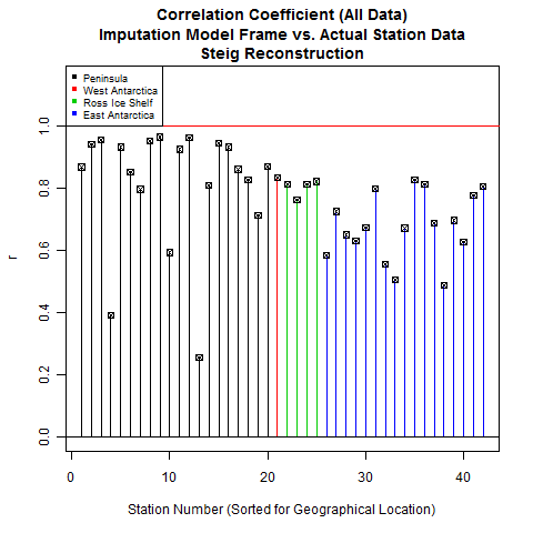
The performance using a regpar setting of 3 is noticeably worse, especially in East Antarctica. This would indicate that a setting of 3 does not provide enough degrees of freedom for the imputation to accurately represent the existing data. And if the imputation cannot accurately represent the existing data, then its representation of missing data is correspondingly suspect.
Another point I would like to note is the heavy weighting of Peninsula and open-ocean stations. Steig's reconstruction relied on a total of 5 stations in West Antarctica, 4 of which are located on the eastern and southern edges of the continent at the Ross Ice Shelf. The resolution of West Antarctic trends based on the ground stations alone is rather poor.
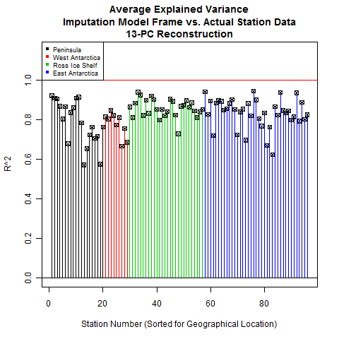
Now that we've looked at correlation coefficients, let's look at a more stringent statistic: average explained variance, or R^2.
Using a regpar setting of 9 also provides good R^2 statistics. The Peninsula is still a bit wanting. I checked the R^2 for the 21-PC reconstruction and the numbers were nearly identical. Without increasing the regpar setting and running the risk of overfitting, this seems to be about the limit of the imputation accuracy.
Steig's reconstruction, on the other hand, shows some fairly low values for R^2. The Peninsula is an odd mix of high and low values, West Antarctica and Ross are middling, while East Antarctica is poor overall. This fits with the qualitative observation that the Steig method seemed to spread the Peninsula warming all over the continent, including into East Antarctica - which by most other accounts is cooling slightly, not warming.
Conclusion
With the exception of the RegEM verification, all of the verification statistics listed above were performed exactly (split reconstruction) or analogously (restricted 15 predictor reconstruction) by Steig in the Nature paper. In all cases, our reconstruction shows significantly more skill than the Steig reconstruction. So if these are the metrics by which we are to judge this type of reconstruction, ours is objectively superior.
As before, I would qualify this by saying that not all of the errors and uncertainties have been quantified yet, so I'm not comfortable putting a ton of stock into any of these reconstructions. However, I am perfectly comfortable saying that Steig's reconstruction is not a faithful representation of Antarctic temperatures over the past 50 years and that ours is closer to the mark.
Note On The Script
If you want to duplicate all of the figures above, I would recommend letting the entire script run. Be patient; it takes about 20 minutes. While this may seem long, remember that it is performing 11 different reconstructions and calculating a metric butt-ton of verification statistics.
There is a plotting section at the end that has examples of all of the above plots (to make it easier for you to understand how the custom plotting functions work) and it also contains indices and explanations for the reconstructions, variables, and statistics. As always, though, if you have any questions or find a feature that doesn't work, let me know and I'll do my best to help.
Lastly, once you get comfortable with the script, you can probably avoid running all the reconstructions. They take up a lot of memory, and if you let all of them run, you'll have enough room for maybe 2 or 3 more before R refuses to comply. So if you want to play around with the different RegEM variants, numbers of included PCs, and regpar settings, I would recommend getting comfortable with the script and then loading up just the functions. That will give you plenty of memory for 15 or so reconstructions.
As a bonus, I included the reconstruction that takes the output of our reconstruction, uses it for input to the Steig method, and spits out this result:
The name for the list containing all the information and trends is "r.3.test".
- - - - - - - - - - - - - - - - - - - - - -
Code is here Recon.R



Reader Comments
to our Newsletter