Most often on this forum we have looked at either surface temperature data from surface observations or lower tropospheric temperature data derived from satellite sounders. Today I'd like to point out a short scale trend in global radiosonde data showing cooling in the last year, as well as examine the record back to 1958.

|
| ©Hadley Center |
The HadAT2 dataset from the Hadley Climate Center takes in balloon radiosonde measurements taken twice daily from hundreds of points around the globe and compiles it. Here is how they describe it:
HadAT consists of temperature anomaly timeseries on 9 standard reporting pressure levels (850hPa to 30hPa). The data is also available as equivalent measures to the broad MSU satellite weighting functions. The gridded product is derived from 676 individual radiosonde stations with long-term records. Because of the criteria of data longevity the resulting dataset is limited to land areas and primarily Northern Hemisphere locations. Radiosondes are single launch instruments and there have been many changes in instruments and observing practices with time. HadAT has used a neighbour-based approach to attempt to adjust for these effects and produce a homogeneous product suitable for climate applications.They also go on to add a cautionary note about data uncertainty:
It is important to note that significant uncertainty exists in radiosonde datasets reflecting the large number of choices available to researchers in their construction and the many heterogeneities in the data.And they go on to suggest alternate data sets for "robustness". For now, we'll just stick to HadAT2, but if readers want to do comparisons against the other datasets I'll post results here. Just visit the HadAT2 page for links.
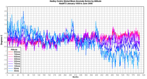
Here is the plot of all the pressure altitude levels of temperature data since 1958:

|
| ©Hadley Center |
The source data set in ASCII text is available here
In the graph above, the warmer (redder) colors represent lower tropospheric data closer to the surface (850mb for example) while the cooler blues (cyans) are the high altitude data (100, 50, and 30mb). You can see in the 850mb data, the familiar signature of the 1998 Super El Nino that raised temperatures globally.
You can also see the slow upward trend in temperature in the lower troposphere data since 1958, about 0.6°C.
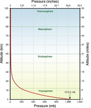
To give laymen readers an idea of the vertical scope of the plot above, here is a graphic showing pressure versus atmospheric altitude.

|
| ©PhysicalGeography.net |
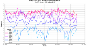
Now what is interesting is when we zoom the data plotted above down to a five year level, as shown in the graph below.

|
| ©Hadley Center |
Note that while preceding years have been relatively flat for trend, during the last 12-18 months, there has been a noticeable downward trend in all atmospheric levels except 50mb and 30mb, while 100mb appears to remain flat. The 50mb and 30mb levels don't appear to have much of a positive trend in the last 12-18 months that differentiate it from the last 5 years.
For those who will immediately jump on the standard gripe of "cherry picking" let me say that I'm only using the zoomed 5 year time period above to better visually illustrate the change in the last 12-18 months. As I mentioned above, the overall long term trend since 1958 in the lower troposphere is still positive.
But whatever has happened globally in the last 12-18 months, the temperature downturn we see makes for interesting discussion.


Reader Comments
to our Newsletter