© Peter Vanderwarker/President and Fellows of Harvard College
"Color has always been there," says Narayan Khandekar. "It's fundamental to how we are as people." Reds, browns and oranges from earthy ochre minerals and black from charcoal appeared on rocks, shells and cave walls as dawn broke on humanity's
artistic temperament.
Later came pigments and dyes derived from plants and animals, and a love affair with owning and mastering colour - in art, clothing and other possessions - that continues to this day.
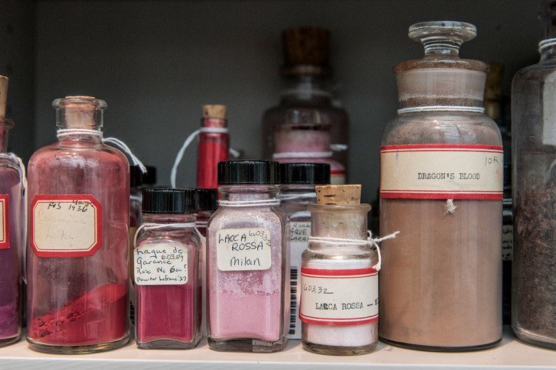
That long-term relationship is documented by the Forbes Pigment Collection. Curated by Khandekar, it contains some 3000 pigments, housed mainly at Harvard University's Fogg Art Museum. Together with its
associated database, it is a unique reference work spanning 5000 years of human history.
The collection was established partly as an attempt to detect cheap imitations of Old Masters, but today it is mainly used by art historians studying the creation of those paintings. Experts can compare the composition of pigments and binding media with reference spectra in the library to understand how a painting was made, and how the depredations of time might have changed the original intention. "It's as close as talking to an artist from 500 years ago as you'll get," says Khandekar.
But even before being used to colour a work of art or other artefact, many pigments have come a long way. Each tells a story of light and shade.
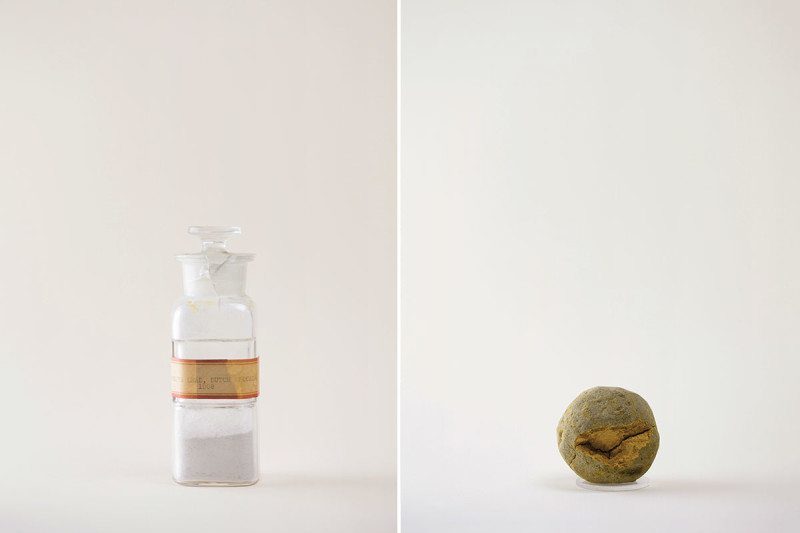
© Pascale GeorgievLead white, Dutch process (left); Raw Indian yellow (right)
The Forbes Collection began with a case of new money for Old Masters. In the 1920s, Edward Forbes, art historian and director of the Fogg Art Museum, was travelling Europe seeking to buy the very finest Old World art for his students to study. All too often, the pigments in the paintings that dealers offered him gave them away as second-rate.
Take white. The warmest hue is lead white, whose subtle red-yellow undertones have suffused European oil paintings since the Renaissance. In the Dutch process, fermenting materials such as tan bark or dung were used to heat vinegar, which then leached the pigment from lead carbonate. In the early 20th century, chemists developed a poorer, if safer, substitute: titanium white, made from the mineral titanium dioxide. Its almost bluish undertones make for strong and stark, but also rather sterile, colour.
By collecting these and thousands more colour samples, Forbes rapidly amassed a reference library, allowing him to distinguish genuine Old Masters from cheap fakes.
Raw Indian yellowIndian yellow, which fluoresces vividly in sunlight, is made of magnesium euxanthate. It's a very different sort of yellow from those frequently used in Western painting - they, like traditional whites, have a leaden glow. Lead-tin yellow, an oxide of lead and tin, was used in medieval frescoes and by Renaissance painters such as Titian and Raphael. Later, Naples yellow, or lead antimonate, found favour. More recently, lead chromate, or chrome yellow, lent US school buses their distinctive hue.
No longer commercially available, Indian yellow was supposedly extracted from the boiled urine of emaciated cows fed exclusively on poisonous mango leaves. A
recent chemical analysis seems to support this idea, indicating the presence of both plant and animal metabolites in the pigment.
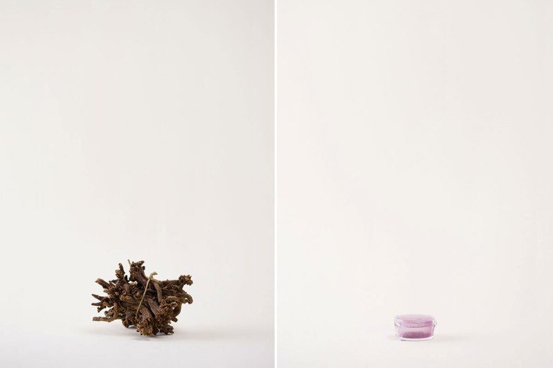
© Pascale GeorgievMadder root (left), Tyrian purple (right)
The Latin name of the common madder plant says it all:
Rubia tinctorum, or dyers' red. While there is little evidence of its use in painting, its crushed roots were used in India and the Middle East possibly as early as the 3rd millennium BC to imbue leather, cotton and wool with rich red hues.
Archaeological evidence from southern Israel shows that by 1000 BC it was being used as part of a complex process involving the use of chemicals called mordants to fix the dyes into fabrics for long-lasting colour.
In 1868, the organic compound responsible for madder's dyeing properties, alizarin, became the first natural pigment to be made synthetically when German chemists working for the company BASF derived it from coal tar. Around this time, the art of colouring began to move away from its roots and towards the dependence on hydrocarbon-derived pigments that marks our modern age.
Tyrian purplePurple is the colour of empresses and kings - an association with luxury that begins in an association with snails.
Sea snails of the family Muricidae, found in the eastern Mediterranean, use their bromide-containing secretions to sedate prey and defend against predators. In the 2nd millennium BC, people in the Phoenician city of Tyre, in modern-day Lebanon, extracted the dye by "milking" live snails or by crushing them. Either way, 10,000 or more were needed to make a single gram of dye, making it at times more valuable than gold. Cleopatra was a fan, as were later emperors of Rome.
Serendipity lost purple its exclusivity. In 1856, the British chemist William Henry Perkin was trying to synthesise quinine when he stumbled across a purple-hued dye. After some indecision he named it mauveine, after the French for the violet mallow flower.
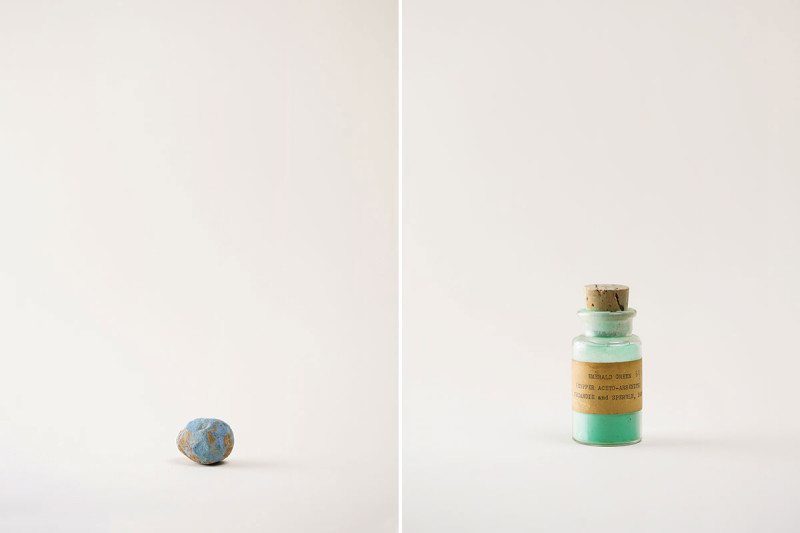
© Pascale GeorgievEgyptian blue (left), Paris green (right)
The pigment surrounding the eyes of the pharaoh Tutankhamun's death mask is not any old blue. Natural blues are
rare, and King Tut got the most prized of all: lapis lazuli, at that time derived from just a few mines in one distant corner of the known world. Those mines, in the north of present-day Afghanistan, have been exploited since the 7th millennium BC and remain the primary source of the pigment.
The Egyptians seem to have been casting around for an alternative 4000 or more years ago. Egyptian blue (pictured) is one of those. How exactly they made it is a mystery, but it probably involved heating sand, lime, sodium-containing compounds and copper derived from a mineral such as malachite to 800 or 900°C. A similar formula
was found in the 19th century by the British chemist Humphry Davy, by analysing blues he scraped off the walls of the 1st-century baths of Titus in Rome.
Paris green Paris green is chemically known as copper acetoarsenite. Together with Scheele's green, or acidic copper arsenite, it was perhaps the most favoured of a series of arsenic-containing compounds used to dye paints, wallpapers and fabrics in 19th-century salons.
The designer William Morris was
a fan. A shareholder in his father's arsenic mining company, he repeatedly dismissed concerns about the pigments' toxicity. "As to the arsenic scare, a greater folly is hardly possible to imagine," he wrote in 1885. Napoleon Bonaparte was supposedly a victim, slowly poisoned by the surrounding furnishings in his final exile in St Helena - although
an analysis in 1982 concluded that the amount of arsenic present, while enough to cause illness, would have to have been supplemented by direct administration to be fatal.
Green has often proved a strangely toxic colour. Another sample in the Forbes collection, from 1942, is asbestine - a pigment obtained by grinding waste asbestos.
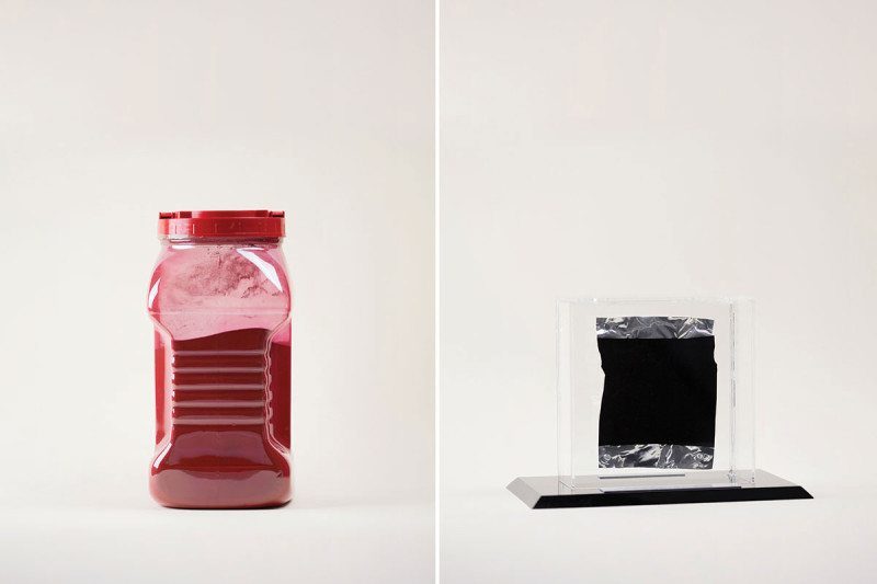
© Pascale GeorgievPigment red 49:2 (left), Vantablack 2.0 (right)
Few artists were so entirely about colour as Mark Rothko. In his later years, he filled broad swathes of canvas with solid colours.
By the 1950s, synthetic chemistry had provided a broad palette of pigments beyond the animal, vegetable and mineral-based options that had been used for millennia. Murals that Rothko painted for an administrative block at Harvard in the early 1960s took advantage of chemistry's rich offerings. They used a pigment called red 49:2 or calcium salt of lithol red.
Pigment red 49:2 was more commonly employed as a low-cost ink in the printing industry. As a paint it was less successful: it was highly "fugitive", fading dramatically on prolonged exposure to light. The murals were removed in 1979, and were only returned to public display at the Harvard Art Museums in 2014. Their original hues were
restored by projecting light of the right colour on to them, leading to
questions about how much the works on display truly were Rothko's.
Vantablack 2.0A trickle of new pigments enters the Forbes collection every year, mostly from the labs of organic chemists.
Vantablack is something different - a black so black it flattens reality. Developed by the UK-based company Surrey Nanosystems, it is made of a forest of evenly spaced carbon nanotubes that bounce photons of light between them, eventually absorbing 99.96 per cent. This removes the subtle differences in the scattering of light that give us a perception of depth (see video, below). Even a crinkled foil covered with this shadiest of shades looks pancake-flat (as in the photo above).
Vantablack was at the centre of an
art controversy in 2014 when Surrey Nanosystems gave the sculptor Anish Kapoor exclusive rights to use the shade in his works. In retaliation artist Stuart Semple released a
pinkest pink available to all bar Kapoor - a shade also featured in the Forbes collection.
Richard Webb is features editor for New Scientist. Pascale Georgiev is a photographer based in London. An Atlas of Rare & Familiar Colour,
which celebrates the Forbes Pigment Collection, is published by Atelier Editions
International Klein Blue...[Link]