When trying to understand the impact of increased testing on case numbers we look to the percentage of tests reported as positive. In a similar way, it is important to double check other data points against each other, as percentages, to truly understand how the epidemic is progressing. Using this approach, it appears that we are over-counting deaths because there are not enough severely sick people from Covid to account for them. In other words, there are proportionately more Covid deaths per case and per hospital admission since the Summer. This paper explains this phenomenon and calls for proper scientific cross-checking to be instituted before a Covid outbreak is declared.
Contradictions in the data
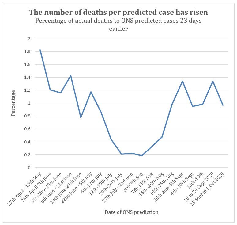
The ONS carry out random testing of the population to estimate how many people have Covid in the UK each week. A sample of people are randomly tested and then modelling is used to predict what proportion of the population test positive at that time. This estimate includes all 'asymptomatic cases' so should be higher than the number that eventually come forward with symptoms and are diagnosed as true positive cases. (Whether asymptomatic cases can be considered 'true' infections is a separate matter entirely, which will not be discussed here.)
Covid data form a predictable relationship with respect to one another
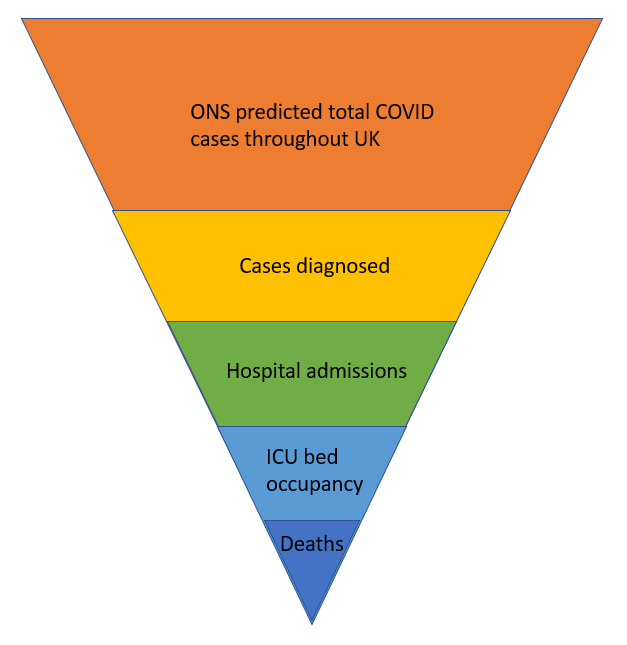
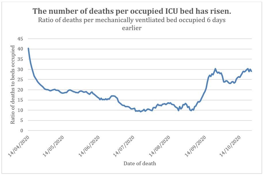
More recently, however, deaths have been increasing out of proportion to the total officially diagnosed cases and of total Covid patients in hospital. Crucially for this paper, the number of severe cases, as measured by hospital admissions and ICU occupancy continue to fall as a proportion of all cases diagnosed. Together this evidence points to a paradox developing since September: more people are dying of Covid than appear to be seriously ill with Covid. So, we have a contradiction. More deaths should be preceded by more ITU admissions and more hospital admissions but we are not seeing a proportionate rise in severe cases to account for the increasing deaths, currently being labelled as Covid.
What is going on?
The only conclusion that can reconcile these contradictory numbers is that our measurements are wrong. If the trend in severe cases leading to death before August had been used to predict Autumn deaths from Autumn severe cases, deaths would have been seriously underestimated. Likewise, if the trend before August in the number of cases (or predicted cases) had been used to predict Autumn severe cases these would have been seriously overestimated. If the number of Autumn deaths is used to reverse engineer the number of severe cases that should have preceded them, we would predict much higher numbers of hospital admissions than we have seen. In essence, each of these data points have lost their historic relationship with each other.
Evidence of the contradictory data
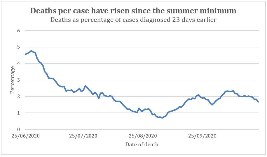
When testing first started only the very sick were tested because of a shortage of tests. As testing increased the number of less severe cases being diagnosed increased. Therefore, having diagnosed all these less severe cases we should expect the percentage of deaths out of diagnosed cases to have fallen over time as testing has inexorably increased. The percentage of deaths, allowing for a 23 day lag, out of diagnosed cases indeed fell from Spring to Summer and reached a minimum in August. However, in September the percentage of deaths from diagnosed cases doubled, climbing back to July levels (Figure 2). Allowing for a different lag before death does not change this shift in percentages. On 22nd July there were 800 new cases officially diagnosed and 23 days later 12 deaths; on 22nd September there were 8 times as many cases officially diagnosed: 6413, to be precise, and 23 days later there were 133 deaths, 11 times as many as July.
What do the other data points suggest?
Let us turn to look closer at cases. If, for an unknown reason, Covid were actually becoming more deadly, then the proportion of severe cases that are being diagnosed ought to have increased recently too. The graph of the exponentially increasing curve of genuine cases in the Spring is familiar to us all. Sadly, those cases resulted in thousands of deaths. The early figures were distorted by lack of testing except for the most severe cases. Later figures give us a rough benchmark for the proportion with severe symptoms and the proportion of fatalities.
The official explanation for deviations in the figures from Spring to Summer is that, with increased testing, we are now diagnosing many more mild cases, as well as a significant number being asymptomatic, in addition to moderate and severe cases and that this gives us a truer picture of disease prevalence. Essentially, more accurate figures helped us to realise that Covid is substantially less deadly than originally feared. This is very common with new viruses.
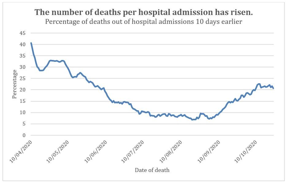
The number needing hospital admission as a proportion of total diagnosed cases has indeed fallen since the Spring (figure 6). Similarly, the number of people using ICU as a proportion of diagnosed cases fell dramatically since the Spring (figure 7).
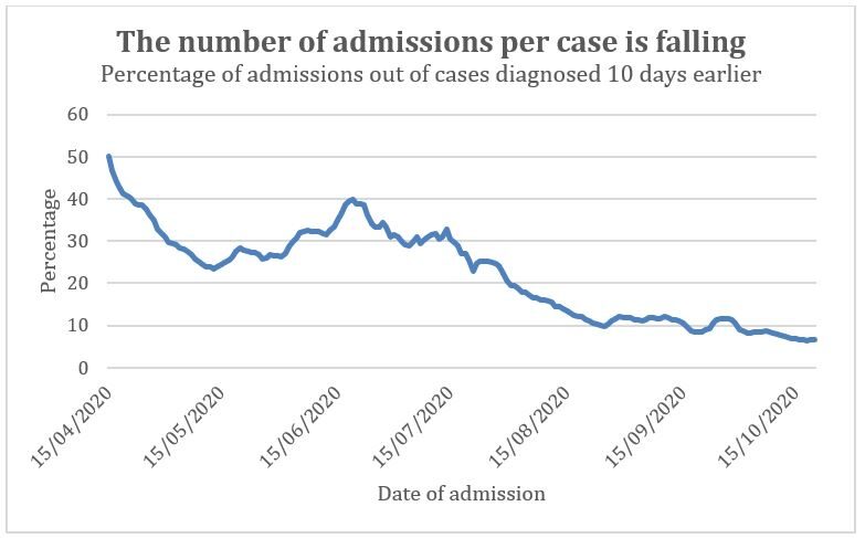
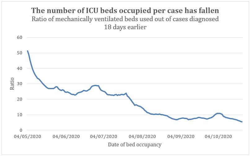
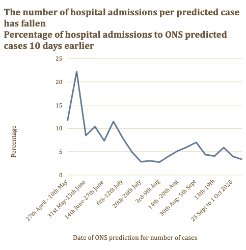
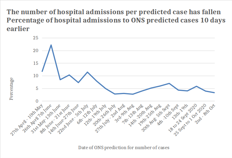
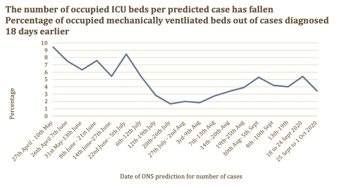
If there are fewer severe cases in hospital but there are more deaths ascribed to Covid then perhaps more people are dying at home of Covid without ever getting to hospital. Covid can kill through clotting malfunction which could cause sudden death outside of hospital. Half of Covid deaths were outside of hospital in Spring (figure 11). However, since September 80% of Covid deaths have been hospital deaths. So, the increasing deaths are increases in hospital deaths. If more patients are dying of Covid in hospital, then there should be more hospital admissions and ITU admissions. This confirms that the paradox of the contradictory data cannot be explained by other factors. It is therefore even harder to reconcile the decreasing proportion of hospital admissions and ICU bed occupancy with the increasing proportion of deaths without accepting that the measurements are wrong.
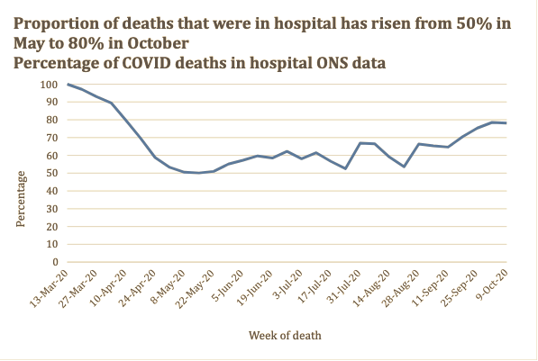
If Summer deaths were because of misdiagnosing Covid in the general hospital population then the mortality rate in hospitals would have been lower in the Summer and matched that of the background general mortality rate. This is indeed what the data suggests. If genuine epidemic or even endemic spread of Covid has now returned, the mortality rate would now start to rise again because the recent cases would be genuine and the Covid death rate after being admitted to hospital is noticeably higher than the background mortality rate of hospital admissions. However, if Covid is genuinely rising, we would also expect the numbers with severe disease to increase in proportion. But, as we have shown, the proportion with severe symptoms of the disease has fallen. So the inconsistent data cannot be explained by earlier misdiagnoses and genuine Covid returning.
The contradictions in the data have no biological explanation, especially the absence of the number of severe cases which would then explain the current increasing death rates ascribed to Covid. Recall that any positive test, even after multiple previous negative tests, is treated not only as a definitive diagnosis but also as the cause of death in the event of a fatality within 28 days for the purposes of national statistics gathering. The only explanation for the significant divergence between the lack of severe cases and a rising death count is that the official statistics are relying on erroneous data.
The lower rate of increase in severe cases, hospital admissions and ICU ventilator bed occupancy compared with deaths strongly suggests that the general epidemic is over and any alleged local outbreaks are arguably false positive local 'pseudo-epidemics'. That is not a term I have coined. It is a term I was taught in the 1990s at medical school. Behind the concept is a world of scientific literature.
A pseudo-epidemic occurs when there is apparent epidemic spread of an infectious disease but the effect is a mirage due to false positive test results. There are numerous real-world examples that could be given of false positive pseudo-epidemics but the one that Gina Kolata wrote about in the New York Times is the most pertinent. An epidemic of whooping cough was diagnosed in 2006 in a hospital in New Hampshire. To control it, testing was ramped up for symptomatic patients and staff. To cut a long story short, the test used was the same type of test, PCR, used for Covid testing and believed to have a similar low risk of false positives. After the index case tested positive, more and more people were tested and the number of positive cases revealed increased rapidly over time. After testing 1000 people 14% of the tests were positive. Finally, confirmatory testing was carried out and not a single positive bacterial culture confirmed whooping cough. It transpired that the symptoms had all been common colds. In retrospect they could see they had placed far too much faith in the PCR test used in that situation which is analogous to the one being used for Covid. There are of course significant differences, the most obvious being whooping cough is a bacterial not viral infection.
Comment: For an easy-to-understand explanation of false positives - and why knowing the actual incidence of a disease is critical in order to know the percentage of actual positives - see this: Could most positive COVID-19 tests be wrong?
The only way to rule out false positive localised pseudo-epidemics is to use confirmatory testing and full diagnostic cross-checking. Data from current mass testing on its own is not sufficient grounds for significant and life-changing policy decisions by the Government, even in conjunction with local political leaders. This is even more true where there is serious local opposition to severe measures. Where a localised pseudo-epidemic occurs, the general picture from the data, taken on its own, will look like a real epidemic, hence the label 'pseudo-epidemic'. However, clues can be spotted in the data that will reveal the true underlying cause is false positive testing not a real epidemic.
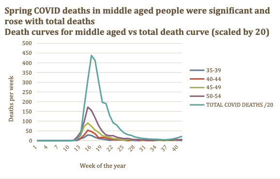
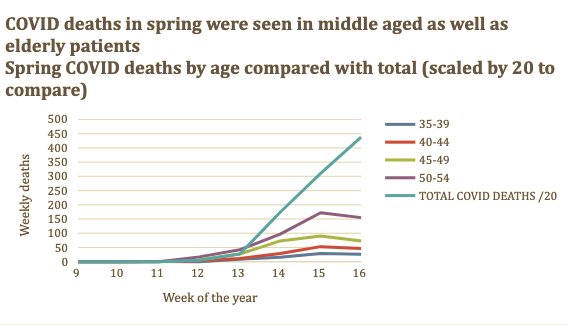
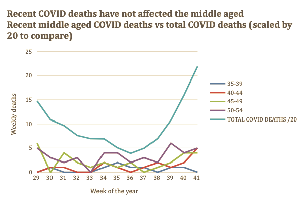
Any genuine Covid cases are not currently distinguishable from false positives because of the vast numbers of the latter. There is further evidence that also suggests erroneous data currently, specifically the different characteristics of the patients diagnosed and dying now compared with the Summer. In Spring 60% of cases were in the over 60s whereas in the last two weeks two thirds of diagnoses were in patients under 30. In Spring, some young and middle-aged people died with the rise in deaths in all age groups being simultaneous. Currently, alleged Covid deaths are almost entirely seen in over 55 year olds (figure 12). Covid deaths in Spring were disproportionately seen in men with only 40% in women. The sex ratio for total deaths returned to normal in mid-June it has risen slightly since then but this can be attributed to normal seasonal variation.
Finally, although there are deaths labelled as Covid, the total numbers of deaths since May has been below the five year average. Two weeks after peak deaths, the majority of patients diagnosed with Covid did not actually have an acute Covid infection in one London Trust. Respiratory emergency admissions are below normal for the time of year.
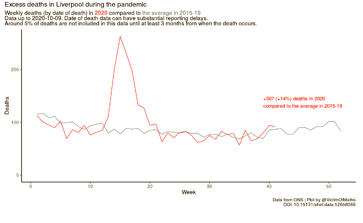
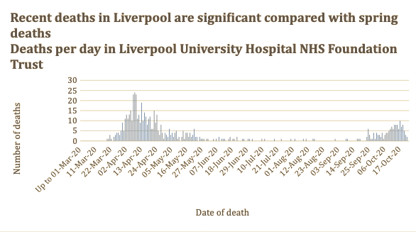
The number of total deaths per week nationwide is around 10,000 per week so a few hundred Covid deaths may not impact significantly on excess deaths. However, Liverpool is currently the worst affected region for Covid deaths. Liverpool University Hospital NHS Foundation Trust has had 140 Covid deaths since the start of September which is 27% of all Covid deaths ever seen in that hospital. The different impact of the first wave and second wave in Liverpool on excess deaths is clear (figure 13). The idea there is currently an out of control pandemic on the scale that we saw in the Spring is untenable.
Covid deaths in Spring resulted in marked excess deaths in Liverpool but deaths in the last two months are not excess deaths
The laboratories have been under huge pressure to increase throughput whilst also increasing turnaround times. Any pathologist would predict a rise in errors in such a scenario, despite the best efforts of the technicians acting in complete good faith. The type of testing carried out for Covid can quite easily produce false positive results without exceptionally high levels of cleanliness to prevent cross contamination with frequent replacement of protective clothing and frequent cleaning of every area of the laboratory from bench to fridge handles. Any rise in errors causing increased false positives would inevitably lead to the mistaken belief that cases were on the rise. By May testing had increased substantially and we were testing 50,000 samples a day. Since then testing has increased fourfold. Given laboratories had to hire staff previously untrained in laboratory work to keep up with the caseload, this could also have led to many more errors, as detailed by The Independent.
In my professional view as a clinical pathologist, it is possible that geographical distribution of the apparent spread of Covid was in fact a mirage created by testing being focused in certain areas put under pressure by circumstances. Any rise in cases resulted in increased testing. And so, a vicious cycle was created. This cycle has been exacerbated recently because policy has changed so that now quality control checks are removed once a certain percentage of positive tests is reached. Local lockdowns come with intensive testing for that area. This would explain why local lockdowns led to increased case numbers. Kafka rears his head once more.
There is a general assumption that the false positive rate can be calculated and assumed to be constant. Comparing results from different tests alongside each other only tells you the false positive rate due to the test kits. False positives can be caused by mistaken diagnosis of other viruses; human DNA; contamination of the sample with viral RNA that is not causing disease as well as from laboratory errors. The error rate of the test kit rate is usually the least of our problems. Laboratory error rates vary day to day and a laboratory under increasing pressure is likely to have an increasing error rate. False positive rates can even be seasonal where there is another seasonal virus that cross-reacts in the testing resulting in a misdiagnosis. The crucial point is the idea that the false positive rate must be a constant is a myth in the real world.
Once false positive diagnoses are removed from the data the scale of any real Covid outbreak will be revealed. Fewer deaths will be attributed to Covid but the dilutional effect of false positives leading to lower infection fatality rates will also be shown to be wrong. Covid had a high mortality rate when spreading as an epidemic.
Matt Hancock has hoped that more testing would be the solution to every Covid problem. We are now embarked on 'Moonshot' plans to test us all daily at a cost of £114 billion (the same as the costs for the whole of the rest of the NHS). SAGE estimate that Moonshot will mean 41% of us having to self-isolate every six months and 2 million of us under house arrest at any one time if we reduce self-isolation to 10 days. Matt Hancock needs to urgently understand that testing is not a panacea and carries with it a suite of problems when done at this scale and under such pressure.
Mathematical models that assume every rise will be an exponential one without any real 'sense check' must be abandoned. The Government must acknowledge that those carrying out the modelling may be erring on the side of caution when evaluating the evidence presented to them. They must also ensure that real world data is given more weight than mathematical models especially when the two are in brazen conflict. A model is only as good as the data put into it.
Modelling has its place but also has severe limitations when too much reliance is placed on many dubious assumptions and seemingly authoritative outputs with lots of zeros. What is needed is a much more careful approach to diagnosis. Loss of sense of smell or characteristic 'ground glass' findings on chest CT scans should be used as a gateway to testing. Any patient testing positive should have a second positive confirmatory test before an official diagnosis is made. Although this approach is less sensitive it would still have sufficient sensitivity to detect a genuine outbreak and prevent spread. The current approach to testing has become the problem it was designed to stop.
The doctors in New Hampshire fully believed they were diagnosing whooping cough. Adjusting to the reality that they had a false positive pseudo-epidemic was not easy. Doctors treating patients in respiratory failure who have a positive Covid test will believe that their patient has Covid. Only confirmatory testing paired with strict criteria for official diagnosis will be enough to dissuade them. Much work is being done by many thousands of people in absolute good faith. Unfortunately, public policy has boxed itself in, such that decision makers are relying too much on dry models and measures of questionable effectiveness such as lockdowns and masks. There is a solution: wet science. This means cross-checking and repeat testing of all alleged positive cases before an official diagnosis is made. Cases can be correctly identified, true outbreaks can be monitored, and knowing who true Covid patients are will allow better treatment for them, as well as for future patients.


A decade ago, I had an MD complain to me that he could not practice medicine if I would not go get the requisite tests. I soon left his "care" as I was not interested in a doctor who "practiced" medicine. I wanted a doctor who engaged in health facilitation, and didn't "practice" at it either. I don't want medicine. I want prevention. But that means they would have to exercise their cognitive functions instead of relying on technology, and exert their analytical skills. And make a helluva lot less $$$.