If virologists were driving policy about COVID-19 rather than public health officials, we'd all be Sweden right now, which means life would effectively be back to normal. The only thing our lockdowns have done at this point is prolong the agony a little bit, and encouraged Governors to make up more useless rules. Sweden's health minister understood that the only chance to beat COVID-19 was to get the Swedish population to a Herd Immunity Threshold against COVID-19, and that's exactly what they have done, so let me start there.
The Herd Immunity Threshold ("HIT") for COVID-19 is between 10-20%
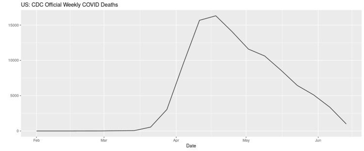
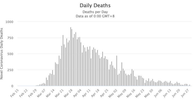
This fact gets less press than any other. Most people understand the basic concept of herd immunity and the math behind it. In the early days, some public health officials speculated that COVID-19's HIT was 70%. Obviously, the difference between a HIT of 70% and a HIT of 10-20% is dramatic, and the lower the HIT, the quicker a virus will burn out as it loses the ability to infect more people, which is exactly what COVID-19 is doing everywhere, including the U.S, which is why the death curve above looks the way it looks. Scientists from Oxford, Virginia Tech, and the Liverpool school of Tropical Medicine, all recently explained the HIT of COVID-19 in this paper:
We searched the literature for estimates of individual variation in propensity to acquire or transmit COVID-19 or other infectious diseases and overlaid the findings as vertical lines in Figure 3. Most CV estimates are comprised between 2 and 4, a range where naturally acquired immunity to SARS-CoV-2 may place populations over the herd immunity threshold once as few as 10-20% of its individuals are immune.Calculations from this study of data in Stockholm showed a HIT of 17%, and if you really love data check out this great essay by Brown Professor Dr. Andrew Bostom titled, COVID-19 'herd immunity' without vaccination? Teaching modern vaccine dogma old tricks. I'm going to share his summary with you, because it's so good:
Naturally acquired herd immunity to COVID-19 combined with earnest protection of the vulnerable elderly — especially nursing home and assisted living facility residents — is an eminently reasonable and practical alternative to the dubious panacea of mass compulsory vaccination against the virus. This strategy was successfully implemented in Malmo, Sweden, which had few COVID-19 deaths by assiduously protecting its elder care homes, while "schools remained open, residents carried on drinking in bars and cafes, and the doors of hairdressers and gyms were open throughout."One of the most vocal members of the scientific community discussing COVID-19's HIT is Stanford's Nobel-laureate Dr. Michael Levitt. Back on May 4, he gave this great interview to the Stanford Daily where he advocated for Sweden's approach of letting COVID-19 spread naturally through the community until you arrive at HIT. He stated:
Stanford's Nobel-laureate Dr. Michael Levitt
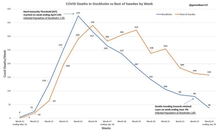
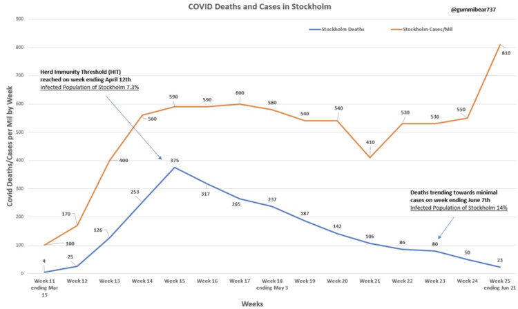
If Sweden stops at about 5,000 or 6,000 deaths, we will know that they've reached herd immunity, and we didn't need to do any kind of lockdown. My own feeling is that it will probably stop because of herd immunity. COVID is serious, it's at least a serious flu. But it's not going to destroy humanity as people thought.Guess what? That's exactly what happened. As of today, 7 weeks after his prediction, Sweden has 5,280 deaths. In this graph, you can see that deaths in Sweden PEAKED when the HIT was halfway to its peak (roughly 7.3%) and by the time the virus hit 14% it was nearly extinguished. (Shoutout to Gummi Bear on Twitter, a scientist who makes great graphs.)
How could Dr. Levitt have predicted the death range for Sweden so perfectly 7 weeks ago? Because he had a pretty solid idea of what the HIT would be. (If you'd like to further geek-out on HIT, check out: Why herd immunity to COVID-19 is reached much earlier than thought.) I absolutely LOVE Dr. Levitt (and as a Stanford alum, so proud he is a Stanford professor), watch this incredible video from just yesterday, go to 10:59 and just listen to this remarkable man!! Thrilled with his brand-new paper, released today, Predicting the Trajectory of Any COVID19 Epidemic From the Best Straight Line.
By the way, as a quick aside, and something else the press won't touch: COVID-19 is a coronavirus, and we have ALL been exposed to MANY coronaviruses during our lives on earth (like the common cold). Guess what? Scientists are now showing evidence that up to 81% of us can mount a strong response to COVID-19 without ever having been exposed to it before:
Cross-reactive SARS-CoV-2 T-cell epitopes revealed preexisting T-cell responses in 81% of unexposed individuals, and validation of similarity to common cold human coronaviruses provided a functional basis for postulated heterologous immunityThis alone could explain WHY the HIT is so much lower for COVID-19 than some scientists thought originally, when the number being talked about was closer to 70%. Many of us have always been immune! If that's not enough for you, a similar study from Sweden was just released and shows that "roughly twice as many people have developed T-cell immunity compared with those who we can detect antibodies in." (We kind of knew this from the data on the Diamond Princess when only 17% of the people on board tested positive, despite an ideal environment for mass spread, implying 83% of the people were somehow protected from the new virus.)
Quick Update: This article came out one day after I wrote mine, and validated everything I just said, except the author is wrong about COVID-19's HIT, it's 10-20%, not 60%, which is even better news:
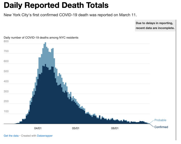
"However, it does provide a possible explanation for why the Covid-19 epidemic seems to have died away in many places once it had infected around 20 per cent of the local population (as judged by the presence of antibodies). If people are developing some kind of immunity to Covid-19 via their T cells then it could mean that a far higher percentage of the population has been exposed to Covid-19 than previously thought. Antibodies and T cells combined, it is conceivable that some places such as London or New York are already at or near the 60 per cent infection level required to achieve herd immunity."Back to death rates over time. We actually have our own Sweden here in the U.S. It's called New York City. In our case, we accidentally created a Sweden scenario, in that we took our medicine quickly, because: 1) New York locked down so late that they didn't flatten anything, 2) they have the highest population density in the U.S. in NYC, and 3) the public health officials and Governors there made the bone-headed decision to send COVID-positive nursing home residents back to their nursing home, accelerating deaths of the most vulnerable. What's their death curve look like today? In this case, I borrowed the graph from the NYC public health website:
Hmm...notice anything about the chart or its slope? The reason deaths from COVID-19 are dwindling down to nothing isn't because Governor Cuomo is a policy genius (in fact, he likely created more unnecessary deaths than any other Governor with the nursing home decision), it's because the virus — like every virus in the history of mankind — is running out of people to infect. The virus has a HIT of 10-20% and 70% of people are likely naturally immune. Hosts are in short supply! That's what viruses do, and wait until you see what New York's likely HIT is today.
We can get a crude, but helpful proxy for whether or not a state (or region) has achieved their own Herd Immunity Threshold if we know the following things: the size of the population, the number of deaths from COVID-19, and COVID-19's IFR, or Infection Fatality Rate. In my first blog post late last month, LOCKDOWN LUNACY: the thinking person's guide, I discussed Infection Fatality Rate in detail, so I am just going to give a very quick summary here. Stanford's Dr. John Ioannidis published a meta-analysis (because so many IFR studies have been done around the world in April and early May) where he analyzed TWELVE separate IFR studies and his conclusion lays out the likely IFR for COVID-19:
The infection fatality rate (IFR), the probability of dying for a person who is infected, is one of the most critical and most contested features of the coronavirus disease 2019 (COVID-19) pandemic. The expected total mortality burden of COVID-19 is directly related to the IFR. Moreover, justification for various non-pharmacological public health interventions depends crucially on the IFR. Some aggressive interventions that potentially induce also more pronounced collateral harms1 may be considered appropriate, if IFR is high. Conversely, the same measures may fall short of acceptable risk-benefit thresholds, if the IFR is low...Interestingly, despite their differences in design, execution, and analysis, most studies provide IFR point estimates that are within a relatively narrow range. Seven of the 12 inferred IFRs are in the range 0.07 to 0.20 (corrected IFR of 0.06 to 0.16) which are similar to IFR values of seasonal influenza. Three values are modestly higher (corrected IFR of 0.25-0.40 in Gangelt, Geneva, and Wuhan) and two are modestly lower than this range (corrected IFR of 0.02-0.03 in Kobe and Oise).The data on IFR has now been replicated so many times that our own Centers for Disease Control announced that their 'best estimate' showed an IFR below 0.3%. In this article on the CDC's new data, they also highlighted how the cascading declines in IFR has removed all the fears of doomsday:
That "best estimate" scenario also assumes that 35 percent of infections are asymptomatic, meaning the total number of infections is more than 50 percent larger than the number of symptomatic cases. It therefore implies that the IFR is between 0.2 percent and 0.3 percent. By contrast, the projections that the CDC made in March, which predicted that as many as 1.7 million Americans could die from COVID-19 without intervention, assumed an IFR of 0.8 percent. Around the same time, researchers at Imperial College produced a worst-case scenario in which 2.2 million Americans died, based on an IFR of 0.9 percent.In order to be as bullet-proof as possible, and because the IFR is an important part of the math I will do right now, I've decided to pick a simple and defensible number, the final number pegged by the CDC for COVID-19's IFR: 0.26% (As an aside, if we'd known this 3 months ago, no one in the public health world would have panicked. It's a bad flu, and the rates for younger people are dramatically below 0.26% and approaching zero for children.) Now that you understand COVID's IFR and the likely HIT, it's much easier to talk about the second wave, the data, and the implications.
Here's the deal:
Yes, certain states are having an uptick in three measurements: COVID-19 tests administered, positive COVID-19 tests, and hospitalizations. All three of these measurements are dubious. Hopefully, some of the rise in cases is REAL, because then the U.S. will arrive at Herd Immunity Threshold ("HIT"), which has been slightly delayed by lockdowns, sooner. Based on the "death curve" in the US, we are very close to being done.Take population, COVID Deaths, and IFR to find HIT
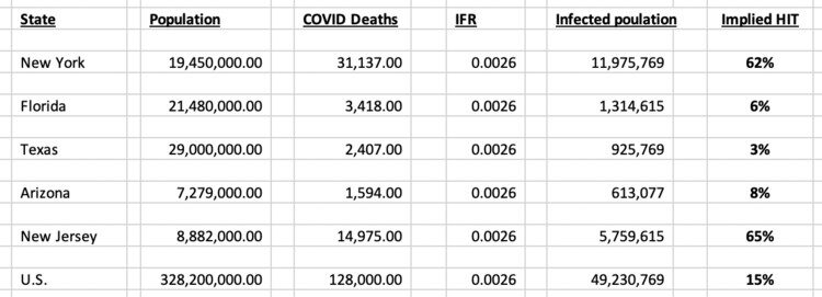
C'mon stay with me! This math is basic, junior high level stuff. And, it's going to give us the most important, but very crude, number we need to understand all this second wave nonsense: the approximate HIT already attained by state and by the United States. If you know how many people have died from COVID-19 in any one region, you can quickly calculate how many people have had COVID-19 in that same region. All you do is divide deaths by the IFR. Let's use NY as the example. As of today, there have been 31,137 deaths from COVID-19. Take 31,137/.0026, you get 11,975,969 people infected with COVID-19. Take those 11 million people divided by New York's population of 19.45 million, you get a HIT of...65%. (Data geek comment: New York's HIT is clearly OVER-stated, because total deaths drives HIT, and NY has a much higher rate of nursing home deaths due to bad policy.)
Huge disclaimer: This math is crude, but it's also directionally accurate, and the comparisons BETWEEN states helps explain what's going on. Importantly, the HIT required to snuff out the virus in any one region could be lower than Sweden's number of 17%, for a million reasons, most notably better medical knowledge today than a few months ago about how to keep a vulnerable person alive. Still, just look at this table I created using the math above:
Notice anything? New York is WELL PAST Herd Immunity Threshold (as is New Jersey), the southern states in the news are BELOW the implied HIT, while the U.S. overall is nearly there with 15%. This is why the death curve from the CDC (and NYC!) that I opened this blog post with looks the way it looks: we are basically done with the virus. Just like Sweden. Oh, and Italy:
Quick update: Mount Sinai doctors just released a study showing a seroprevalence study of a random sample of 5,000 New Yorkers, it states that "by the week ending April 19, the seroprevalence in the screening group reached 19.3%." If you take that 19.3% number, and consider what we just learned from Sweden — that half of people with immunity won't show it with this test — and then consider how many more people have been exposed since April 28, it's entirely plausible that NY is well past 40% or more people, which starts to look closer to the 65% number my math shows. Either way, let's just keep it simple: New York, and especially NYC, are WELL PAST HIT of 10-20%, which explains why their death curve looks the way it looks.
Florida details
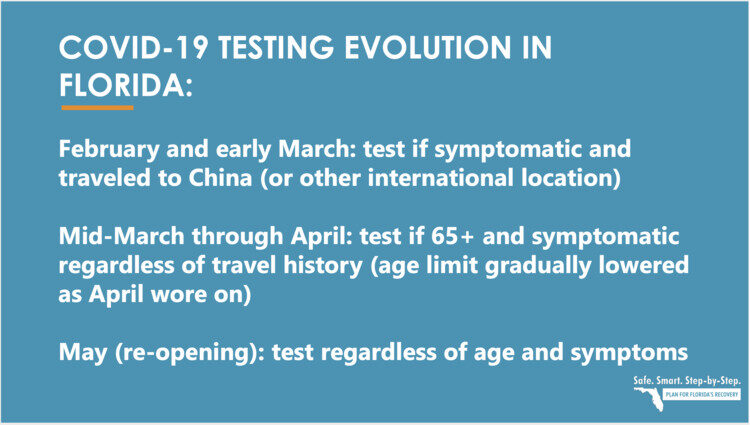
While HIT matters more than anything else in explaining the trajectory of the virus, and tells us that the U.S. is very close to being done with COVID-19, I wanted to take a closer look at one state, Florida, the current whipping boy of the press. They also have great data. No one seems to be listening to the Governor, the health department, or the hospitals in Florida, who all seem to be saying the same thing, which is basically that everything is fine. On June 20, Florida's department of health produced a presentation that explained how their testing had changed over time. Check out this slide:
So, as the state re-opened, they began to test everyone, "regardless of age and symptoms." What do you think would happen when they did that? Obviously, more positives. So, here's my first fact:
Fact #1: All of the "second wave" states have dramatically increased their testing. This alone causes cases to rise, and is the single biggest reason they have.
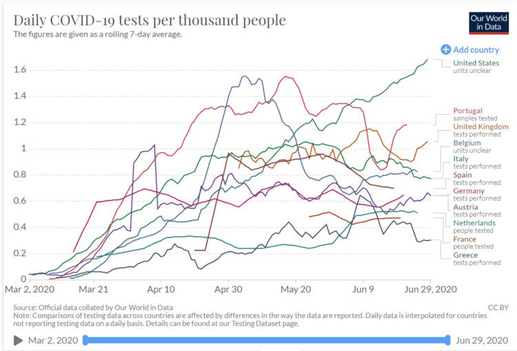
Still not convinced? Check out this eye-opener of a chart that shows per-capita testing in the U.S. versus other countries. Notice anything about June? Not only do we do MORE testing than any other country, but our testing spiked in June, right as all the headlines about more cases came out. Hmmm...
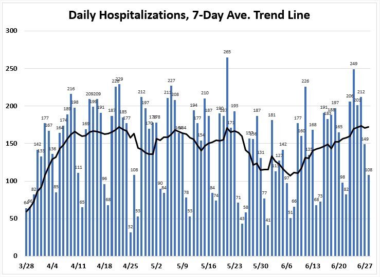
It's not quite that simple. Yes, cases are up because more testing is being done. Cases have never, ever been a reliable indicator of ANYTHING. But, hospitalizations have been a reliable indicator. And, unexpectedly, there was an uptick in hospitalizations for COVID-19 beginning around June 6th in Florida, as you can see here:
The most obvious reason COVID-19 hospitalizations are going up is because of what's happening in the hospital system. Patients are returning to the hospitals for elective surgery that were all delayed during the lockdown. EVERY patient is screened for COVID-19. A patient who is undergoing elective knee surgery and tests positive for COVID-19 even though they are asymptomatic will be classified as "hospitalized with COVID-19." This was explained in a recent NY Times article:
One-third of all patients admitted to the city's [Miami] main public hospital over the past two weeks after going to the emergency room for car-crash injuries and other urgent problems have tested positive for the coronavirus.Fact #2: Hospitalizations for COVID-19 are up slightly because of how COVID-19 positive patients are tracked. They will be in the number even if they didn't go to the hospital BECAUSE of COVID-19.
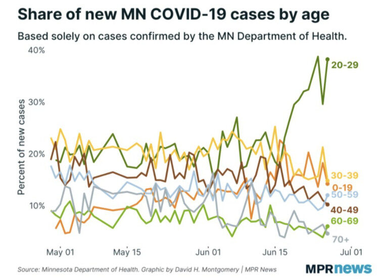
Still, there is something else going on. It's not just more tests and the way hospitalizations are happening. Many states re-opened on May 1 and their trend lines were flat to down for weeks. It's as if some super-spreader event happened in certain states towards late May/Early June. It's really clear that something unique is going on if you look at data from Minnesota, the state where George Floyd was tragically murdered, where positive cased are stratified by age:
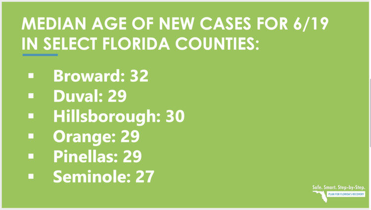
As you can see, in Minnesota, the percentage of positive cases by people age 20-29 really spiked in mid to late June, which means infections likely happened in early June or late May. Yes, obviously, the densely-packed protests for racial equality and social justice — which I personally applaud — appear to have caused a REAL uptick in cases and hospitalizations. See this article, Houston Protesters Begin to Fall Ill With Coronavirus After Marching for George Floyd. Just look at the median age of NEW cases in Florida for mid-June (used to be in the mid-60s):
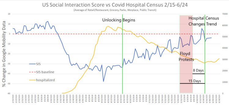
Fact #3: A REAL rise in both cases and hospitalizations perfectly matches the timing of the nationwide protests which included many densely-packed crowds together for many hours and even days.
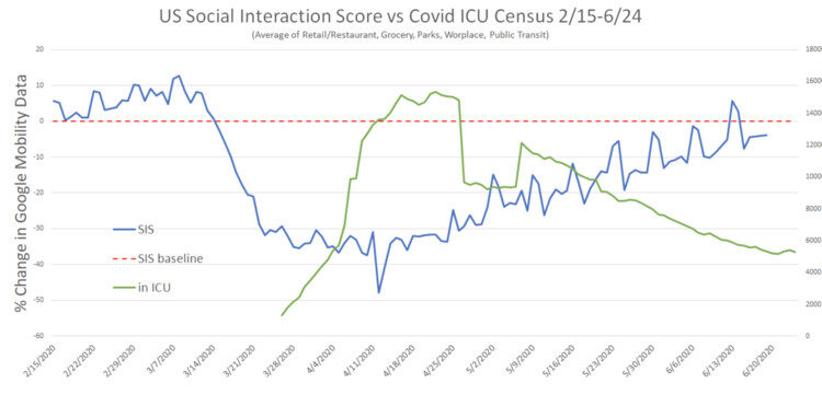
Not convinced? Check out this great graph that overlays the timing of the protests, lockdowns, social mobility, and hospitalizations using data for the entire US. Note there is a time delay between exposure and hospitalizations (between 8 and 15 days), and look at when the yellow hospitalization line goes up.
However, the good news about all of this is that there has been no impact on the number of COVID-19 patients in ICUs, which is consistent with the fact that we know younger patients are less impacted by COVID-19, check out this chart:
Fact #4: Despite a small uptick in hospitalizations, the number of COVID-19 patients in the ICU continues to decline.
IT'S DEATHS, NOT CASES
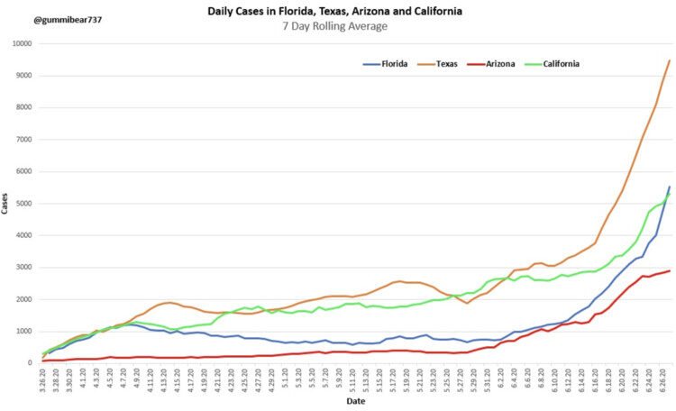
You've been hearing about a handful of states with rising cases, here they are on a chart, cases are clearly rising:
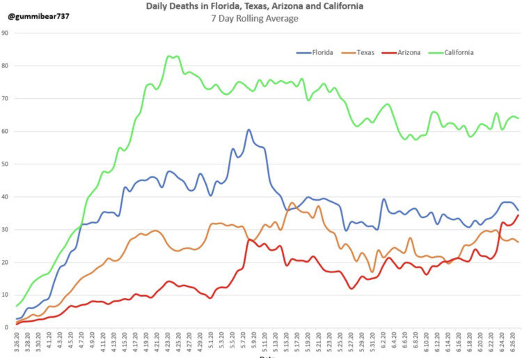
But for those states, what about deaths? They appear to be going the other way:
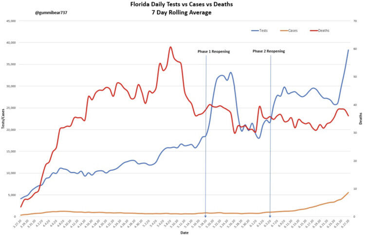
And, finally, perhaps the most important slide, using Florida as the example, there is NO correlation between more tests, more positive tests, and DEATHS (red line in the graph). The fact that these three measures are not linear means Florida has a low and stable death rate, and the recent uptick in positive cases — which happens to be perfectly timed to the nationwide protests — means nothing:
Fact #5: There is NO correlation in Florida — the state taking the most heat in the press about a second wave — between positive tests and deaths.
Of course, anyone who has been paying attention to the data could have told you that, because the national data on COVID-19 deaths is looking more and more like Sweden's, as we already discussed. Today, our national HIT is roughly 15%, which means we are almost done, no matter what any Governor does.
I've seen discussion about how the protests caused an uptick in infections amongst younger people. Some in opposition to that fairly obvious reality point to New York, which also had densely-packed protests but has NOT seen an uptick in hospitalizations — how do you explain that? By now, you know the answer: New York's HIT is already 65%!
Notably, in the math I used, Florida only had a Herd Immunity Threshold number of 6%, well below the target of 17%. So, yes, they MAY WELL have to endure a few more deaths before they achieve HIT. But, it's highly likely that 1) it won't need to be as high as 17% because the people being infected are much younger (where death rate is much lower) and 2) that it will happen in the next few weeks, and policy will have nothing to do with whether it happens or not. Either way, because we know the national number is 15%, the virus is almost gone, no matter what anyone says or does, and all you need to do to verify that is look at the CDC's death curve.
A FINAL THOUGHT ABOUT FLORIDA
John Thomas Littell, MD is a family physician in Florida. I was going to publish an excerpt from his Letter to the Editor of the Orlando Medical News, but it's so good and so wide-ranging, I want you to read the whole thing, and then we can wrap this up:
Several times a day, on every possible news outlet, we are bombarded with updates as to the new number of "cases" of COVID-19 in the U.S. and elsewhere. News analysts then use these numbers to justify criticisms of those who dare to reject the CDC's recommendations with regards to mask wearing and social distancing. It is imperative that all Americans - and especially those in the medical profession - understand the actual definition of a "case" of COVID -19 so as to make informed decisions as to how to live our lives.Dr. Littell brings up many more issues than I have chosen to address in this post, because I already wrote about them in my previous blog post on May 30.
Older Americans remember all too well the dread they experienced when a family member was diagnosed with a "case" of scarlet fever, diphtheria, whooping cough (pertussis), or polio. During my career in family medicine, including several years as an Army physician, I have cared for patients with chickenpox, shingles, Lyme disease as well as measles, tuberculosis, malaria, and AIDS. The "case definition" established for all of these diseases by the CDC requires the presence of signs and symptoms of that disease. In other words, each case involved a SICK patient. Laboratory studies may be performed to "confirm" a diagnosis, but are not sufficient in the absence of clinical symptoms.
Having now been privileged to care for sick patients with COVID-19, both in and out of the hospital setting, I am happy to see the number of these sick patients dwindle almost to zero in my community - while the "case numbers" for COVID-19 continue to go up. Why is that?
In marked contrast to measles, shingles, and other infectious disease, "cases" of COVID-19 do NOT require the presence of ANY symptoms whatsoever. Health departments are encouraging everyone and anyone to come in for testing, and each positive test is reported as yet another "new" case of COVID-19!
On April 5, 2020, a small number of state epidemiologists (Council of State and Territorial Epidemiologists (CSTE) Technical Supplement: Interim-20-ID-01) came up with a "surveillance" case definition for COVID-19. At the time, there was uncertainty as to whether or not completely asymptomatic persons could transmit COVID-19 sufficiently enough to infect and cause disease in others. (This notion has never been proven and, in fact, has recently been discounted - cfr " A Study on the Infectivity of Asymptomatic SARS-CoV-2 Carriers, Ming Fao et al, Respir Med, 2020 Aug - available online through PubMed 2020 May 13, as well as recent reports from the WHO itself). The CSTF thereby justified the unconventional case definition for COVID-19, adding "CSTE realizes that field investigations will involve evaluations of persons with no symptoms and these individuals will need to be counted as cases."
Hence, anyone who has a positive PCR test (the nasal swab, PCR test for COVID Antigen or Nucleic Acid) or serological test (blood test for antibodies -IgG and/or IgM) would be classified as a "case" - even in the absence of symptoms. In our hospitals at this time, there are hundreds of former nursing home residents sitting in "COVID" units who are in their usual state of good health, banned from returning to their former nursing home residences simply because they have TESTED Positive for COVID-19 during mass testing programs in the nursing homes.
The presence of a positive lab test for COVID-19 in a person who has never been sick is actually GOOD news for that person and for the rest of us. The positive test indicates that this person has likely mounted an adequate immune response to a small dose of COVID-19 to whom he or she was exposed - naturally (hence, no need for a vaccine vs. COVID-19).
It is important as well to understand that the presence of lab testing is not the ONLY criterion that the the CDC uses to established a diagnosis of COVID-19. The presence of only 1 or 2 flu-like symptoms (fever,chills, cough, sore throat, shortness of breath) - in the absence of another proven cause (e.g., influenza, bacterial pneumonia) is SUFFICIENT to give a diagnosis of COVID-19 - as long as the patient also meets certain "epidemiological linkage" criteria as follows:
"In a person with clinically compatible symptoms, [a "case" will be reported if that person had] one or more of the following exposures in the 14 days before onset of symptoms: travel to or residence in an area with sustained, ongoing community transmission of SARS-CoV-2; close contact (10 minutes or longer, within a 6 foot distance) with a person diagnosed with COVID-19; or member of a risk cohort as defined by public health authorities during an outbreak." Note that the definition of a "risk cohort" includes age > 70 or living in a nursing home or similar facility.
So, in essence, any person with an influenza- like illness (ILI) could be considered a "case" of COVID-19, even WITHOUT confirmatory lab testing. The CDC has even advised to consider any deaths from pneumonia or ILI as "Covid-related" deaths - unless the physician or medical examiner establishes another infectious agent as the cause of illness.
Now perhaps you see why the increasing number of cases, and even deaths, due to COVID-19 is fraught with misinterpretation and is NOT in any way a measure of the ACTUAL morbidity and mortality FROM COVID-19. My patients who insist upon wearing masks, gloves and social distancing are citing these misleading statistics as justification for their decisions (and, of course, that they are following the "CDC guidelines"). I simply advise them, "COVID-19 is NOT in the atmosphere around us; it resides in the respiratory tracts of infected individuals and can only be transmitted to others by sick, infected persons after prolonged contact with others".
So you may ask - why are we continuing to report increasing numbers of cases of COVID as though it were BAD news for America? Rather than as GOOD news, i.e, that the thousands of healthy Americans testing positive (also known as "asymptomatic") are indicative of the presence of herd immunity - protecting themselves and many of us from potential future assaults by variants of COVID?
Why did we as a society stop sending our children to schools and camps and sports activities? Why did we stop going to work and church and public parks and beaches? Why did we insist that healthy persons "stay at home" - rather than observing the evidence-based, medically prudent method of identifying those who were sick and isolating them from the rest of the population - advising the sick to "stay at home" and allowing the rest of society to function normally? And, while we witnessed the gatherings of protestors in recent days with little concerns for COVID-19 spread among these asymptomatic persons, most certainly many are hoping that the increasing "case" numbers for COVID-19 will discourage folks from coming to any more rallies for certain candidates for political office.
Fear is a powerful weapon. FDR famously broadcast to Americans in 1933 that "We have nothing to fear, but fear itself". I would argue that we have to fear those who would have us remain fearful and servile and willing to surrender basic freedoms without justification.
John Thomas Littell, MD, is a board-certified family physician. After earning his MD from George Washington University, he served in the US Army, receiving the Meritorious Service Medal for his work in quality improvement, and also served with the National Health Service Corps in Montana. During his eighteen years in Kissimmee, FL, Dr Littell has served on the faculty of the UCF School of Medicine, President of the County Medical Society, and Chief of Staff at the Florida Hospital. He currently resides with his wife, Kathleen, and family in Ocala, Florida, where he remains very active as a family physician with practices both in Kissimmee and Ocala.
Wasn't this supposed to be about hospitals?
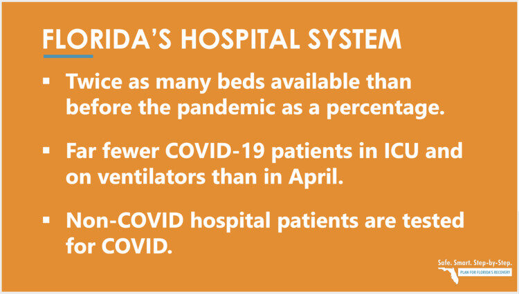
The only reason ever given for locking down in the first place was space availability in hospitals. Here's what Florida said about their hospitals last week:
And here's what doctors in Houston, Texas said last week:
Hospital CEO's including, Dr. Marc Boom with Houston Methodist, Dr. David L. Callender with Memorial Hermann Health System, Dr. Doug Lawson with St. Luke's Health, and Mark A. Wallace with Texas Children's Hospital, held a zoom conference, June 25, out of concern, "that recent news coverage has unnecessarily alarmed the Houston community about hospital capacity during this COVID-19 surge." The two key major takeaways from today's discussion: The Houston health care system has the resources and capacity necessary to treat patients with COVID-19 and otherwise...Sigh. So why is the press making such a big deal out of the "second wave"? I don't do politics, but if I did I would probably mention that here.
What are Governors doing?
In a quick word: nothing helpful. I think this guy summarizes how I feel:
Seriously, though, the rollbacks of openings are simply ridiculous, and simply compounding a terrible idea, and delaying the inevitable process within each region of achieving a proper Herd Immunity Threshold. If you want to get angry about lockdowns all over again, like I did in my article in May, just read this: The lockdown is causing so many deaths. Here's an excerpt:
How many people aged 15 or under have died of Covid-19? Four. The chance of dying from a lightning strike is one in 700,000. The chance of dying of Covid-19 in that age group is one in 3.5million. And we locked them all down. Even among the 15- to 44-year-olds, the death rate is very low and the vast majority of deaths have been people who had significant underlying health conditions. We locked them down as well. We locked down the population that had virtually zero risk of getting any serious problems from the disease, and then spread it wildly among the highly vulnerable age group. If you had written a plan for making a complete bollocks of things you would have come up with this one.In Conclusion
Dr. Michael Levitt and Sweden have been right all along. The only way through COVID-19 is by achieving the modest (10-20%) Herd Immunity Threshold required to have the virus snuff itself out. The sooner politicians — and the press — start talking about HIT and stop talking about new confirmed cases, the better off we will all be. Either way, it's likely weeks, not months, before the data of new daily deaths will be so low that the press will have to find something new to scare everyone. It's over.
A quick note:
Haters of this article will post articles about Sweden saying their approach has been a failure. They will point to recent press about Sweden having higher rates of COVID-19 positive tests lately — Sweden has pushed back strongly — so here'a chart for the haters, it shows positive cases in Sweden, tracked against deaths. There's no correlation.
For my truly committed readers who made it this far:
"The death rate is a fact; anything beyond this is an inference."William Farr, creator of Farr's law, knew this over 100 years ago. Viruses rise and fall at roughly the same slopes. It's predictable, and COVID-19 is no different, which is why, after looking at all these death curves, it's not very hard to declare that the pandemic is over. Oxford's center for Evidence Based Medicine has a wonderful explanation of Farr's law, and it's well worth a read. Some of my favorite quotes:
William Farr (1807 - 1883)
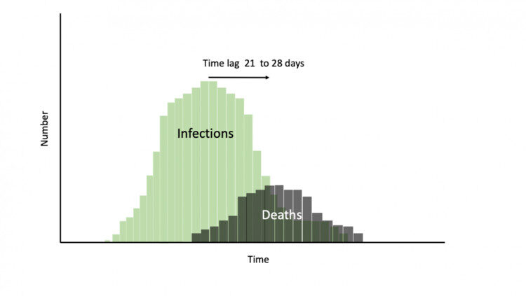
"Farr shows us that once peak infection has been reached then it will roughly follow the same symmetrical pattern on the downward slope."
"In the midst of a pandemic, it is easy to forget Farr's Law, and think the number infected will just keep rising, it will not. Just as quick as measures were introduced to prevent the spread of infection we need to recognise the point at which to open up society and also the special measures due to 'density' that require special considerations."
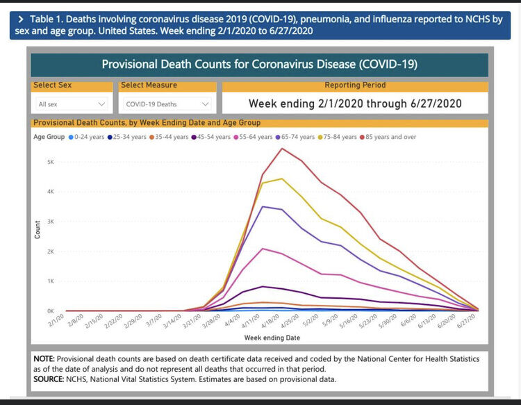
"Once peak deaths have been reached we should be working on the assumption that the infection has already started falling in the same progressive steps. Using deaths as the proxy for falling infections facilitates the planning of the next steps for reopening those societies that are in lockdown."A reader just sent me this chart from the CDC. If you don't think the COVID-19 virus has run its course according to Farr's Law, I can't help you!
J.B. Handley is the best-selling author of How to End the Autism Epidemic. He graduated with honors from Stanford University, and currently serves as a Managing member of Bochi Investments, a private investment firm. He can be reached at jbhandleyblog@gmail.com


Cressida Dick's soy boy army in action....[Link]