1) Overstating of the number of people who are going to die
This starts with the now-infamous Imperial College London (ICL) 'Report 9' that modelled 500,000 deaths if no action was taken at all, and 250,000 deaths if restrictions were not tightened. This set the train of lockdown restrictions in motion. Some argue that Imperial's modelling may have come true had it not been for lockdown. But this does not explain Sweden. Academics there said its assumptions would mean 85,000 deaths if Sweden did not lock down. It did not - and deaths are just under 6,000.
2) Leaked SAGE papers
Next came a print paper written by SAGE members to support a two-week 'circuit breaker', leaked to the press. The reports were striking.
"'With no social distancing measures in place from now until January, the virus could potentially spiral out of control and kill 217,000 people, hospitalise 316,000 and infect 20.7 million. But with a strict two-week lockdown the number of deaths could be reduced by 100,000, admissions by 139,000 and infections by 6 million.'Understandably, this made headlines. But when the lead author was interviewed by the BBC, he said that he wished he 'hadn't put these numbers in the study' because it was an extreme scenario only included 'for illustration'.
3) Miscategorisation of 'Covid death'
Under the original system, someone run over by a bus would be counted as a 'Covid death' if he or she had tested positive for Covid but later recovered. When this anomaly was pointed out by the Oxford Centre for Evidence-Based Medicine, it turned out even the Health Secretary was unaware what the Covid death data referred to. He ordered an immediate inquiry. This illustrates how poor-quality data from Public Health England was misleading the government itself. A new system was eventually set up: counting deaths within 28 days of a positive Covid-19 test. This removed 4,149 deaths from the 15 July death count.
4) Overstating the effect of lockdown on reducing virus transmission
On 17 March Patrick Vallance, the Chief Scientific Adviser, stated that keeping the coronavirus death toll in the UK to less than 20,000 would be 'a good outcome' - yet on 16 July he had to admit the UK's coronavirus outcome had 'not been good'. After lockdown, a range of 7,000 to 20,000 deaths was given by Professor Neil Ferguson of Imperial College London. UK Covid deaths are now approaching 45,000.
5) Exaggerating Covid's impact on hospitals
A leaked NHS report written in April warned that the UK would need 25,000 hospital beds to treat Covid patients 'well into July'. However, on 24 July the daily count of confirmed Covid-19 patients in hospital was 928 in England and 1,356 across the UK, or just 5 per cent of the prediction.
6) Exaggerated fears about lifting lockdown
Imperial's 'Report 20' on 4 May, contains a prediction of tens of thousands of deaths in Italy within three weeks of reopening. Yet by 30 June, just 23 daily deaths had been reported (lockdown officially ended on 4 May and internal travel restrictions on 3 June). On 29 May, SAGE advisors stated that 'Covid-19 was spreading too fast to lift lockdown in England'. The mobility index (based on the request for map indications from the web) in June was around 20 per cent over the norm for the month for the UK, yet cases continued to decline to a low of 624 on 30 June.
7) The Vallance graph
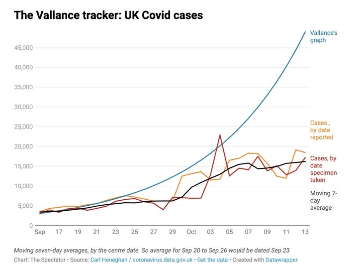
On 21 September, Sir Patrick Vallance held a press conference where he sought to raise public support for further restrictions. The only graph he showed was one where cases doubled every seven days. This time, at least, the 'scenario' could be measured against reality. The Vallance chart showed infections hitting 50,000 cases a day by 13 October without action. His graph did not lead to any change in policy and when this day arrived, the moving average was 16,228.
8) The Excel spreadsheet blunder
This was blamed on a Covid testing glitch that led to 16,000 missed cases and up to 50,000 untraced contacts who should otherwise have been self-isolating. Added to this are grave errors about the overall quality of the data, further undermining confidence in the system.
9) Reluctance to acknowledge uncertainties in evidence
Let's take the two-metre rule. Sir Patrick Vallance told the Health and Social Care Committee on the 5 May that 'a minute at two metres contact is about the same risk as six seconds at one metre'. He added: 'That gives you some idea of why the two metres becomes important. The risk at one metre is about 10 to 30 times higher than the risk at two metres, so the distancing is an important part of this'. On 4 June, SAGE gave a very different estimate: at one metre it could be two to 10 times higher than at two metres they reported. So, who got it right? A one-size-fits-all two metre social distancing rule, however, is inconsistent with the underlying science of exhalations and indoor air. The majority of existing evidence is observational and non-peer-reviewed, depending very much on populations, study settings, sample collection methods and primary outcome. Such studies do not allow a definition of a specific relative risk of SARS-CoV-2 at different distances.
10) Lack of access and transparency in data
The Manchester Evening News asked for trust-by-trust Covid admissions numbers as a proportion of overall capacity in Greater Manchester. Six out of seven relevant trusts did not comply with the request. Wigan, Wrightington and Leigh said that 'we are unable to provide figures - these will be issued at national level', while none others replied. We were advised that a Freedom of Information request was required to obtain the data and it would take up to 21 days for a response. At the Oxford University Centre for Evidence-Based Medicine, we have also had access to essential healthcare data blocked. But we are aware of important data, used to set lockdown restrictions, that are not in the public domain. This disturbing lack of transparency in what is a global public health and economic crisis hinders our understanding.
All told, the production, dissemination and use of data in the UK paints a disturbing picture. Over the course of this pandemic, we have observed outright errors, misunderstandings of effects, too much certainty being reported by advisors and interpretation lacking the normal context. So are lockdown decisions being taken on a false premise? Without transparency, how can errors be detected?
Poor quality of death data leaves us unable to say for certain who died because of Covid, who died with Covid as a cofactor - and who died of Covid after contracting the infection in hospital. Deaths outside hospitals are not subject to detailed analysis, despite their importance. The use of the word 'cases' implies that all cases are the same. They are not. Those who really matter are the contagious and the gravely ill (with the two categories overlapping). This data is not reported presumably because the numbers are not known and are lost in the testing frenzy.
Rather than be cautious in the use of such data, the government's approach has been publishing worst-case scenarios. These assumptions so far have largely proven to be unreasonable and, all too often, flatly incorrect. However, we have shown that this realisation has had little effect on the approach. This leaves the public - and policymakers - in a hopeless position when it comes to navigating our way out of this mess.


Comment: If exact data were available, it would further support the case that Covid is not a deadly disease and all these measures taken have nothing to do with 'protecting public health'.
So are these really data 'failures', or does the data reflect what the powerful and wealthy want us to see?