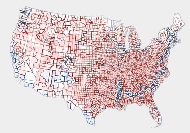
© Ken Field
On May 11, 2017, a reporter named Trey Yingst, who covers the White House for the conservative news network OANN, tweeted a photo of a framed map of the United States being carried into the West Wing. The map depicted the 2016 election results county-by-county, as a blanket of red, marked with flecks of blue and peachy pink along the West Coast and a thin snake of blue extending from the northeast to Louisiana.
It was a portrait of the country on election night, but on Twitter, it was also a Rorschach test.
Conservatives replying to Yingst's tweet interpreted the expanse of red as proof of their party's dominance throughout all levels of government. Liberals viewed the map as a distortion, masking the fact that most of that redness covers sparsely populated land, with relatively few voters.
In reality, both sides are right, says Ken Field. A self-proclaimed "cartonerd," Field is a product engineer at the mapping software company Esri and author of a guidebook for mapmakers called
Cartography. The problem, he says, isn't with people's partisan interpretation of the map. The problem is believing that any single map can ever tell the whole story. "People see maps of any type, and particularly election maps, as
the result,
the outcome, but there are so many different types of maps available that can portray results in shades of the truth," Field says. "It's a question of the level of detail that people are interested in understanding."
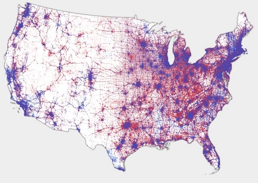
© Ken FieldThe Pointillism Approach - Rather than distributing the dots evenly around a county, they are distributed proportionally according to where people actually live
It stands to reason that President Trump would want that particular map hung in the West Wing. There is an awful lot of red on it. But focusing on that map alone could lead Republicans to overestimate their advantage, and lead Democrats to misunderstand the best ways to catch up. That's one reason why Field recently published an
extensive gallery of more than 30 alternative maps designed to tell markedly different stories about what happened on election night 2016. (Well, that and he just really loves maps.)
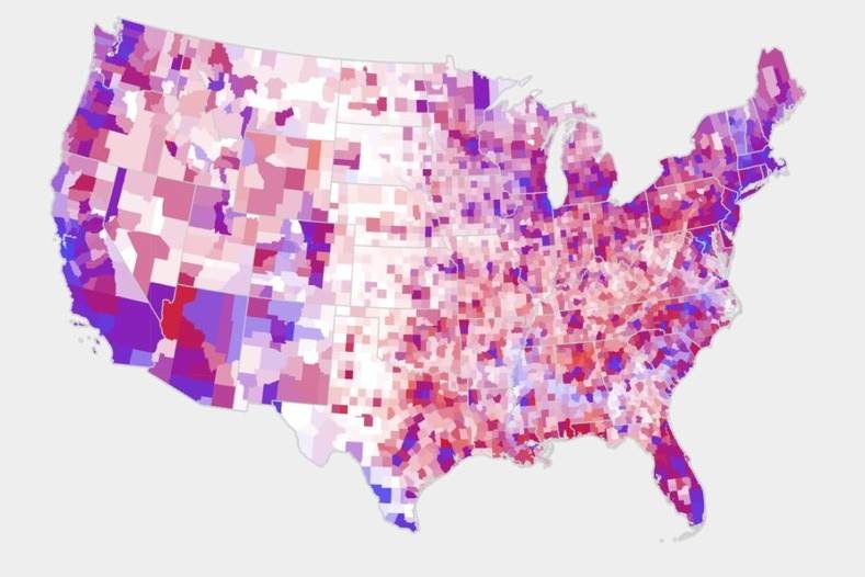
© Ken FieldPresidential election 2016: Value-by-alpha
"All of these maps show different versions of the truth," he says. "None are right, and none are wrong, but they all allow you to interpret the results differently."
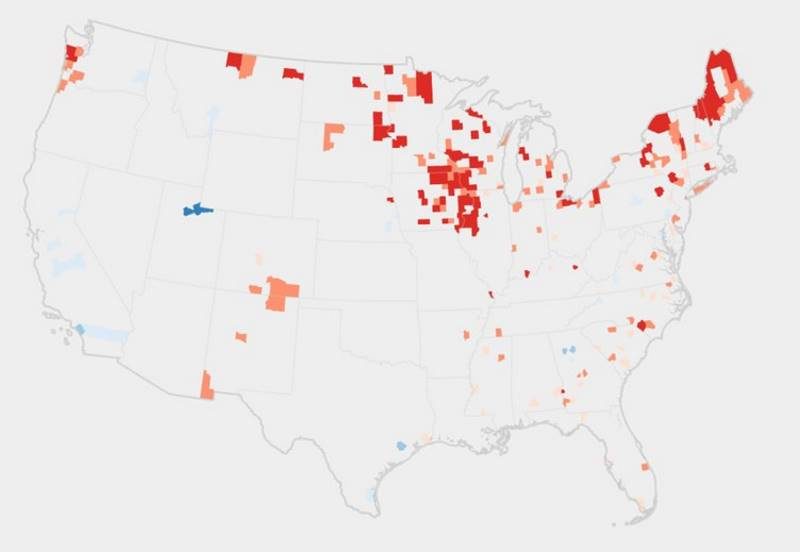
© Ken FieldThis map uses color to highlight vote share in counties that flipped from red to blue or blue to red between the 2012 and 2016 elections.
An interactive view from above:
Read the rest of the article
here.
Issie Lapowsky is a senior writer for WIRED, covering politics and national affairs.



Reader Comments
to our Newsletter