In the early days of Global Warming, the theories predicted that the upper atmosphere would heat due to increases in CO2. Well, that didn't happen. One recent article by NASA says that the Thermosphere (above 100,000 ft) has cooled in recent years due to decreased solar activity and a reduction in ultraviolet light. That certainly seems reasonable. Another article stated that if the lower atmosphere warms, the upper atmosphere must cool, which makes no sense to me.
Other articles posit that as CO2 increases the level at which radiation escapes to space also increases and the upper atmosphere warms. That also made no sense to me.
I decided to take a look at temperatures aloft and reasoned that the difference between day and night temperatures in the upper atmosphere might reveal whether the nighttime atmosphere is cooling faster or slower than in previous years. If cooling slower the temperature curves at 00z and 12z would tend to converge and if cooling faster the curves would diverge. Simple, right?
Upper air data was obtained from NOAA for the period 1970 through 2016. The NOAA site houses balloon data in different formats but only the standard levels of 850, 700, 500, 400, 300, 250, 200, 150, and 100mb data were used. It was felt that the best way to test the hypothesis was to use data from an upper air station where moisture levels were low in the belief that a lot of moisture would cloud the results.
Initially, Tucson was selected for its dry climate and where the 00z and 12z observation times coincided with the time of maximum and minimum temperatures at 5 pm and 5 am at that location. After downloading the data as yearly files, a computer program averaged all 00z and 12z observations for each mandatory level.
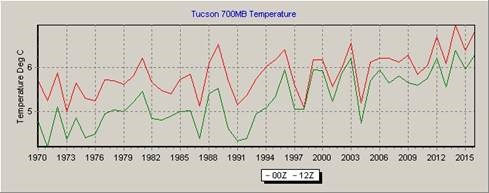
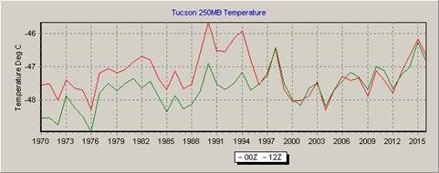
The results from plotting Tucson average yearly 0000z and 1200z temperatures at different heights were unexpected, to say the least.
As expected, the 12z curve (green) shows that the air cooled during the night on average about three degrees through 1995 and then narrowed to only two degrees through 2016. Both curves are trending upward and beginning in the mid-90s the curves tend to converge, which may support the Global Warming theories since CO2 cools slower than air. However, that would mean that Global Warming did not start until the mid-90s, which is an unlikely scenario.
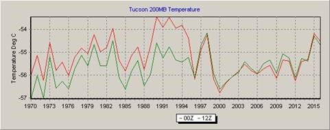
The strangeness continues with the following charts.
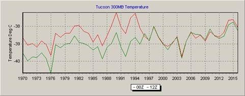
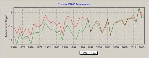
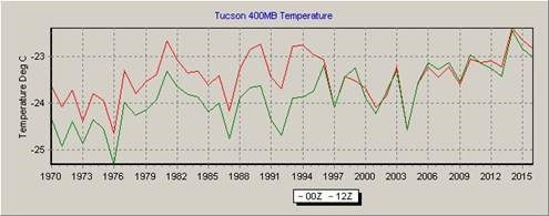
We are now above 90% of the moisture, and any changes in the divergence of the two curves must be due to external forces. It is unreasonable to think that a steadily rising CO2 would suddenly make itself known in this way. The following charts are included to show that the converging curves are present at all upper levels.
As can be seen in the preceding charts something happened in 1996 that affected the atmosphere beginning at 850mb and increased in severity as we go aloft, culminating in a rather large drop in temperature at 100mb. There are two things about the preceding charts: 1. the temperature, after convergence, on each chart from 300mb and higher, cool until the curve is flat at 100mb and 2. There is little change in the curves before 1996.The NASA article said that the Thermosphere has cooled due to a reduction in ultraviolet light from a quite sun. Perhaps it is affecting lower levels also.
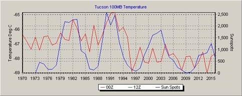
If we plot the 100mb Tucson temperatures with a three-year delay of sunspots, the graph above is the result. The correlation between sunspots and the 00Z temperature is .44.
Normally we tend to think that conditions in the lower atmosphere affect the upper atmosphere, but the charts indicate that it is the other way around and the upper atmosphere is affecting the lower levels, and that is why the biggest change is not at 850mb but at 100mb where significant cooling has taken place.
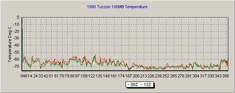
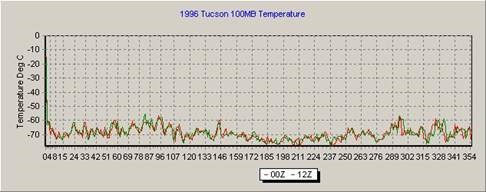
To check for errors the daily data for the years 1995 and 1996 were plotted as shown below. In these two examples, there are less than 365 observations because of missing data at the 100mb level.
This error check does show that the temperature does indeed cool in the first half of 1996 as compared to 1995.
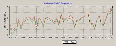
As stated earlier, Tucson was chosen because it was dry and the observation times were ideal. But to me the temperatures changes were very unusual and to investigate further, I obtained rawinsonde data for Anchorage, Alaska, and the charts are shown below. While not as dramatic as the temperature changes for Tucson, the Anchorage charts also show a rather abrupt change in temperature, but not in 1996 but 1999. Again the biggest change was with temperatures at 100mb.
Note how the two curves on Anchorage's 850mb chart are much closer than the same chart for Tucson. I believe this is due to much greater water vapor in the air over Anchorage compared to Tucson. Also, the times of observation are at 3 am and 3 pm, which is not ideal but not bad either.
While the 100mb data for Anchorage is cooler in later years, it does not have the pronounced cooling as seen in the Tucson chart and convergence occurs in 1999 as opposed to 1996 for Tucson. Anchorage charts for levels between 850mb and 100mb are not shown but are available if anyone is interested in them.
Only the 100mb chart is shown for Spokane. Note cooling in later years and the convergence started in 2006.
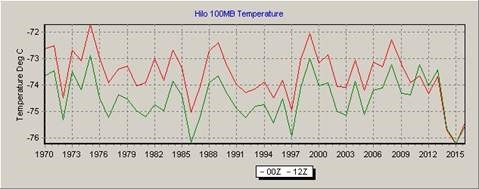
And here is Hilo Hawaii where the temperatures converged in 2011.
So now we have Tucson temperature aloft curves converging in 1996, Anchorage's in 1999, Spokane's in 2006, and Hilo's in 2011.
· Tucson's 100mb temperatures are increasing until about 1990, drop sharply until they converged in 1996 and then remain constant.
· Anchorage's 100mb temperatures drop until about 1996, increase slightly and converge in 1999 and almost constant after that.
· Spokane's 100mb temperature is decreasing after 1982 and then converging in 2006 and remaining constant after that.
· Hilo's 100mb temperature curve is rather constant until it converges in 2011 and drops sharply in 2014.
These graphs raise many questions and provide few answers. Whatever the cause of cooling temperatures at the 100mb level, it is not directly related to steadily increasing CO2. It is apparent that the phenomenon is worldwide and it starts at the higher levels.
As a further check, El Paso data was used as shown in the following graph.
The plots for El Paso were almost identical to Tucson's and also has a correlation of 0.44.
The following conclusions are pure speculation.
The sun is the main driving force for changes in temperature at high altitudes, less so for high latitude locations. It is clear that the sun is changing the temperature at high altitudes, but what about the convergence of night and day temperatures?
Occam's Razor says that the simplest answer is usually correct, which means that the sun is causing both. And indeed the answer is simple. Consider that normally the radiation from the sun passes through the atmosphere without heating it and all the heat in the upper air comes from below as long wave radiation. But if ultraviolet radiation is heating the upper atmosphere, we have a different kettle of fish. Since prior to the sun becoming quiet the upper atmosphere was being heated during the day, that extra heat would be dissipated at night, but without that heating, the night temperature stays the same as the day temperature.




Reader Comments