"Why is the news on global warming always bad? Perhaps because there's little incentive to look at things the other way. If you do, you're liable to be pilloried by your colleagues. If global warming isn't such a threat, who needs all that funding? Who needs the army of policy wonks crawling around the world with bold plans to stop climate change?
But as we face the threat of massive energy taxes - raised by perceptions of increasing rates of warming and the sudden loss of Greenland's ice - we should be talking about reality."

|
| ©Getty Images |
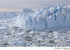
| Disko Bay, Greenland: Temperatures on the island are no warmer than they were in the mid-20th century. |
President George W. Bush has just announced his goal to stabilize greenhouse-gas emissions by 2025. To get there, he proposes new fuel-economy standards for autos, and lower emissions from power plants built in the next 10 to 15 years.
Pending legislation in the Senate from Joe Lieberman and John Warner would cut emissions even further - by 66% by 2050. No one has a clue how to do this. Because there is no substitute technology to achieve these massive reductions, we'll just have to get by with less energy.
Compared to a year ago, gasoline consumption has dropped only 0.5% at current prices. So imagine how expensive it would be to reduce overall emissions by 66%.
The earth's paltry warming trend, 0.31 degrees Fahrenheit per decade since the mid-1970s, isn't enough to scare people into poverty. And even that 0.31 degree figure is suspect.
For years, records from surface thermometers showed a global warming trend beginning in the late 1970s. But temperatures sensed by satellites and weather balloons displayed no concurrent warming.
These records have been revised a number of times, and I examined the two major revisions of these three records. They are the surface record from the United Nations' Intergovernmental Panel on Climate Change (IPCC), the satellite-sensed temperatures originally published by University of Alabama's John Christy, and the weather-balloon records originally published by James Angell of the U.S. Commerce Department.
The two revisions of the IPCC surface record each successively lowered temperatures in the 1950s and the 1960s. The result? Obviously more warming - from largely the same data.
The balloon temperatures got a similar treatment. While these originally showed no warming since the late 1970s, inclusion of all the data beginning in 1958 resulted in a slight warming trend. In 2003, some tropical balloon data, largely from poor countries, were removed because their records seemed to vary too much from year to year. This change also resulted in an increased warming trend. Another check for quality control in 2005 created further warming, doubling the initial overall rate.
Then it was discovered that our orbiting satellites have a few faults. The sensors don't last very long and are continually being supplanted by replacement orbiters. The instruments are calibrated against each other, so if one is off, so is the whole record. Frank Wentz, a consulting atmospheric scientist from California, discovered that the satellites also drift a bit in their orbits, which induces additional bias in their readings. The net result? A warming trend appears where before there was none.
There have been six major revisions in the warming figures in recent years, all in the same direction. So it's like flipping a coin six times and getting tails each time. The chance of that occurring is 0.016, or less than one in 50. That doesn't mean that these revisions are all hooey, but the probability that they would all go in one direction on the merits is pretty darned small.
The removal of weather-balloon data because poor nations don't do a good job of minding their weather instruments deserves more investigation, which is precisely what University of Guelph economist Ross McKitrick and I did. Last year we published our results in the Journal of Geophysical Research, showing that "non-climatic" effects in land-surface temperatures - GDP per capita, among other things - exert a significant influence on the data. For example, weather stations are supposed to be a standard white color. If they darken from lack of maintenance, temperatures read higher than they actually are. After adjusting for such effects, as much as half of the warming in the U.N.'s land-based record vanishes. Because about 70% of earth's surface is water, this could mean a reduction of as much as 15% in the global warming trend.
Another interesting thing happens to the U.N.'s data when it's adjusted for the non-climatic factors. The frequency of very warm months is lowered, to the point at which it matches the satellite data, which show fewer very hot months. That's a pretty good sign that there are fundamental problems with the surface temperature history. At any rate, our findings have not been incorporated into the IPCC's history, and they probably never will be.
The fear of a sudden loss of ice from Greenland also makes a lot of news. A year ago, radio and television were ablaze with the discovery of "Warming Island," a piece of land thought to be part of Greenland. But when the ice receded in the last few years, it turned out that there was open water. Hence Warming Island, which some said hadn't been uncovered for thousands of years. CNN, ABC and the BBC made field trips to the island.
But every climatologist must know that Greenland's last decade was no warmer than several decades in the early and mid-20th century. In fact, the period from 1970-1995 was the coldest one since the late 19th century, meaning that Greenland's ice anomalously expanded right about the time climate change scientists decided to look at it.
Warming Island has a very distinctive shape, and it lies off of Carlsbad Fjord, in eastern Greenland. My colleague Chip Knappenberger found an inconvenient book, "Arctic Riviera," published in 1957 (near the end of the previous warm period) by aerial photographer Ernst Hofer. Hofer did reconnaissance for expeditions and was surprised by how pleasant the summers had become. There's a map in his book: It shows Warming Island.
The mechanism for the Greenland disaster is that summer warming creates rivers, called moulins, that descend into the ice cap, lubricating a rapid collapse and raising sea levels by 20 feet in the next 90 years. In Al Gore's book, "An Inconvenient Truth," there's a wonderful picture of a moulin on page 193, with the text stating "These photographs from Greenland illustrate some of the dramatic changes now happening on the ice there."
Really? There's a photograph in the journal "Arctic," published in 1953 by R.H. Katz, captioned "River disappearing in 40-foot deep gorge," on Greenland's Adolf Hoels Glacier. It's all there in the open literature, but apparently that's too inconvenient to bring up. Greenland didn't shed its ice then. There was no acceleration of the rise in sea level.
Finally, no one seems to want to discuss that for millennia after the end of the last ice age, the Eurasian arctic was several degrees warmer in summer (when ice melts) than it is now. We know this because trees are buried in areas that are now too cold to support them. Back then, the forest extended all the way to the Arctic Ocean, which is now completely surrounded by tundra. If it was warmer for such a long period, why didn't Greenland shed its ice?
This prompts the ultimate question: Why is the news on global warming always bad? Perhaps because there's little incentive to look at things the other way. If you do, you're liable to be pilloried by your colleagues. If global warming isn't such a threat, who needs all that funding? Who needs the army of policy wonks crawling around the world with bold plans to stop climate change?
But as we face the threat of massive energy taxes - raised by perceptions of increasing rates of warming and the sudden loss of Greenland's ice - we should be talking about reality.
Mr. Michaels is senior fellow in environmental studies at the Cato Institute and professor of environmental sciences at University of Virginia.


Reader Comments
to our Newsletter