Since the vaccine rollout there have indeed been radical changes to this metric, so as we approach the halfway mark of 2023 I thought an update was warranted. Unfortunately there is still no evidence of any real slowdown of this alarming development.
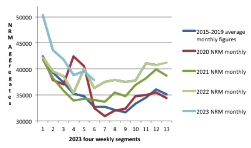
Here is a chart which shows what has been happening with raw non-respiratory mortality data during the four Covid years. The years are each displayed with 13 data-points of four-weekly (monthly) aggregated figures.
Each year appears to be worse than the previous one, and but for the still unexplained spike in non-respiratory deaths at the very beginning of the pandemic, 2020 would have been broadly similar to the 2015-2019 average. Something therefore happened in 2021 that changed the picture radically.
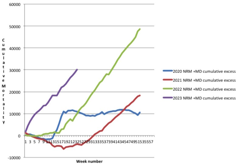
As all four Covid years are showing some excess non-respiratory deaths relative to the 2015-2019 average, the cumulative excess NRM can be displayed like this.
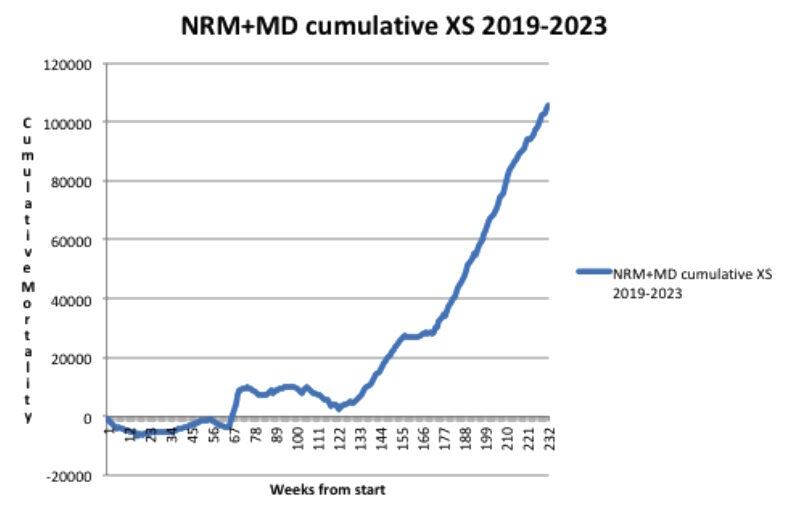
When looked at as a continuous curve with all four years shown consecutively, the chart then looks like this.
So, to summarise, the estimated total excess non-respiratory death toll now exceeds 100,000. Please note that in contrast to my previous article, this time I have already added the estimated mortality displacement (MD) into the cumulative figures for excess NRM. This reflects the fact that cumulative excess all-cause mortality through the Covid years (relative to the pre-Covid 2015-2019 average) stands now at just over 200,000. Mortality displacement lowers the expected number of deaths (so increases the excess) owing to deaths being brought forward in periods of higher mortality.
This is because even though adding in mortality displacement does not change the overall shape of the graphs, it displays more accurately the true picture of the scale of what has been going on with excess deaths in England and Wales. That a similar picture has occurred in many other countries around the world is illustrated by the recent Eugyppius article comparing excess deaths in Germany and Japan.
This chart shows just how stable the trend has been with non-respiratory mortality in the period from 2010 through 2020. The red line represents the 52-week moving average and the data are taken from the ONS weekly mortality reports for England & Wales.
It can be clearly seen that there is a slight rising trend in the period from 2010 through 2020, consistent with a growing population of aged people in the U.K., then a much more abrupt change beginning in 2021.
Looking at multi-year trends in this way, rather than at more recent averages (like the five-year average favoured by the ONS in its mortality statistics for example), can mitigate against the effects of amortisation of a higher rate of mortality and thus normalisation of unwelcome new trends, as Nick Rendell pointed out in his recent article.
The chart also shows how the core mortality in the population typically follows seasonal patterns, rising in the winter and falling in the summer, and thus mimicking to a certain extent the patterns of mortality evident in the ebb and flow of the respiratory season.
Influenza-like illness is normally the main killer during these times, but evidence is mounting that there is a mutually antagonistic competition between rival respiratory pathogens. Thus the Covid years turned out to not be an exceptionally significant addition to overall respiratory mortality, because to some extent they just repressed the influenza deaths that would have occurred anyway.
There is though this strong correlation between the timing of respiratory deaths and core non-respiratory deaths. One could speculate that respiratory deaths, which vary in number each year, bring forward deaths from non-respiratory causes, and so a corresponding lull in these types of death follows naturally in the summer months.
So has Covid been so extraordinarily different from all the other respiratory diseases that we normally experience each year, and somehow increased the size of the winter non-respiratory mortality peaks, whilst also reducing the size of the normal summer lulls? Or is it perhaps something else entirely, as yet unexplained? As the catastrophe is still unfolding, answers are urgently required.
One glimmer of hope that all this will not be washed under the carpet is that mainstream media have begun to report on the heart death epidemic specifically, although at this stage the disturbingly large increase has been entirely attributed to such things as delayed diagnoses, reduced heart drug prescriptions and ambulance delays. Yet the elephant in the room is still never mentioned in polite company.


Reader Comments
Pharma Journal, England February 2021:
"The biggest vaccination programme in the UK’s history began on 8 December 2020 when Margaret Keenan, who was then aged 90 years, was vaccinated at University Hospital, Coventry, with a COVID-19 vaccine manufactured and developed by Pfizer and BioNTech. By 27 January 2021, more than six million people had received a vaccination, with nearly 450,000 people being given two doses of a vaccine..." [Link]
Since that time, mortuaries, hospitals and ambulance services in Great Britain (and most other vaxxed countries [Link] ) have been stretched to the breaking point with the dead and dying.
January 08, 2021 - Police being recruited to drive London ambulances because the 999 calls have gone through the roof; [Link]
October 2021 - Belfast ambulance services under severe load; [Link]
December 2022 - English Ambulance Driver Strike due to never ending demand; [Link]
Correlation can and often does equal causation.
People must be getting paid big bucks to be this blind to this much evidence on the ground.
That link is to a utube video by Dr. Suneel Dehand. It's four days old.
It's gotten so bad at work that the dead are hardly spoken of now. We had a 29 year old drop dead on a zoom call last Monday and there's hardly a peep... It's fucking creepy.
That was meant to say fear rather than fee. Bloody phone.
"Delayed Action" isn't just for cold remedies anymore.
Thank you very much for your observations. Your work place sounds 'detached' from reality. Please don't fall into that trap yourself.
Scary.