To evaluate the risk/benefit of a vaccine for treating a virus, such as covid-19, we can compare the all-cause mortality rate of vaccinated against unvaccinated people on a periodic basis. If the mortality rate for those vaccinated is consistently lower than that for unvaccinated then we might conclude the vaccine must be beneficial.
Placebo Vaccination
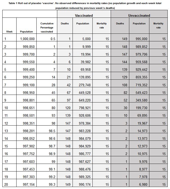
Imagine that a placebo rather than a vaccine is quickly rolled out to a population of one million people of similar age and health. Let's assume the weekly non-virus mortality rate for this population is 15 per 100,000 (100k), so we would expect about 150 out of the million to die in any given week. Because the placebo changes nothing, the mortality rates for both vaccinated and unvaccinated average the same 15 per 100k, each week every week. Hence, on average, what we should observe — as the 'vaccination' programme rolls out to most of the population — is shown in Table 1. Notice that the placebo vaccine roll-out programme is enacted at pace and the cumulative percentage of the population vaccinated rises to 98% within 12 weeks.
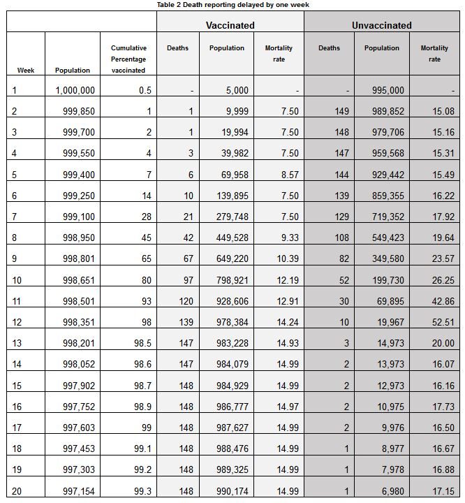
Now suppose there is a one-week delay in the reporting of deaths. Such delays are routine in statistical reporting of mortality and vaccine data. Then the data reported by the authorities is different from reality, here shown in Table 2, which is the same as Table 1 but where the death totals are simply 'shifted' down one week.
(Update) Here's a 60-second video showing how to this is done in Excel and proving there are no tricks involved other than simply shifting the deaths down by one week:
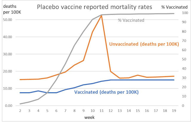
Suppose we want to examine and compare the mortality rates of the unvaccinated and vaccinated cohorts based on the data in Table 2. Figure 1 shows this comparison, and we can see that the mortality rate is consistently lower for the vaccinated than that for the unvaccinated throughout the roll out of the vaccination programme and it reduces as soon as vaccination nears population saturation at close to 100%. We might conclude that those who remain unvaccinated look to be suffering much higher levels of mortality than the vaccinated. The reporting delay therefore creates a completely artificial impression that the vaccine must be highly effective. In fact, it looks like a magic 'cure all' wonder drug!
The fact that the mortality rate of the unvaccinated peaks when the percentage of those vaccinated peaks should ring some alarm bells that something strange is going on (unless there is independent evidence that the virus was peaking at the same time).
ONS data on Covid-19 Vaccination
While the placebo vaccine example was purely hypothetical, Figure 2 shows the vaccinated against unvaccinated mortality using the data in the latest ONS report mortality in England by Covid-19 vaccination status (weeks 1 to 38)[1], complemented by NIMS vaccination survey data (up to week 27 only). Here we show other-than covid mortality to remove the virus signal.
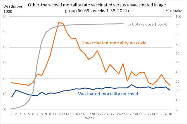
If this is not a statistical illusion how is it possible that the unvaccinated are dying from non-covid causes at a higher rate than vaccinated? Also how is it possible that, at the time vaccination rates are ramped up to nearly 100% of the population, the nonvaccinated are dying from non-covid deaths at almost twice the rate of those who are vaccinated?
These same patterns are also observable in the 70-79 and 80+ age groups (with the mortality peaks for the unvaccinated appearing at different weeks because these age groups received vaccinations earlier). This strongly suggests that what we are observing is a genuine statistical illusion unexplainable by any real impact of the vaccine on mortality rates. There could, of course, be reasons other than just delays in death reporting or misclassification. For example, any systematic underestimation of the actual proportion who remain unvaccinated would lead to a higher mortality rate for unvaccinated higher than that for the vaccinated, even if the mortality rates were equal in each category.
Consider a deadly placebo
It is also important to note that even if the actual mortality rate for the vaccinated was higher than that of the unvaccinated, where the vaccine was causing death, as a side effect, we would still likely observe the same illusion.
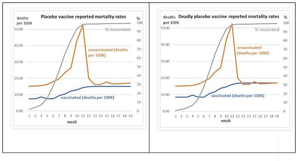
To see this effect let's revisit our placebo vaccine example and make a small change to Table 1 where instead of a mortality rate of 15 per 100k for the vaccinated, suppose it is 17 per 100k (a rise in mortality of approximately 13%). So, the placebo vaccine is killing two more people per 100k and gives no mortality benefit otherwise. In this scenario the reported mortality rate for the 'deadly placebo' is compared to the first 'placebo' scenario, in Figure 3. Even here we see the illusion that the mortality rate for the vaccinated is lower than unvaccinated. Both scenarios are the opposite of reality, and both look interchangeable. This means the chance of picking up a vaccine side effect signal is close to impossible and instead the illusion is created of vaccine efficacy.
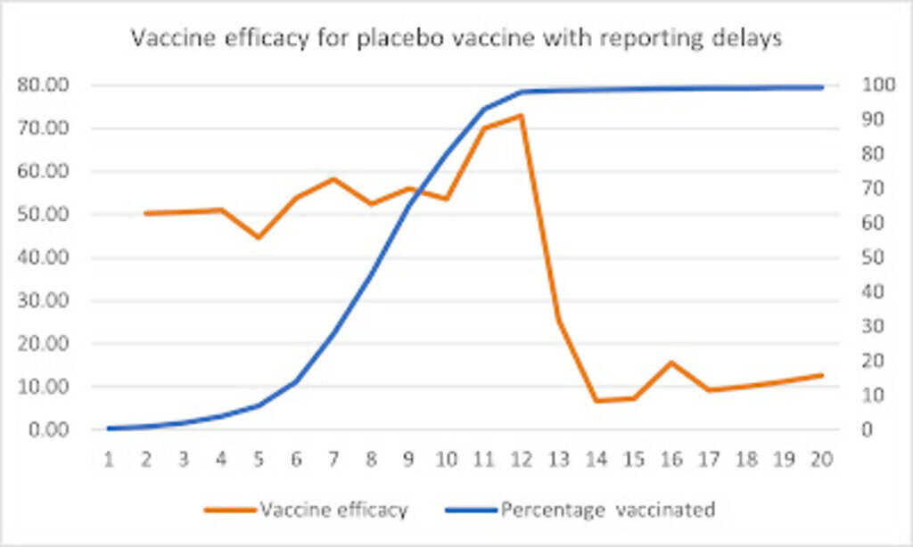
Finally, it is important to note that the same statistical illusion applies to all measures of vaccine efficacy whether they be cases, hospitalizations, or deaths. In fact, replacing the number of deaths in Table 1 with number of cases, with a one week reporting delay, would result in vaccine efficacy rates as shown in Figure 4.
This occurs when the actual placebo vaccine efficacy for cases is zero.
This reporting bias is one type of bias that might be called 'reporting lag censoring', a phenomenon whereby structural or process factors systematically interfere with when data is handled and reported with the consequential effect that it is then misinterpreted, leading to false conclusions.
[1] Deaths involving COVID-19 by vaccination status, England: deaths occurring between 2 January and 24 September 2021
Norman Fenton is Professor in Risk Information Management at Queen Mary University of London and also a Director of Agena, a company that specialises in risk management for critical systems.
Martin is Professor in Computer Science and Statistics at QMUL and a Director of Agena Ltd.


Reader Comments
Director-General of the WHO confirms vaccine passports are discriminatory, children should not be vaxxed, and the jabs are useless
Footage has emerged of the Director-General of the World Health Organization speaking with the President of Brazil, Jair Bolsonaro, in which he clearly states that the WHO does not recommend...Or don't want to talk about it.
In the "Wochenschau", the German troups were always about to repulse the "Bolshevik Hordes" from German soil, and destroy them utterly. Right until they captured Berlin.
Eyes are useless for those who do not want to see.
Once this would have been impossible to do because of our education now it is like taking candy from a baby for lack thereof.
The futures so bright I gotta wear shades. [Link]
If you're gonna discuss "statistics" after ignoring the statistics that prove there never was a "pandemic" before the clot-shot started....you might be a dumbshit.
[Link]