Ken Stewart has scanned the trend maps at BOM (Bureau of Meteorology), and his point is spot on. As soon as I saw the neat joint
six page advertising pamphlet for the climate-theory-backed-by-bankers, I wondered what happened to the first 60 years of last century, and Ken found it. Did the BOM forget they have hundreds of data points from back then? Did they forget to use their own Website, where you can pick-a-trend, any-trend, and choose the one with err...more convenient results?
Or is it the case that their collective mission is not necessarily to provide Australians with the most complete and appropriate information available, but with what the bureaucracy needs them to know? And what they need to know, apparently, is the carefully censored version of the truth that will keep government ministers happy (
Let us tax them more!), keep department heads smiling (
Let the climate cash cow continue!), and last, but not least, help staff
feel good (We're sure we're helping the environment!).
Why censor half their own data?The
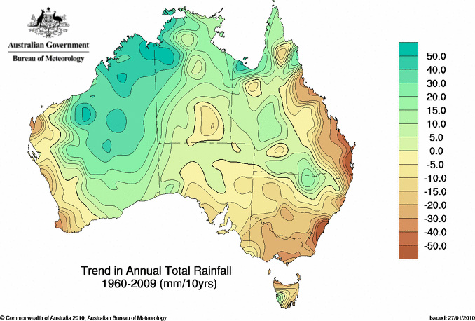
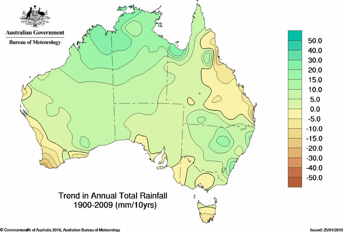
trend map page works exquisitely well (I am happy to praise the BOM Web site team). Compare these two trend maps:
.
The brown bits are the parts that
used to get lots more rain in the 1960s The dark green bits are areas that are quite a lot wetter at the moment than they used to be. But, if we go back past 1960, back to when records started to come together, the trends are decidedly less scary, and, all in all,
you'd think Australia might be getting a bit more rain than it did a century ago (you'd be right).
Note that it took not just one national institution to come up with the publication that ignores 60 years of data; the pamphlet is the combined effort of the CSIRO and the BOM, both funded by the people of Australia.
Don't mention the rising rainfall trendThe team carefully noted that
"total rainfall on the Australian continent has been relatively stable", but didn't mention that it had actually increased, as
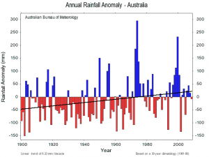
David Stockwell pointed out. This is supposed to be the state of the Australian climate? According to the BOM itself (see the fine print on that graph), our rainfall has increased by about 6mm a decade over the last 100 years.
Is there any reason (other than the obvious) for choosing such a censored set of data? Fans of the theory of man-made global warming will rightly point out that most of our emissions of CO2 have come since 1960, and they might dutifully add that "
things are worse than we thought" (i.e., the trend is speeding up).
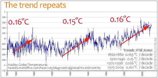
Except on a global scale, the temperature trends of the carbon-forced era (post 1960) aren't any different than those in the pre-carbon-forced era.
And in science,
more data is always a useful thing - especially when it isn't what one expects.
The only reason to censor data is to herd people towards one particular conclusion.Andrew Bolt had a fast wrap on the joint BOM CSIRO document.
Thanks to Ken for the heads up and help!
Joanne Nova is a freelance science presenter & writer, professional speaker and former TV host; author of The Skeptics Handbook (over 200,000 copies distributed & available in ten languages).


Reader Comments
to our Newsletter