There follows a guest post by 'Amanuensis', an ex-academic and senior Government researcher/scientist with experience in the field, who has undertaken a re-analysis of ONS data on deaths by vaccination status and concluded that vaccine effectiveness against death has been significantly overestimated owing to a failure to take into account the delay between infection and death. His analysis also uncovers an alarming spike in Covid deaths following vaccination during a Covid surge which, he says, needs urgent investigation. This post is also available on his Substack page.Recently a blog post was brought to my attention. This was a very interesting piece of work that is directly related to a previous post of mine analysing the deaths by vaccination status figures published by the Office for National Statistics.
In Norman Fenton's excellent analysis he considers the impact of a delay in the reporting of a death on the shape of the deaths curve; he finds that such a delay during a vaccination campaign will naturally result in the creation of a spike in unvaccinated deaths and an under-estimation of deaths in the vaccinated - indeed, he notes that you would see that spike in deaths even if the vaccines do nothing. If you want to read more about his analysis his site can be found here - and I recommend at least a quick skim of his work because I'll be building on the fundamentals of data analysis that he considers.
However, there is a small but significant flaw in his argument; that there was a delay in reporting deaths which has then resulted in the spike in cases that we see in the data. Unfortunately, a check of the data source reveals that the deaths data were given by the date at which the death occurred, not the date at which it was reported. Thus there is little scope to introduce a delay in the data using this mechanism.
This then seems like a conundrum - we have a mechanism that might explain the spike in deaths in the unvaccinated apparent in the deaths data for last spring, but we can't explain how the necessary delay might have occurred. But there is a potential explanation.
To understand what might have occurred, we first need to explore the timescales of the progression of Covid disease.
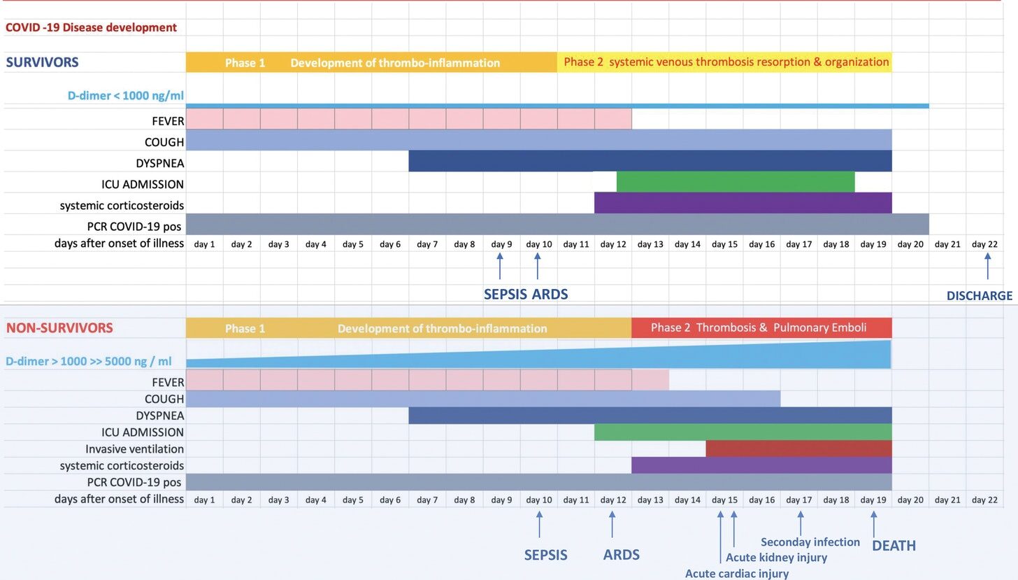
We know that Covid disease follows three broad stages, as illustrated by this figure (from Oudkirk et al, 2020):
As can be seen in the lower half of the figure, first comes a mild symptomatic period lasting approximately seven days. Most individuals recover at this point, but in a minority there next comes a period where there is a significant shortage of breath (dyspnea - this is when medical assistance is often sought), and in a subset of those individuals this is followed by a period of significant illness and, potentially, death. The time period between symptom onset and death, if it occurs, has a median value of approximately 19 days.
On top of that, there is a short incubation period of three to four days between the point of infection and the onset of symptoms. Adding this period on gives a median duration between the point of infection and death of approximately 23 days, or three and a bit weeks.
The important point in this analysis is that it is not correct to compare weekly death statistics with the vaccinated population at the week of death; for this analysis the important point of the disease progression was the point of infection, not the point of death. Thus we should be comparing each week's deaths with the vaccination numbers three and a bit weeks prior, i.e., the point in time when the infection that led to the death will have likely occurred.
It is important to point out that this isn't a nuance that is 'worth a try', like the potential for the deaths to be reported a week after they occurred. This is the only correct way to interpret these data, and to use the vaccination numbers for the week of death is incorrect. Alas, I have realised this too late, and can only apologise for the misleading statistics I discussed in my earlier post - you can be sure that I'll punish myself with a glass of wine later.
I shall discuss how this new factor affects my past analysis on the non-Covid deaths in a later post, but for now - how does the use of the vaccination numbers at the likely point of infection, rather than the point of death, affect the analysis of deaths with Covid?
In this post I'll show data from week four to week 20 - week four because those dying in week four will have caught Covid in week one of 2021 and we don't have relevant data prior to week one, and week 20 because the primary impact of this delay will be to affect data during the vaccine rollout - I'll cover later data in a separate post. I'll be showing data for unvaccinated and for those with a single jab, and will show the data for no delay and a three week delay. Note that I'll be discussing deaths per week per 100,000 individuals, not simply 'deaths'.
Just to explain briefly how the following graphs will be laid out, I have plotted the adjusted deaths per week per 100,000 individuals against the week of the year. I note that the periods during which vaccinations were given are not shown; they will be earlier for the older age groups (indeed, many of these were vaccinated in December 2020) and later for the younger age groups. The data for the unvaccinated is given in red, with open circles for no delay and filled circles for the data with the three week delay. Similarly, the data for those given their first dose of vaccinate is given in blue, with open circles (no delay) and filled circles (with delay).
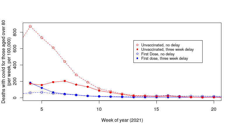
Let's start with the updated graph for deaths per week per 100,000 in those aged over 80:
It can be seen immediately that the introduction of a delay to compensate for the time between infection and death has had a significant impact on the shape of the curves in the graph. First consider deaths per week per 100,000 individuals in the unvaccinated (red data points). The introduction of the delay has reduced deaths in the unvaccinated at week four from approximately 800 per day to approximately 200 per day. We have also increased deaths in those single-jabbed from approximately 80 per day to approximately 200 per day. In the original data the deaths in the unvaccinated fell rapidly to approximately week 10, but in our new data with the delay the data for deaths in the unvaccinated is rather flat with a small peak at week seven.
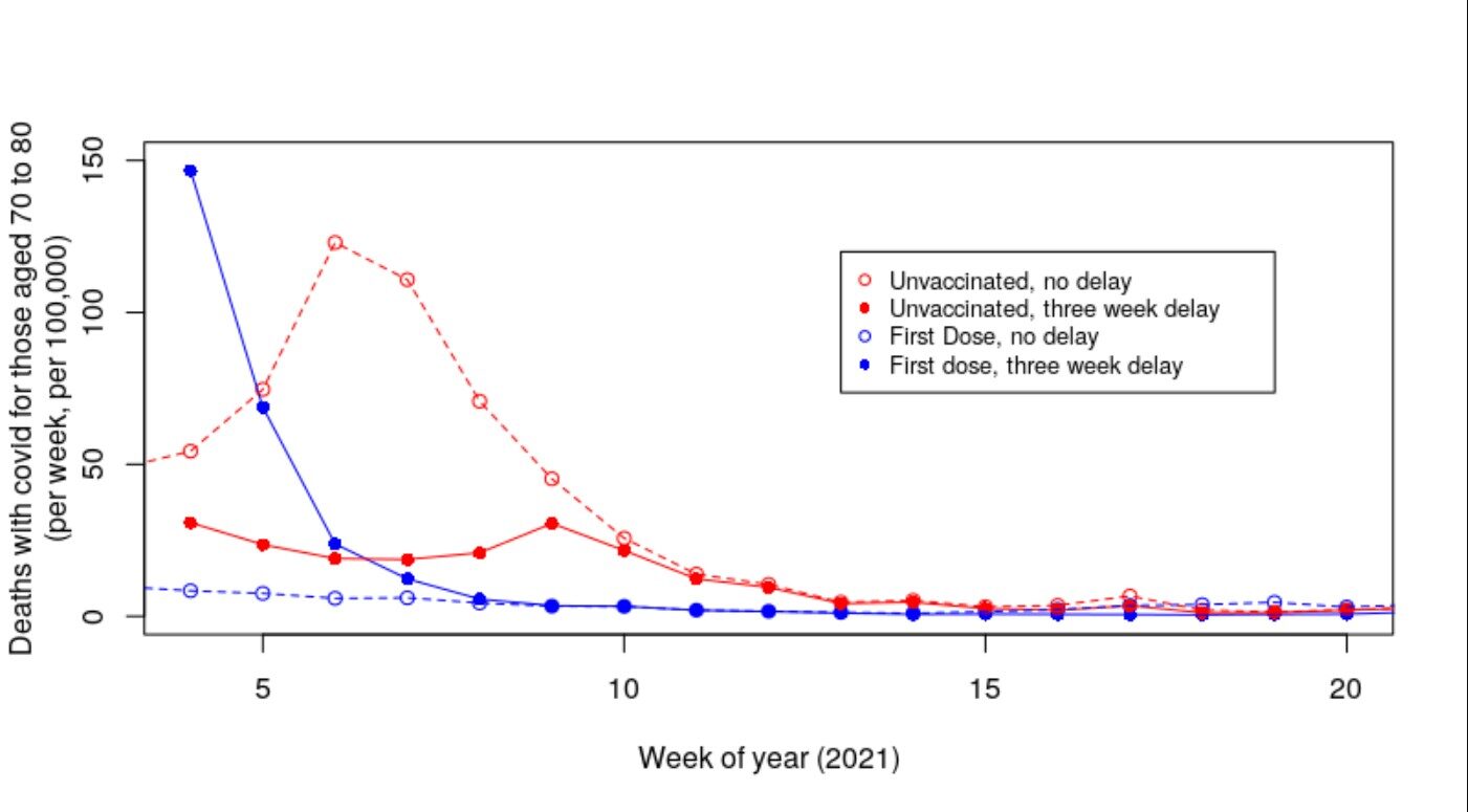
It is worthy of note that there is still a net excess of deaths per week in the unvaccinated compared with those that received a single dose of vaccine, but that the difference is substantially reduced. Also noteworthy is that at week four the data for those having received a first dose isn't flat - perhaps deaths from Covid in the vaccinated at earlier time points were higher? Hmm - what about the data for those aged 70-80 who were vaccinated just that little bit later?
That's a pretty scary graph. With the introduction of a delay to compensate for the time between infection and death we've eliminated the majority of the peak in deaths per week per 100,000 that we saw with the uncompensated data. What's more, there is now a pronounced increase in the deaths of those with a single dose of the vaccine at the far left of the graph. It should be noted that these individuals were vaccinated after those aged over 80; thus we are getting closer to the point of vaccination in this graph.
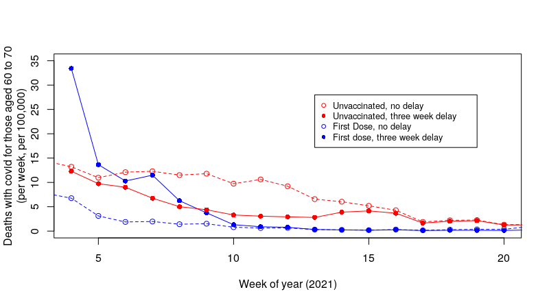
And the data for those aged 60-70?
That's a little less impressive, but we still see a substantial decrease in deaths per week per 100,000 in the unvaccinated and a substantial increase in deaths in the weeks after the vaccinated had their first dose.
I note that we're still seeing a peak in deaths at the start of the study period, whereas the main roll-out of the vaccines in those aged between 60 and 70 was later in July, when the Covid wave was receding rapidly. The peak in cases in the UK was around January 8th, and as testing was usually instigated by symptomatic disease which starts three to four days after infection; it is likely that the point of peak infections was in the first week of the year. Thus it is likely that what we're seeing in the graph for deaths in those aged 60 to 70 reflects vaccinations before the main roll-out of the vaccine. This is probably also true for the data for those aged between 70 and 80. This suggests that the main risks came with vaccination during the peak of that infectious wave, and that risks were lower after it. Of course, this aspect will equally affect the unvaccinated, and thus the comparison between the two groups holds.
To summarise what we've found in this new approach to the analysis: it appears that introducing a shift in the data (the delay) to try to work with the date of infection rather than the date of death significantly reduces the number of deaths seen in the unvaccinated over a sustained period of time and identifies a period of increased risk of death for a shorter period after vaccination.
Because we have shifted deaths per week per 100,000 lower in the unvaccinated and higher in the vaccinated the obvious question is - what is the net position? This is rather difficult to calculate given the data we have, however, we can gain an indication of the net position through a comparison of the sum of all the individual data points over the study period (weeks four to 20, 2021):
It should be stressed that this isn't a prediction of the number of actual deaths per 100,000 during the study period; it is merely an attempt to compare the impact of our analysis on the vaccinated vs unvaccinated. Nevertheless, the two pairs of summed-deaths per week per 100,000 highlighted in green suggest that the vaccines' impact on deaths was not as high as has been suggested. I'd note that although the data suggest that the vaccines made things worse, I think that might be an over-interpretation of the data - certainly, there is a significant shift in the unvaccinated versus vaccinated population during this period that doesn't support a simple interpretation of 'deaths in the vaccinated were higher'. Moreover, the impact of a proportion of the deaths being with-but-not-of-Covid will likely remove at least some of this effect (I'll come back to this point). Also, the analysis is sensitive to the delay between infection and death - a shift in timescale could have been introduced by the Alpha variant prevalent during this time, changes in treatments for the vaccinated and/or changes in disease progression introduced by the vaccines themselves.
I note that the summed death data for those over 80 (highlighted in yellow) still shows a net benefit of the vaccine - I suggest that this is because those individuals aged over 80 were vaccinated before the study period. Thus it is likely that they did have a similar peak in deaths but during weeks one to three of 2021 and the peak is not seen in our analysis; if this is the case then it is likely that those aged over 80 also saw a lower net benefit from vaccination.
The observant amongst my readers will note that I have not addressed the data for those aged between 10 and 59 found in the U.K. ONS release. As I discussed in a previous post, this is a very wide age range and the variation in death rates in this group is too great to be able to perform a meaningful analysis. It would be nice if the UK ONS could release future data with more granularity in the 10 to 59 yrs age range, but for now these data cannot be considered useful for analysis.
The introduction of a shift in the data to compensate for the delay between infection and death has had a significant impact on the data for deaths with Covid. But is it correct?
I am a little concerned about one aspect of these data - the problem being the usual one of 'deaths with Covid'. The compensation mechanism I have used is only valid for people dying from Covid - those people dying of something else while infected with Covid should not have the compensation applied to them - well, they shouldn't be included in the data at all, but once the with-but-not-of data are mixed up with the with Covid deaths application of our delay compensation mechanism will introduce artefacts into our data that will increase the risk that we're now underestimating the benefits of the vaccines. Unfortunately, of course, we don't have separate data for with and from Covid deaths.
Comment: Wonder why?
As it stands I believe that the truth lies somewhere in between the original analysis and this analysis with a compensatory delay, but where in between? Actually, I'm not sure it matters that much:
- If there are many with-but-not-of Covid deaths then this compensatory mechanism shouldn't be used and thus we have to go back to our original analysis by the date of death. However, if most deaths were with-but-not-of Covid then really the vaccines aren't particularly necessary;
- If there aren't many with-but-not-of Covid deaths then the application of the necessary compensatory delay results in the vaccines looking rather ineffective.
For what it is worth, I believe that approximately one third of all with Covid deaths were actually from some other cause and the individual just happened to be Covid infected. If this is the case then the strength of the effect identified in this post will be lower than I have found. Nevertheless, it appears that there would still be a significant effect even with the removal of the with-but-not-of deaths; the vaccines are likely to offer some limited protection against death, however, the increased risk of death during the period immediately after vaccination is likely to remain.
I believe that this approach to the analysis of the U.K. ONS deaths data for early 2021 strongly suggest that there were fewer deaths in the unvaccinated group than has been considered to be the case. Also, importantly, there were likely to have been more deaths in those given their first dose of vaccine during this period, particularly in the first few weeks after vaccination and particularly during an infectious Covid wave.
This latter point is important. It suggests that in general there appears to be a an increased risk of death immediately after receipt of the first dose of Covid vaccine. If this is the case then vaccination during last winter's Covid wave will have increased the risk of death in those vaccinated. This work is only a preliminary investigation into incomplete data; however, it reveals a very concerning result - more data and analysis must be undertaken into the risks suffered by the vaccinated in the period immediately after vaccination. Until such analysis shows the vaccines to have low risk in this period, it must be recommended that:
- Individuals being given their first dose of Covid vaccine should be warned that they may have a period of significantly increased risk from Covid over the weeks following vaccination and that they should take additional precautions to protect themselves from disease, including partial self-isolation.
- Mass vaccination during an infectious wave should be discouraged; there are increased numbers of infected individuals and thus increased risk in the crucial few weeks post vaccination.


Reader Comments
to our Newsletter