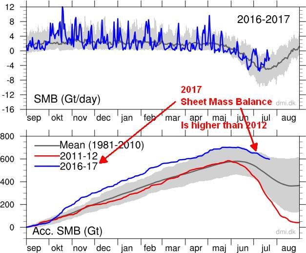
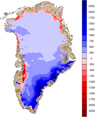
Here you can follow the daily surface mass balance on the Greenland Ice Sheet. The snow and ice model from one of DMI's climate models is driven every six hours with snowfall, sunlight and other parameters from a research weather model for Greenland, Hirlam-Newsnow. We can thereby calculate the melting energy, refreezing of melt water and sublimation (snow that evaporates without melting first). The result of this is a change in the snow and ice from one day to the next and this change is shown below. All numbers are in water equivalent, that is, the amount of water the snow and ice would correspond to if it was melted.
The model has been updated in 2014 to better account for meltwater refreezing in the snow, and again in 2015 to account for the lower reflectivity of sunlight in bare ice than in snow. Finally, it has been updated again in 2017 with a more advanced representation of percolation and refreezing of meltwater. At the same time, we have extended the reference period to 1981-2010. The update means that the new maps, values and curves will deviate from the previous ones. Everything shown on this site, however, is calculated with this new model, so that all curves and values are comparable.
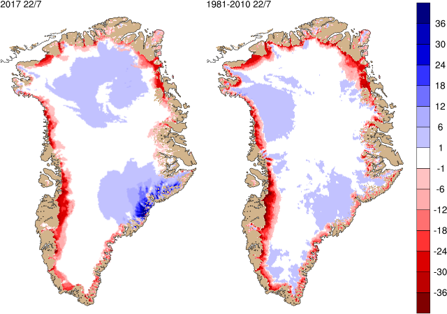
The surface mass balance is calculated over a year from September 1st to August 31st (the end of the melt season). The figure to the right shows the sum of all the daily changes from September 1st up to today. Next year on September 1st the map will be reset and we start over. This accumulated map illustrates how much the surface mass balance has contributed in each point across the ice sheet.
The figure below shows the total daily contribution from all points on the ice sheet (top) and the same accumulated from September 1st to now (bottom). The blue curves show this season's surface mass balance in gigatons (Gt; 1 Gt is one billion tons and corresponds to 1 cubic kilometer of water), and for comparison the mean curves from the historical model run are shown with two standard deviations on either side. Note that the accumulated curve does not end at 0 at the end of the year. Over the year, it snows more than it melts, but calving of icebergs also adds to the total mass budget of the ice sheet. Satellite observations over the last decade show that the ice sheet is not in balance. The calving loss is greater than the gain from surface mass balance, and Greenland is losing mass at about 200 Gt/yr.
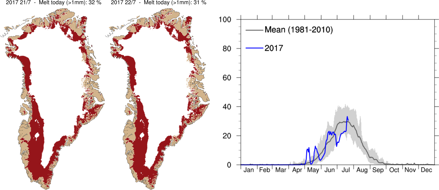
The graph to the right of the maps shows the percentage of the area of the Greenland ice sheet that has melted every day this season on the blue curve. This can be compared with the dark grey curve that is the average melt area over the period of 1981-2010. The light grey band shows the differences from year to year as the range of each day through this period leaving out the most extreme high and low values each day.
This melt map only shows areas where melt has happened. It does not include evaporation directly from the ice sheet surface or show how much snow and ice has melted. Much of the melt water will refreeze in the surface snow layers rather than running off the ice sheet, this process is included in the calculations of surface mass balance which is why the melt area appears different to the surface mass balance plots above.
Ice flow
Due to gravity, ice flows slowly outwards like dough on a kitchen counter. When snow falls on top of the ice sheet year after year, the layers below are slowly compressed into ice. In the central part of the ice sheet, where little if any melt occurs, new layers will therefore continually be added. The ice does not grow in height, however, since the extra ice is balanced by the flow away from the center. Further out towards the coast we find the equilibrium line, where snowfall and melt are exactly balanced. Below the equilibrium line, there is more melt than snowfall and here the net mass loss is countered by the flow coming out from the center of the ice sheet. Here it is the ice sheet itself which melts.
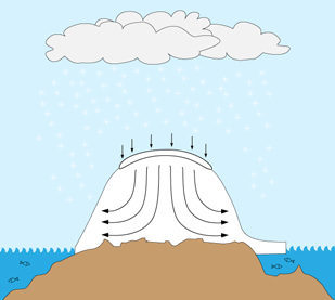
- the amount of snow that falls and is compressed to ice
- the amount of snow and ice that melts or evaporates (sublimates) and
- the amount of ice that flows away due to the ice motion
If climate changes, the surface mass balance may change such that it no longer matches the calving and the ice sheet can start to gain or lose mass. This is important to keep track of, since such a mass loss will lead to global sea level rise. As mentioned, satellites measuring the ice sheet mass have observed a loss of around 200 Gt/year over the last decade.
Greenland Climate Research Centre collaborates with DMI on research in both atmospheric impact on the Greenland Ice Sheet and the ice flow itself and its interaction with the rest of the climate system.
Further reading: Scientific publication on the surface mass balance model.
For further information please contact climate scientist Peter L. Langen


Reader Comments