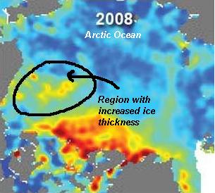
When looking at arctic ice reports, the most important thing to remember is that we have only been studying the arctic since the end of 1978. That's only three decades, which is a small data set to truly identify a trend for long-term climate. We must look closely at the reports themselves, such as the most recent one from NASA/JPL. The analysis does take time, but that could also mean old data is shown, ignoring current trends. Also, many of these ice reports are released in the summer, when it is 'expected' to be hot, and ice in the arctic is at its lowest point all year. So gloabal warming or climate change aside, the time of year can be misleading.
The latest report from NASA on arctic sea ice states that between 2004 and 2008 (see the comparrison images and scale in the slide show below), the ice has shrunk by 57%, comparing it to the size of Lake Michigan. NASA scientist Jay Zwally says global warming is to blame. The image here does show a region of increased ice thickness in that same time frame, but this is not mentioned. Most coverage of this report fails to state that just this winter the National Snow and Ice Data Center had to come clean that its remote sensors were failing. It had underestimated ice about the size of California:
The problem arose from a malfunction of the satellite sensor we use for our daily sea ice products. Upon further investigation, we discovered that starting around early January, an error known as sensor drift caused a slowly growing underestimation of Arctic sea ice extent. The underestimation reached approximately 500,000 square kilometers (193,000 square miles) by mid-February. Sensor drift, although infrequent, does occasionally occur and it is one of the things that we account for during quality control measures prior to archiving the data.So, does the NASA report include the bad, missing data? The latest data for June does show a dramatic ice retreat during 2006 and 2007, but a recovery has been seen since then. This recovery is much more significant! Last year, the return of sea ice in the arctic satellite analysis from the University of Illinois Arctic Climate Research Center showed there was no cause for concern. Sea ice levels rebounded at near record levels and, in fact, returned to levels not seen in almost 30 years.
Why is there so much confusion with the data? Is it just spin by one side or both? The charts below do show a trend of reduced ice on average since we have been measuring it, but it also shows that there has been a little rebound. Actually, there has been a few rebounds in the past, which shows that there are other forces at play than just the rise of CO2.
The past two winters have shown a dramatic rebuilding of the arctic sea ice. Of course that will be 'thin' ice because it is new ice. Some of it will melt in the summer, but it does indicate a changing tend. I would focus more on this upcoming winter to see if ice continues to rebuild. That would be good news to focus on, and it should be reported. However, I don't see that happening.
In the perspective of this scientist and many others... 30 years of ice measurements do not represent climate! It is like plotting the high temperatures for a week and using that for the trend of the century. The climate models have indicated that more CO2 will increase the ice melt, but they do not show any stability or recovery. So, do you think the positive aspects are being covered up like Carlin's EPA report, or just ignored?
Slide Show Link.


Reader Comments
to our Newsletter