© Joannenova
Frank Lansner has done some excellent follow-up on the missing "decline" in temperatures from 1940 to 1975, and things get even more interesting. Recall that the original "hide the decline" statement comes from the ClimateGate e-mails and refers to "hiding" the tree ring data that shows a decline in temperatures after 1960. It's known as the "divergence problem" because tree rings diverge from the allegedly measured temperatures. But, Frank shows that
the peer reviewed data supports the original graphs, and that real measured temperatures did decline from 1960 onwards...sharply. Yet, in the GISS version of that period, temperatures from the cold 1970's were repeatedly "adjusted" years later, and progressively made warmer.
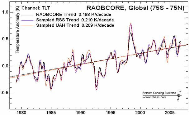
The most mysterious period is from 1958 to 1978, when a steep 0.3C decline was initially recorded in the Northern Hemisphere. Years later, this was reduced so far it became a mild warming against the detailed corroborating Raobcore evidence. Raobcore measurements are balloon readings. How accurate are they? They started in 1958, twenty years before satellite temperature records (which are renowned for their accuracy).
Put the two methods side-by-side, and they tie together neatly, telling us that both of them are accurate, reliable tools.
You can see how similar the data from both methods is:
© Unknown
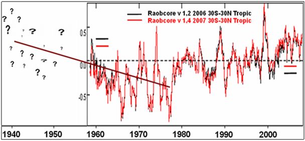
So what do the raobcores tell us about the period before satellites started recording temperatures? They make it clear that temperatures fell quickly from 1960 to 1970.
© Unknown
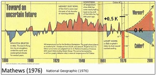
The decline in the original graph in
National Geographic in 1976 is apparently backed up by highly accurate balloon recordings, and was based on peer reviewed data:
Budyko 1969 and
Angell and Korshover (1975). These two sets overlap from 1958 to 1960, and correlate well, so stitching them together is reasonable, and it doesn't make much difference which year is chosen from the overlap (indeed any other choice makes the decline slightly steeper).
What's thought-provoking is that the Raobcore data above is for 30N-30S,
covering all the tropics on both sides of the equator, and still shows the decline. This begs the question of whether the Southern Hemisphere data has been adjusted too. It would be good to see the Raobcore sets farther towards the Arctic. It would also be good to look at the Southern Hemisphere. Where are the data sets and peer reviewed papers on temperatures from 1965 to 1980? I hope someone does a follow-up on these, too
© National Geographic
When did the "funny business" begin?
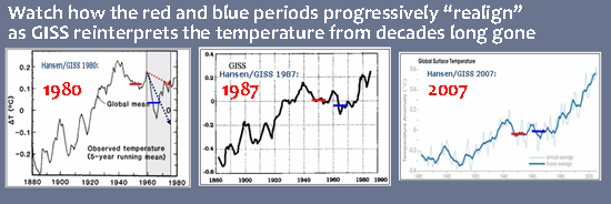
By 1980 Hansen and GISS had already produced graphs that were starting to neutralize the decline. His graphs of 1987 and 2007 further fudged the decline, until the cooling from 1960 to 1975 was completely lost.
© Unknown
Watch how the cooling trend of the 1960's to 1970's is steadily adjusted up so that 0.3 degrees cooler gradually becomes 0.03 warmer (notice the red and blue horizontal lines in the graphs above).
Mathews Graph 1976: 1955 - 1965 was around
0.3C warmer than 1970's
Hansen/GISS 1980: 1955 - 1965 was around
0.1C warmer than 1970's
Hansen/GISS 1987: 1955 - 1965 was around
0.05C warmer than 1970's
Hansen/GISS 2007: 1955 - 1965 was around
0.03C cooler than 1970's
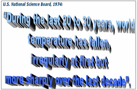
And in 1974, there was the forerunner of the "It's worse than we thought" message.
© US National Science Board
Frank has more information and details on his blog
Hide the decline.
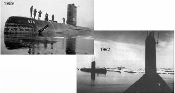
If 1958 temperatures were similar to the 1990's, this rewrites the entire claim of unprecedented recent warming. Lansner also reminds us of the photos taken in the arctic by submarines that surfaced around the North Pole.
© Unknown
Reader Comments
to our Newsletter