UAH: June 2009: anomaly near zero

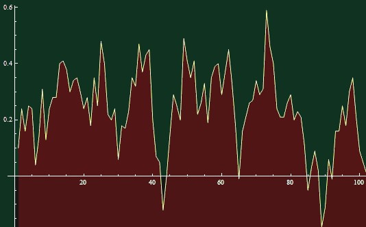
UAH MSU has officially released their June 2009 data. This time, they're faster than RSS MSU. The anomaly was +0.001 °C, meaning that the global temperature was essentially equal to the average June temperature since 1979. June 2009 actually belonged to the cooler half of the Junes since 1979.
Global warming is supposed to exist and to be bad. Sometimes, we hear that global warming causes cooling. In this case, global warming causes global averageness. In all three cases, it is bad news. The three main enemies of environmentalism are warm weather, cool weather, and average weather.
It is not a coincidence that these enemies are very similar to the four main enemies of communism. The four main enemies that were spoiling the success of communism were Spring, Summer, Fall, and Winter. :-) See Anthony Watts' blog for additional discussion.
Bonus: trends over different intervals
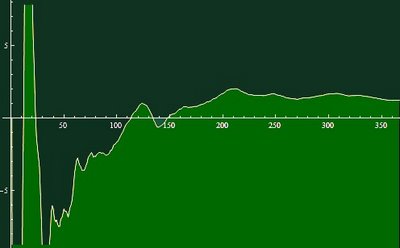
You may have been intrigued by my comment that the cooling trend during the last 8.5 years is -1.45 °C. What is the result if you choose the last "N" months and perform the linear regression?
You may see that the cooling trends are dominating for most intervals shorter than 110 months; the trend in the last 50 months is around -6 °C per century. Only when the period gets longer than 150 months i.e. 12.5 years (but less than 31 years), the trend becomes uniformly positive, around 1.2 °C per century for the intervals whose length is close to 30 years.
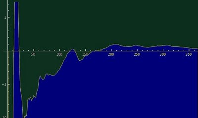
Note that those 12.5 years - where you still get a vanishing trend - is from January 1997 to June 2009. If you consider the UAH mid troposphere data instead (relevant for the part of the atmosphere where the greenhouse warming should be most pronounced, according to both proper atmospheric science and the IPCC report, page 675), all the trends are shifted downwards:
You need to consider time periods longer than 180 months i.e. 15 years (at least from Summer 1994) - but shorter than 31 years - to see a uniformly positive warming trend. And the trend that you can calculate from those 30+ years is just 0.4 °C per century and chances are that this 30+-year trend will actually drop below zero again, in a few years. At any rate, the blue graph makes it clear that in the right context, the longer-term warming trend converges to zero at a very good accuracy.
According to the IPCC, the surface warming trend should be around 3 °C per century which should translate to a 4-5 °C warming per century in the mid troposphere where the greenhouse effect has the strongest muscles. You see that according to the last 30 years of the data, the IPCC overestimates the warming trend by one order of magnitude!
Because the mid troposphere is the dominant locus of the greenhouse "fingerprint", this is the most appropriate method to check the validity of the IPCC predictions. Their order-of-magnitude error is equivalent to the mistake of a biologist who confuses squirrels and elephants.
To be more specific about a detail, half of the Earth's surface is between 30°S and 30°N - because, as Sheldon Cooper said in TBBT, sine of 30 degrees is exactly 1/2. But the mid-troposphere warming (8 km above the surface) is faster than the surface at least between 40°S and 40°N, i.e. on the majority of the surface, so it is likely that even when you take the global averages of both quantities, the mid-troposphere should see a faster warming than the surface.
Someone may argue that those 30 years represent too short an interval and the trend will be higher in 100 years. But such a reasoning is a wishful thinking. Moreover, periods longer than 30 years don't really belong to the present generation. In 30 years, most of the population of the Earth won't remember the year 2009 - and they shouldn't be affected by stupid fads of those mostly dumb people from 2009.


Reader Comments
to our Newsletter