For this next post, I skip kind of deep into the report because
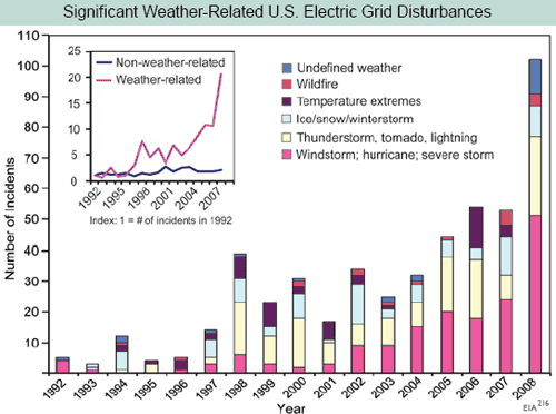
Kevin Drum was particularly taken with the power of this chart from page 58.

© unknown
I know that skepticism is a lost art in journalism, so I will forgive Mr. Drum. But in running a business, people put all kinds of BS analyses in front of me trying to get me to spend my money one way or another. And so for those of us for whom data analysis actually has financial consequences, it is a useful skill to be able to recognize a steaming pile of BS when one sees it. (
Update: I regret the snarky comment about Kevin Drum - though I disagree with him a lot, he is one of the few folks on either side of the political aisle who is willing to express skepticism for studies and polls even when they support his position. Mr. Drum has posted an update to his original post after I emailed him this information).
First, does anyone here really think that we have seen a 20-fold increase in electrical grid outages over the last 15 years but no one noticed? Really?
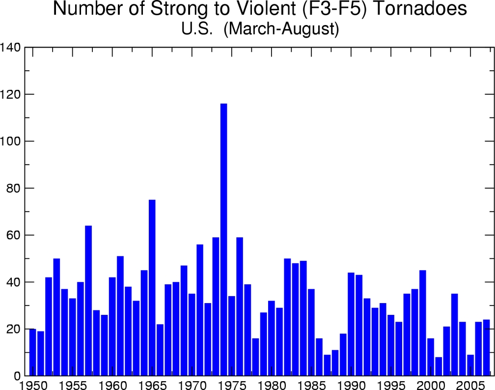
Second, let's just look at some of the numbers. Is there anyone here who thinks that if we are seeing 10-20 major outages from thunderstorms and tornadoes (the yellow bar) in the last few years, we really saw ZERO by the same definition in 1992? And 1995? And 1996? Seriously? This implies there has been something like a 20-fold increase in outages from thunderstorms and tornadoes since the early 1990's. But tornado activity, for example, has certainly not increased since the early 1990's and has probably decreased (from the NOAA,
a co-author of the report):

© unknown
All the other bars have the same believability problem. Take "temperature extremes." Anyone want to bet that is mostly cold rather than mostly hot extremes? I don't know if that is the case, but my bet is the authors would have said "hot" if the data had been driven by "hot." And if this is proof of global warming, then why is the damage from cold and ice increasing as fast as other severe weather causes?
This chart screams one thing at me: Basis change. Somehow, the basis for the data is changing in the period. Either reporting has been increased, or definitions have changed, or there is something about the grid that makes it more sensitive to weather, or whatever (this is a problem in
tornado charts, as improving detection technologies seem to create an upward incidence trend in smaller tornadoes where one probably does not exist). But there is NO WAY the weather is changing this fast, and readers should treat this whole report as a pile of garbage if it is written by people who uncritically accept this chart.
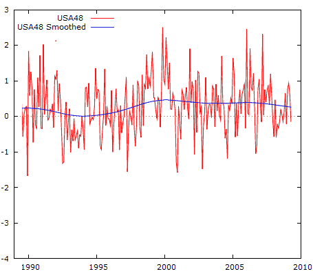
Postscript: By the way, if I want to be snarky, I should just accept this chart. Why? Because here is the US temperature anomaly over the same time period (using the
UAH satellite data as graphed by Anthony Watt, degrees C):

© unknown
From 1998 to today, when the electrical outage chart was shooting up, the US was actually cooling slightly!
This goes back to the reason why alarmists abandoned the "global warming" term in favor of climate change. They can play this bait and switch, showing changes in climate (which always exist) and then blaming them on CO2. But there is no mechanism ever proposed by anyone where CO2 can change the climate directly without going through the intermediate step of warming.
If climate is changing but we are not seeing warming, then the change can't be due to CO2. But you will never see that fact in this helpful government propaganda piece.
Reader Comments
to our Newsletter