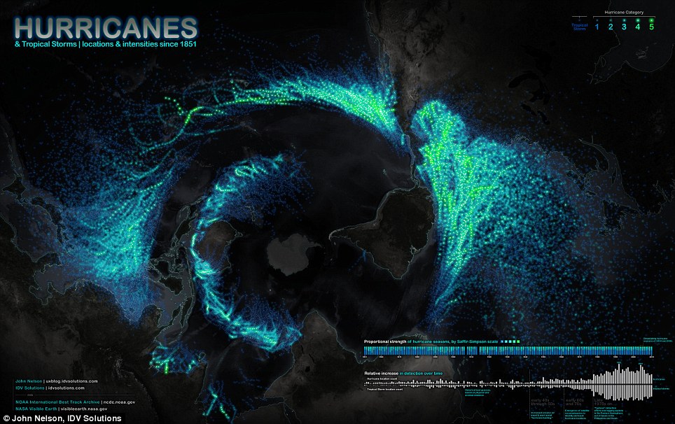
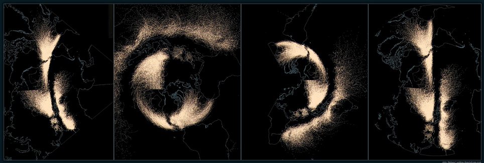
This amazing image was created by designer John Nelson, and shows data of every recorded event since 1851.
It also offers a unique perspective of the earth from the bottom up - with Antarctica in the middle, the Americas on the right and Asia on the left

'When I put it onto a rectangular map it was neat looking, but a little bit disappointing,' Nelson told OurAmazingPlanet.
But the unorthodox, bottom-up perspective allowed the curving paths the storms make across the world's oceans to shine, he said.
Nelson used U.S. government data on tropical storms and hurricanes from 1851 through 2010.
The hurricane map is the latest in a series of maps Nelson has made that showcase the planet's natural phenomena in arresting ways.
A map of the world's earthquakes since 1898 and a map of the rise in U.S. wildfires since 2001 also offer unique, wide-scale looks at natural disasters.

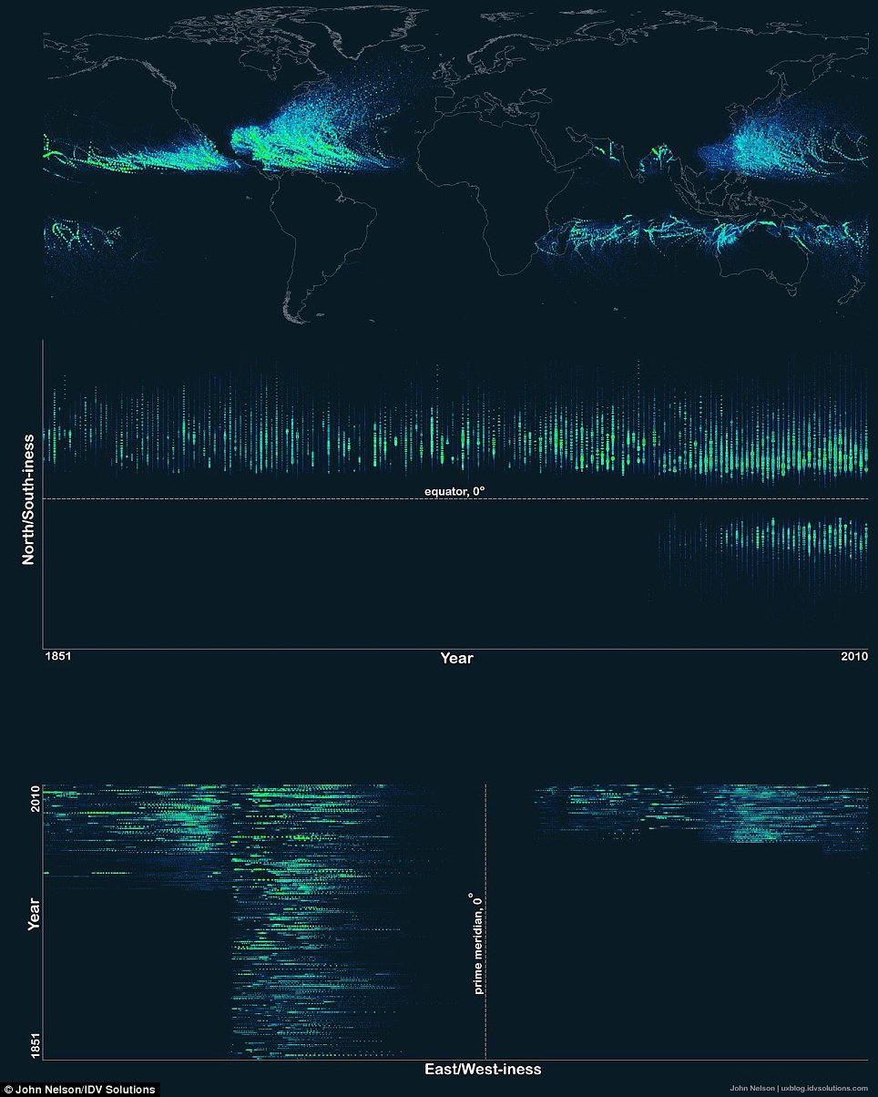
It shows the number of storms leapt up in the latter half of the 20th century, because of technological advances.
Comment: This was due perhaps in part to technological advances, but more or less the same technology used to record storms was being used twenty years ago as are being used today. So clearly there HAS been a significant increase in the number of hurricanes and tropical storms.
'When first registering the data, I accidentally assigned time as one of the location coordinates and, after the initial disappointment of what I though was mucked up data, realized that what I was actually seeing was a timeline visualization of where we've historically paid mind to collecting storm data,' he said.

In addition, the dearth of storms in the Eastern and Southern Hemispheres is also a product of a lack of data. The United States began to add storms from these regions to the archive beginning only in 1978.


spiral enough?