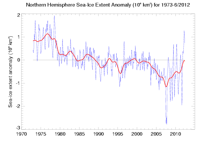
The graph was from the UK Met Office website and tracks monthly anomalies in NH sea ice, which clearly show ice extent recovering from the 2007 minimum.
Intrigued, I asked the Met Office for their comments and received the following reply from John Kennedy, a Research Scientist :-
"There are problems with the sea-ice data (starting early 2009 - see http://www.metoffice.gov.uk/hadobs/hadisst/) so we removed the links to the sea-ice extent diagrams from the web site. The diagrams should have been removed too, but apparently not. Thanks for bringing this to my attention. There are better sources for monitoring sea-ice extent, such as that produced by NSIDC.A look at the Met Office web page, that John mentions, explains :-
The diagram shows monthly sea-ice extent for the northern hemisphere, plotted as anomalies relative to the long-term mean (1979-2011) for each month."
"03/DECEMBER/2010. The SSM/I satellite that was used to provide the data for the sea ice analysis in HadISST suffered a significant degradation in performance through January and February 2009. The problem affected HadISST fields from January 2009 and probably causes an underestimate of ice extent and concentration.So regardless of the original problems, the data has been reprocessed to compensate. This may not be ideal, but nobody seriously suggests that these sort of satellite measurements are accurate anyway. It is also true that there is a step up during 2009 and 2010, that might be related to the discontinuity.
It also affected sea surface temperatures in sea ice areas because the SSTs are estimated from the sea ice concentration (see Rayner et al. 2003). As of 3rd December 2010 we have reprocessed the data from January 2009 to the present using a different sea ice data source. This is an improvement on the previous situation, but users should still note that the switch of data source at the start of 2009 might introduce a discontinuity into the record. "
Nevertheless, it is clear that, based on the new data source, sea ice extent has continued to recover during the last two years. (The graph runs up to June 2012).
Furthermore, the claim that the links were removed because of the problems in 2009 simply does not hold water, as the graph has continued to be maintained right up till two months ago.
One wonders if NSIDC would withdraw all their graphs and datasets every time there was a satellite problem and start all over again? Of course not.
And, since my contact with John Kennedy, the graph has completely disappeared, as well as the links. What are the Met trying to hide?
Is the real reason the fact that the graph does not agree with NSIDC's version of events?


[Link]