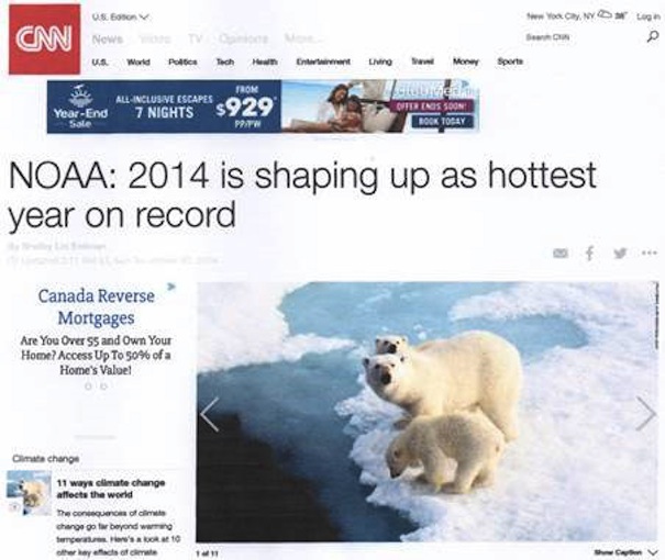
We know the headline referred to NOAA's projection, but the public only remember "warmest year". It is a routine of manipulation of headlines practiced by bureaucrats and supporters of the Intergovernmental Panel on Climate Change (IPPC), from the start. The claim was not surprising, because NOAA was pushing 2014 as warm beginning in January with this headline "NOAA: January 2014 fourth-warmest on record." Various months were identified during the year, for example, "NOAA: August 2014 Was The Warmest On Record," noting August was the warmest by a fraction. But they had already reported,
The summer of 2014 is officially the hottest since the modern instrumental record began more than 130 years ago, according to the latest state of the climate report from NOAA's National Climatic Data Center.
By October they were summarizing the year.
"This makes the first ten months of 2014 the warmest January to October period on record and puts 2014 on track to be the warmest year recorded in the NOAA archive, which dates back to 1880."
Bob Tisdale provided an excellent summary of the "Anticipation" for two surface records from GISS and NCDC. He was not surprised when these records appeared, showing 2014 was the warmest, according to them, by 0.02°C. Remember, this is from a record that is restricted by the historic record to measurements of 0.5°C. We also know the two satellite records, RSS and UAH, both show it was not the warmest year.
To counteract the headline you need something very dramatic, because there is nothing significant about the 2014 temperature as Tisdale plans to identify in an upcoming article titled, "The Uptick in Global Surface Temperatures in 2014 Doesn't Help the Growing Difference between Climate Models and Reality". He is interested in seeing how Gavin Schmidt, who replaced James Hansen at the Goddard Institute for Space Studies (GISS), is carrying the torch. History shows that GISS readings are consistently higher than all other sources. It is just one indicator of the temperature adjustments made so the AGW hypothesis fits the political agenda.
Challenges and IPCC Fixes
How valid is the 2014 claim? In the 10,000 - year context, it is significant because it is among the 3 percent coldest years, which is far more significant than the 100-year warm alarmists proclaim. There are two major reasons: Highest readings occur in the most recent years of a rising temperature record. Every alteration, adjustment amendment and abridgement of the record so far, was done to create and emphasize increasingly higher temperatures.
1. The instrumental data is spatially and temporally inadequate. Surface weather data is virtually non-existent and unevenly distributed for 85 percent of the world's surface. There are virtually none for 70 percent of the oceans. On the land, there is virtually no data for the 19 percent mountains, 20 percent desert, 20 percent boreal forest, 20 percent grasslands, and 6 percent tropical rain forest. In order to "fill-in", the Goddard Institute for Space Studies (GISS), made the ridiculous claim that a single station temperature was representative of a 1200 km radius region. Initial claims of AGW were based on land-based data. The data is completely inadequate as the basis for constructing the models.
2. Most surface stations are concentrated in eastern North America and Western Europe and became the early evidence for human induced global warming. IPCC advocates ignored, for a long time, the fact that these stations are most affected by the urban heat island effect (UHIE).
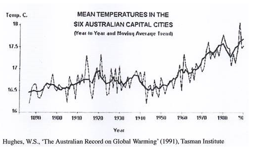
The UHIE was one of the first challenges to the claim of AGW evidenced in the instrumental record. Two graphs produced by Warwick Hughes were the most effective and appeared in 1991, shortly after the first IPCC Report in 1990. Figure 2 shows temperature at six major Australian cities.
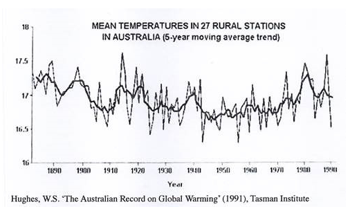
A most likely explanation for the increasing UHIE, is expansion of the suburban area until it encompassed airport weather stations originally outside the city. The automobile made this possible. Figure 3 provides a comparison with 26 rural stations.
The difference is marked. What is equally interesting is that temperatures were higher in the first part of the record from 1880 and 1900.
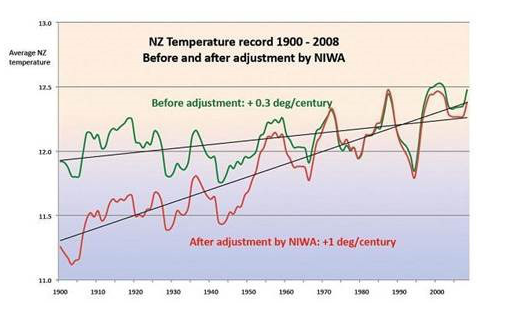
3. There is a consistent revision of the record to lower historic readings. This increases the gradient of supposed warming. It is apparent in the New Zealand record (Figure 4).
A search of WUWT, using the term "temperature adjustments", yields a plethora of evidence. Every adjustment serves to change the gradient of the curve making today warmer than the past. Explanations, when given, usually provide little justification for the adjustment. The other tell tale sign is that virtually all adjustments occur before the UAH satellite temperature record began in 1991.
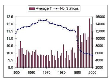
4. Policy anticipated that satellite data would replace the need for surface weather stations. As a result many weather stations were abandoned (Figure 5), or at least not included in the calculation of the global average.
"The figures below indicate:Figure 5 Source
a the number of stations with record length at least N years as a function of N ,
b the number of reporting stations as a function of time,
c the percent of hemispheric area located within 1200km of a reporting station."
The number of surface stations was inadequate in 1960, but was further reduced in 1990. Notice that only approximately 1000 stations cover 100 years.
But how accurate can the global temperature be when Antarctica is omitted. Consider the IPCC conclusion:
"Most of the observed increase in global average temperatures since the mid-20th century is very likely due to the observed increase in anthropogenic GHG concentrations. It is likely that there has been significant anthropogenic warming over the past 50 years averaged over each continent (except Antarctic)."Antarctica is 14 million km2, an area almost equal to Russia, (17 million km2), the largest country on Earth.
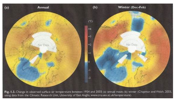
Add to that the 14 million km2 of the Arctic Ocean, for which there is no data, as the Arctic Climate Impact Assessment (ACIA) Report notes (Figure 6).
Extent of these regions is one thing, their role in world climate is another, and arguably far more important than almost any other region.
6. Figure 6 shows that fewer stations are a contributing factor to higher temperatures.
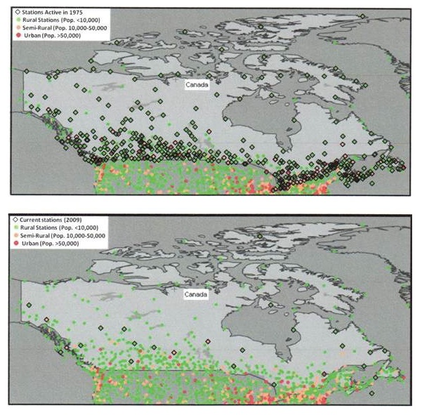
Stations NOAA used from the Global Historical Climate Network (GHCN) in Canada illustrate the problem. (Figure 7).
There are 100 stations north of the Arctic Circle, but NOAA only uses Eureka, a known warm anomaly, to cover 1/3 of the second largest country on Earth. Even the 1200km measure doesn't apply.
7. Alteration of the historic record includes the infamous hockey stick, in which a member of the Climatic Research Unit (CRU) group is reported to have told Professor David Deming, "We have to get rid of the Medieval Warm Period? That involved creating the handle of the hockey stick. The blade was formed from CRU Director Phil Jones' data that showed an increase of 0.6°C in approximately 120 years. The problem was the error factor was ±0.2°C or ±33 percent.
8. 20th century temperature trends begin with warming from 1900 to 1940, cooling from 1940 to 1980, warming from 1980 to 1998 and a slight cooling trend to 2014. Alarmists attributed the cooling to human addition of sulphate, but that failed when temperatures began to rise, with no decline in sulphate levels.
9. If we accept overall warming from 1900, which is reasonable as the Earth emerges from the Little Ice Age (LIA), then the highest temperatures will occur in the most recent record (Figure 8).
Identifying that 2014 was fractionally warmer than any other in the record does not change the trend of the "pause". It does not enhance the CO2 causation claim.
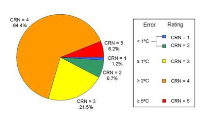
10. The claim is 2014 is 0.02°C warmer than any other year. It is reasonable to assume that the US temperature record is among the best. Anthony Watts showed that only 7.9 percent of US stations are accurate to < 1°C. (Figure 9)
A Counter Headline Must Provide Perspective
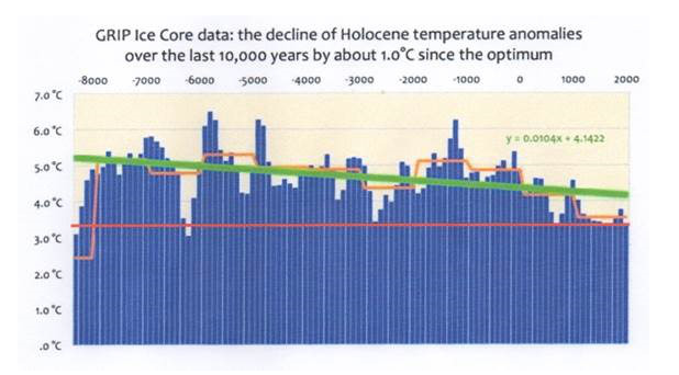
Some form of the title for this article could work. "2014: Among the 3 percent Coldest Years in 10,000 year." Figure 10 shows the Northern Hemisphere temperature for the period variously called the Climatic Optimum, the Hypsithermal, and the Holocene Optimum.
Figure 10 Source
The red line, added to the original diagram, imposes the approximate 20th century temperatures (right side) against those of the last 10,000 years. As CO2Science noted from Dahl-Jensen (1998),
After the termination of the glacial period, temperatures increased steadily to a maximum of 2.5°C warmer than at present during the Climatic Optimum (4,000 to 7,000 years ago).
The key phrase in the 2014 claim is, "in the record", but that only covers approximately 100 years. In the climatologically meaningful 10,000-year context, it is among the coldest.
The claim that 2014 was the warmest on record was politically important for proponents of the Intergovernmental Panel on Climate Change (IPCC) story that human CO2 was causing global warming. Central to that argument was the need to prove late 20th century temperatures were the "warmest ever". This is why the 2014 claim conveniently appeared before the Conference of the Parties (COP) meeting in Lima Peru, at which the false IPCC claim was desperately promoted. Political importance of the measure was accentuated by the continued, 18+ years lack of increase in global temperature.
Evidence keeps contradicting the major assumptions of the anthropogenic global warming (AGW) hypothesis. As T.H. Huxley (1825 - 1895) said,
The great tragedy of science - the slaying of a beautiful hypothesis by an ugly fact.
The problem is the facts keep piling up and the AGW proponents keep ignoring, diverting, or stick-handling (hockey terminology), their way round them. We know the science is wrong because the IPCC projections are wrong. Normal science requires re-examination of the hypothesis and its assumptions. The IPCC removed this option when they set out to prove the hypothesis. It put them on a treadmill of fixing the results, especially the temperature record. As Chinese General Tao Kan said, "It is like riding on the back of a tiger and finding it hard to get off."




The author misses the bit where Gavin Schmidt admitted that the statement "2014 was the warmest year on record" omitted the words "with 38% certainty". In other words Schmidt and NASA GISS were 68% certain that 2014 was not the hottest year on record. As this statement was only based on 10% of station data (they forgot to include 90% of it). the satement should actually have read something like:
"GISS are now 97% certain 2014 was not the warmest year on record".
Somebody somewhere will end up having to do Schmidt's job for him to determine the exact degree of certaintity to which 2014 was not the warmest year on record. Doubtlesses the truth sayer will not get paid for doing the job properly but Schmidt no doubt will for performing his real job: deception.