As it happens, the same satellite that scans for fires also provided the basemap image. I heart NASA.

© John Nelson
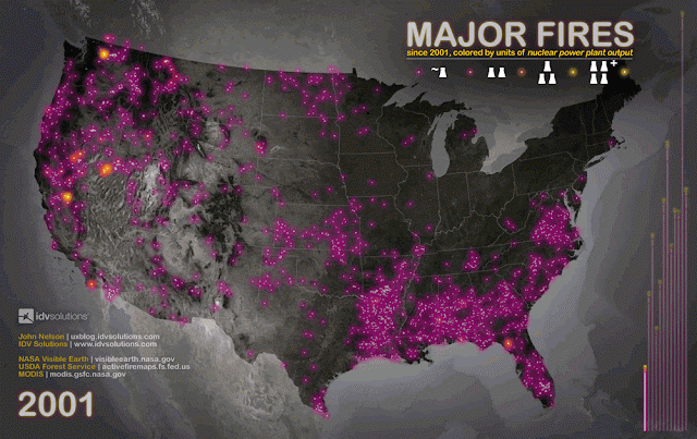
Anyways, each dot represents a moment of pretty extreme heat, down to the one square kilometer level (I only retained fires greater than 100KW MW and of those only fires that the system was more than 50% confident of). They've been colored and scaled by "units" of the typical American nuclear power plant's summertime capacity to provide some sort of baseline of the fires' magnitude.
There are a couple temporal charts in there, too. The seasonal curve I would expect, but the overall upwards trend was interesting (and 2012 is only half through). Is it related to a lag-offset El Niño or La Niña effect?
It's almost like the universe balancing itself out, considering the general density of historical tornadoes. Except poor Florida gets a heaping pile of both. Can there be a fire tornado? If so, look out, Tampa. Also, what's cooking in the south Mississippi basin? And check out the firewall of the Cascades -You shall not pass!
For more info on risk mapping, check out idvsolutions.com.
For more data viz poster prints, check out zazzle.com/idvswag.
Click here to view the infographic in close-up detail.


Comment: It's probably related to Earth Changes:
Reign of Fire: Meteorites, Wildfires, Planetary Chaos and the Sixth Extinction
Fire and Ice, the Day After Tomorrow