One private citizen and a phone call undid the entire premise of this graph portrayed by the National Climatic Data Center. We need more people like Warren willing to ask questions.
Related: see my report on why tornado trends in general follow this same pattern that duped NCDC and why. (Link) - Anthony
Update on GCCI Post #4: Grid Outage Chart
June 18, 2009, 9:26 am by Warren Meyers
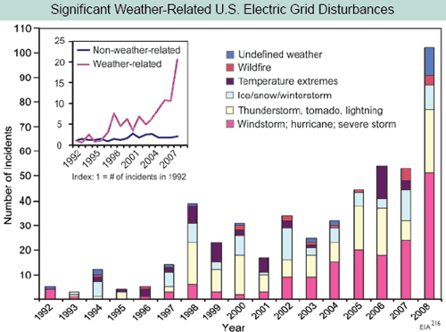
Yesterday I called into question the interpretation of this chart from the GCCI report where the report used electrical grid outages as a proxy for severe weather frequency:
I hypothesized:
This chart screams one thing at me: Basis change. Somehow, the basis for the data is changing in the period. Either reporting has been increased, or definitions have changed, or there is something about the grid that makes it more sensitive to weather, or whatever (this is a problem in tornado charts, as improving detection technologies seem to create an upward incidence trend in smaller tornadoes where one probably does not exist). But there is NO WAY the weather is changing this fast, and readers should treat this whole report as a pile of garbage if it is written by people who uncritically accept this chart.I had contacted John Makins of the EIA who owns this data set yesterday, but I was too late to catch him in the office. He was nice enough to call me today.
He said that there may be an underlying upward trend out there (particularly in thunderstorms) but that most of the increase in this chart is from improvements in data gathering. In 1997, the EIA (and Makins himself) took over the compilation of this data, which had previously been haphazard, and made a big push to get all utilities to report as required. They made a second change and push for reporting in 2001, and again in 2007/2008. He told me that most of this slope is due to better reporting, and not necessarily any underlying trend. In fact, he said there still is some under-reporting by smaller utilities he wants to improve so that the graph will likely go higher in the future.
Further, it is important to understand the nature of this data. The vast majority of weather disturbances are not reported to the EIA. If the disturbance or outage remains local with no impact on any of the national grids, then it does not need to be reported. Because of this definitional issue, reported incidents can also change over time due to the nature of the national grid. For example, as usage of the national grid changes or gets closer to capacity, local disturbances might cascade to national issues where they would not have done so 20 years ago. Or vice versa - better grid management technologies might keep problems local that would have cascaded regionally or nationally before. Either of these would drive trends in this data that have no relation to underlying weather patterns.
At the end of the day, this disturbance data is not a good proxy for severe weather. And I am left wondering at this whole "peer-reviewed science" thing, where errors like this pass into publication of major reports - an error that an amateur like myself can identify with one phone call to the guy listed by this data set on the web site. Forget peer review, this isn't even good basic editorial control (apparently no one who compiled the report called Makins, and he was surprised today at the number of calls he was suddenly getting).
Postscript: Makins was kind enough to suggest some other data bases that might show what he believes to be a real increase in thunderstorm disturbances of electrical distribution grids. He suggested that a number of state PUC's keep such data, including the California PUC under their reliability section. I will check those out, though it is hard to infer global climate trends from one state.


Reader Comments
to our Newsletter